A change in the world price of a labor-intensive good does not stop in the product market. It changes the wage-rental ratio that firms can afford while still breaking even. The Lerner diagram shows this link visually by connecting goods prices, production techniques, and factor prices in trade theory.
The diagram is part of the Heckscher-Ohlin-Samuelson tradition. It explains how goods prices can determine wages and capital returns when production uses labor and capital under competitive conditions. Its main purpose is not to show market power, monopoly pricing, or tariff-export-tax equivalence.
This distinction matters because “Lerner” appears in several economics topics. The Lerner Index measures market power using the gap between price and marginal cost. The Lerner diagram, by contrast, is a trade-theory tool for studying factor prices. Lerner Symmetry is a separate trade-policy theorem about import tariffs and export taxes, and it is not the subject here.
The diagram links goods to factors
The Lerner diagram begins from a basic trade-theory question. If goods prices change, what happens to the prices of the factors used to produce those goods? In a two-good, two-factor model, the factors are usually labor and capital. The factor prices are the wage rate \(w\) and the rental return to capital \(r\).
The diagram is especially useful in the Heckscher-Ohlin model, where countries differ in factor abundance. A labor-abundant country tends to export the labor-intensive good. A capital-abundant country tends to export the capital-intensive good. Once trade changes goods prices, the same price changes feed into wages and capital returns.
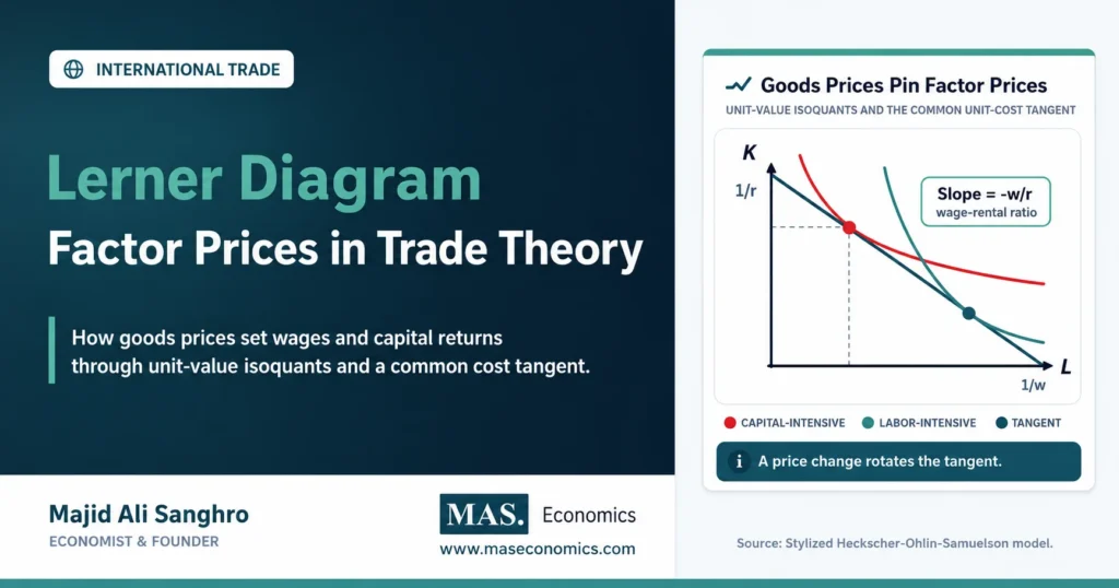
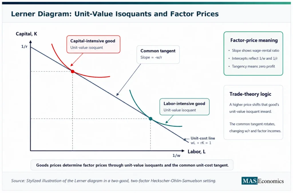
The Lerner diagram turns that mechanism into geometry. It places labor and capital on the axes and draws unit-value isoquants for goods. These isoquants show input combinations capable of producing one dollar’s worth of output for each good at given goods prices.
Factor prices appear through a common tangent line. The slope and intercepts of that tangent line contain the wage-rental information. When goods prices change, the unit-value isoquants shift, the common tangent changes, and the implied factor prices change.
Unit-value isoquants carry prices
A normal isoquant shows combinations of labor and capital that produce a fixed physical quantity of output. A unit-value isoquant is different. It shows input combinations that produce one unit of value, such as one dollar’s worth of output.
If the physical production function for good \(i\) is:
then one dollar’s worth of output requires:
Unit-Value Output
This is why prices matter directly in the diagram. If the price of a good rises, fewer physical units are needed to produce one dollar of value. The unit-value isoquant for that good shifts inward toward the origin. If the price falls, more physical output is needed to produce one dollar of value, so the unit-value isoquant shifts outward.
The inward or outward movement is the bridge from goods prices to factor prices. A higher product price changes the amount of labor and capital needed to produce a fixed value of output. The cost-minimizing condition must then adjust, and that adjustment changes the implied wage-rental ratio.
Zero profit pins factor prices
Under perfect competition, firms earn zero economic profit in equilibrium. The price of each good equals its unit cost. In a two-good model with labor and capital, the zero-profit conditions can be written as:
Zero-Profit Conditions
Here, \(P_X\) and \(P_Y\) are goods prices, while \(c_X(w,r)\) and \(c_Y(w,r)\) are unit cost functions. If both goods are produced, the two product prices provide two equations for the two factor prices \(w\) and \(r\).
The Lerner diagram expresses the same logic visually. The common tangent line to the two unit-value isoquants represents the factor-price line. At tangency, each good is produced at minimum cost for the prevailing wage and rental rate. The same factor prices support zero profit in both industries.
That is the central insight. In this model, goods prices do not merely affect output choices. They can pin down the wage and rental return compatible with competitive production.
The tangent line shows costs
The factor-price line in the Lerner diagram is an isocost line. For one dollar’s worth of output value, the cost condition can be written as:
Unit-Cost Line
With labor on the horizontal axis and capital on the vertical axis, the line intercepts are \(1/w\) on the labor axis and \(1/r\) on the capital axis. A higher wage lowers the labor intercept because one unit of value buys less labor. A higher rental rate lowers the capital intercept because one unit of value buys less capital.
The slope of the line is:
This slope is the negative wage-rental ratio. A steeper line means labor is more expensive relative to capital. A flatter line means capital is more expensive relative to labor.
The common tangent is important because it touches both unit-value isoquants. This means the same wage and rental rate allow both industries to cover costs exactly. If the tangent shifted or rotated, the wage-rental ratio would change.
Goods-price changes rotate the tangent
The most important use of the Lerner diagram is comparative statics. A change in a goods price shifts one unit-value isoquant and changes the common tangent. The new tangent implies a new wage-rental ratio.
Suppose good \(X\) is labor-intensive and its relative price rises. Since one dollar’s worth of \(X\) now requires fewer physical units of \(X\), the unit-value isoquant for \(X\) shifts inward. The capital-intensive good’s unit-value isoquant may remain unchanged if its price is constant.
The new common tangent must adjust to touch the shifted \(X\) isoquant and the unchanged \(Y\) isoquant. Because \(X\) is labor-intensive, the adjustment raises the relative reward to labor. The wage rises relative to the rental return on capital.
This gives the visual intuition behind the Stolper-Samuelson theorem. A rise in the relative price of a good raises the real return to the factor used intensively in that good and lowers the real return to the other factor.
Labor intensity drives the result
The Lerner diagram depends on clear factor intensity. One good must be labor-intensive relative to the other, and the other must be capital-intensive relative to the first. If good \(X\) uses a higher labor-capital ratio than good \(Y\) at common factor prices, \(X\) is labor-intensive.
In diagram terms, the labor-intensive unit-value isoquant is positioned so that its cost-minimizing point uses relatively more labor and less capital. The capital-intensive isoquant uses relatively more capital and less labor.
This distinction is what gives the price change its distributional effect. A higher price for the labor-intensive good makes the labor-using industry more profitable at the old factor prices. Competition for labor then bids wages up. Since both industries must still satisfy zero-profit conditions, the rental return to capital falls relative to wages.
If the capital-intensive good’s price rises instead, the result reverses. The return to capital rises relative to wages, and labor loses relative purchasing power. The diagram makes this asymmetry visible.
Factor prices affect both industries
A common mistake is to treat the wage effect as if it only applies inside the industry whose price changed. The Lerner diagram shows why that is incomplete. Because labor and capital move between industries domestically, a change in factor prices affects both industries.
If the labor-intensive good becomes more valuable, the labor-intensive sector expands its demand for labor. Wages rise. But the higher wage is not paid only in the labor-intensive industry. Domestic labor markets transmit the wage change across sectors, assuming factors are mobile within the country.
The capital-intensive sector must then adjust to the new wage-rental ratio. It may use a different technique, change its input mix, or contract output depending on the full model setting. The factor-price change is economy-wide, not sector-specific.
This is why the Lerner diagram is useful for trade theory. It connects a goods-market shock to economy-wide factor prices through competitive cost conditions.
The diagram clarifies equalization
The Lerner diagram also helps explain factor price equalization. If two countries have the same technologies, produce both goods, and face the same goods prices under free trade, then they share the same unit-value isoquants.
If the same two unit-value isoquants apply in both countries, the same common tangent applies as well. That tangent implies the same wage-rental ratio and the same factor prices. Goods-price equalization therefore leads to factor-price equalization under the theorem’s strict assumptions.
The logic can be summarized as:
Factor-Price Link
This does not mean real-world wages automatically become equal across countries. The diagram explains a benchmark. Technology differences, transport costs, tariffs, factor-quality differences, and specialization can all prevent exact factor-price equalization.
Trade changes income distribution
The Lerner diagram is powerful because it makes the distributional effect of trade visible. Trade changes relative goods prices. Relative goods prices change factor prices. Factor-price changes affect workers and capital owners differently.
If a country opens to trade and the price of its labor-intensive export rises, labor gains relative to capital. If the price of its capital-intensive export rises, capital gains relative to labor. The model therefore predicts that trade creates winners and losers inside countries, even when national income rises.
This point is central to the Heckscher-Ohlin-Samuelson framework. Trade is not only about specialization and aggregate gains. It also changes the relative rewards of factors of production. The Lerner diagram gives a compact way to see that mechanism without treating wages as separate from goods prices.
The same logic also explains why trade politics often follows factor lines. Groups tied to the expanding export sector tend to favor trade, while groups tied to import-competing sectors may resist it. The diagram does not model politics directly, but it shows the price mechanism behind those conflicts.
The model needs careful assumptions
The Lerner diagram works cleanly only under strong assumptions. Markets are competitive. Firms minimize cost. Technologies are known and well-behaved. Factors are mobile between sectors inside a country. Both goods are produced. Factor intensity rankings are stable. Goods prices are taken as given by firms.
These assumptions are not small details. If factors cannot move between sectors, factor prices may not equalize domestically. If firms have market power, price may not equal unit cost. If only one good is produced after trade, one zero-profit equation cannot pin down two factor prices. If technologies differ across countries, identical goods prices do not imply identical factor prices.
The diagram is therefore a benchmark, not a literal picture of every economy. Its purpose is to isolate the factor-price mechanism inside trade theory. Real economies then add technology gaps, institutions, trade costs, unemployment, adjustment frictions, and skill differences.
Caveat. The Lerner diagram shows the factor-price logic of a competitive two-good, two-factor trade model. It should not be read as a direct prediction that observed wages and capital returns equalize across real countries.
Lerner topics differ clearly
The Lerner diagram should be kept separate from two other Lerner-named concepts. The Lerner Index is a microeconomics measure of market power. It compares price with marginal cost and asks how far a firm’s price is above competitive marginal cost.
The Lerner diagram asks a different question. It asks how goods prices determine factor prices in a competitive trade model. Its tools are unit-value isoquants, zero-profit conditions, and the wage-rental ratio.
Lerner Symmetry is different again. That theorem concerns the equivalence between an import tariff and an export tax under certain trade-balance and relative-price conditions. It belongs to trade policy, not factor-price geometry.
Keeping these concepts separate prevents keyword confusion. The Lerner Index is about market power. The Lerner diagram is about factor prices in trade theory. Lerner Symmetry is about tariff and export-tax equivalence.
Explains
Three concepts behind the Lerner diagram
Related trade theory concepts are developed across the MASEconomics international trade library.
Explore the MASEconomics BlogConclusion
Lerner diagram analysis shows how goods prices determine factor prices in a competitive two-good, two-factor trade model. Unit-value isoquants carry product-price information, and the common tangent line reveals the wage-rental ratio consistent with zero profit in both industries.
The diagram is useful because it makes the Stolper-Samuelson mechanism visible. A rise in the price of a labor-intensive good raises the return to labor and lowers the return to capital. A rise in the price of a capital-intensive good raises the return to capital and lowers the return to labor.
The result is conditional. It depends on competitive markets, mobile domestic factors, stable factor intensities, shared technology in cross-country applications, and continued production of both goods. The diagram remains valuable because it clarifies the route from trade prices to wages and capital returns.
Frequently Asked Questions
What is the Lerner diagram?
The Lerner diagram is a trade-theory diagram that uses unit-value isoquants and a common tangent line to show how goods prices determine factor prices such as wages and capital returns.
How does the Lerner diagram show factor prices?
It shows factor prices through the common unit-cost tangent to two unit-value isoquants. The slope of the tangent reflects the wage-rental ratio, while the intercepts reflect the cost of labor and capital.
How is the Lerner diagram related to Stolper-Samuelson?
The diagram gives a geometric explanation of Stolper-Samuelson. When the relative price of a good rises, the return to the factor used intensively in that good rises, while the other factor’s return falls.
Is the Lerner diagram the same as the Lerner Index?
No. The Lerner Index measures market power by comparing price with marginal cost. The Lerner diagram studies factor prices in trade theory using unit-value isoquants and zero-profit conditions.
Why are unit-value isoquants used in the Lerner diagram?
Unit-value isoquants connect production technology to goods prices. They show input combinations that produce one unit of output value, so price changes shift the isoquants and alter implied factor prices.
Thanks for reading! If you found this helpful, share it with friends and spread the knowledge. Happy learning with MASEconomics