When a coal-fired power plant sets its output level, the cost it considers is the cost it actually pays: fuel, labor, capital, and the regulatory fees it cannot avoid. The cost it ignores is the one borne by everyone downwind: respiratory disease, acid rain, climate effects, and the long tail of damages spread across thousands of people who never signed a contract with the plant. The gap between what the firm pays and what society pays is not a footnote in environmental economics. It is the structural reason why unregulated markets produce too much of some goods and too little of others, and why competitive equilibrium can fail to be socially efficient even when every individual decision is privately rational. The wedge between private cost and social cost divergence and social cost is the engine of externality analysis, and the diagram that captures it is the second essential tool in the welfare-loss toolkit.
The diagram has three curves and one equilibrium comparison. Marginal private cost, marginal social cost, and marginal social benefit each carry a precise definition, and the geometry that connects them shows exactly how much output the market chooses and how much it should have chosen. This article works through the construction, derives the inefficiency, walks through positive externalities as the symmetric case, and explains where the diagram fits in the broader logic of market failure analysis.
The Three Curves: MPC, MSC, and MSB
The cleanest way into externality geometry is to recognize that there are not one but three separate cost-and-benefit concepts at work in any market with spillovers. Confusing them is the most common source of error in undergraduate problem sets, and the most common source of confusion in policy debates.
Marginal private cost, written as MPC, is the cost a producing firm actually faces when it makes one more unit. It includes the wages it pays workers, the price it pays for inputs, the rent it pays for capital, and any taxes or fees it cannot avoid. The standard supply curve in a competitive market is the MPC curve. Firms produce up to the point where price equals MPC because that is where additional output stops being profitable for them.
Marginal social cost, written as MSC, is the cost society as a whole bears when one more unit is produced. It includes everything the firm pays, plus everything that spills over onto third parties. For a polluting plant, MSC equals MPC plus the marginal external damage from emissions. For a logistics company that congests local roads, MSC equals MPC plus the marginal congestion cost imposed on other drivers. The vertical distance between MSC and MPC is the marginal external cost, often written as MEC. When the externality is negative, the MSC lies above the MPC. When the externality is positive in production, the MSC lies below the MPC. When there is no externality, the two curves coincide, and the standard competitive analysis applies.
Marginal social benefit, written as MSB, is the value society places on one more unit consumed. In markets without consumption externalities, MSB equals the standard demand curve, because each buyer’s willingness to pay reflects the value they place on the unit, and there are no third-party effects. When consumption itself generates spillovers, such as vaccination protecting unvaccinated neighbors, MSB diverges from marginal private benefit (MPB) in the same way MSC diverges from MPC on the production side. For the diagram in this article, the focus stays on the production-side case where MSB equals demand and the wedge sits between MPC and MSC.

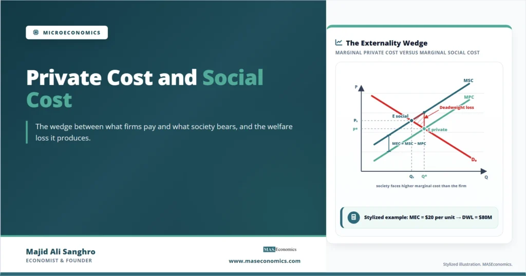
The diagram captures the entire externality story in one frame. The market clears at E private, where MPC meets the demand curve, producing quantity Q*. This is where private agents stop trading, because the buyer of the last unit values it exactly at what the seller charges. Social efficiency, however, requires output Qs, where MSC meets demand. At every unit between Qs and Q*, the value to society of one more unit (read off the demand curve) is less than the cost to society of producing it (read off the MSC). Those units are produced anyway, because firms only see MPC. The triangle between MSC, MPC extended, and demand from Qs to Q* is the deadweight loss from the externality. It is the externality’s contribution to social inefficiency, measured in the same welfare units as the tax triangle from the previous article in this cluster.
Missing Price Signals and Private Equilibrium
The deeper question is not what the diagram shows, but why the underlying market mechanism fails to deliver social efficiency on its own. The answer comes from the structure of property rights and the absence of a price for the external effect.
Competitive markets are efficient when every cost and benefit of a transaction is reflected in the price the parties negotiate. The first fundamental theorem of welfare economics establishes this result formally: under standard assumptions, a competitive equilibrium is Pareto efficient. The crucial phrase in that theorem is “under standard assumptions”, and one of those assumptions is the absence of externalities. When production or consumption affects third parties without their consent and without compensation, the price mechanism stops conveying full social value. Firms make decisions on the basis of MPC because that is what they pay. They have no financial reason to consider MSC because no one charges them for the damage they impose.
The diagnosis is therefore not that firms are behaving immorally or irrationally. They are behaving exactly as the price signals tell them to. The signal is wrong because the property right over clean air, quiet streets, or a stable climate is either unassigned or unenforced. If pollution rights were properly defined and tradable, the polluter would face the social cost in its own profit calculation, and MPC would equal MSC. This is the insight behind cap-and-trade systems and the analytical core of the Coase theorem, which argues that with low transaction costs and well-defined property rights, private bargaining can internalize the externality without government intervention. Where transaction costs are high, or the affected parties are too dispersed to organize, government intervention becomes necessary, which is why the diagram leads naturally into Pigouvian taxation as the next stage of the analysis.
Welfare Arithmetic of the Externality
The deadweight loss in the externality case has the same triangle structure as the tax case, but with one important difference: the source of the wedge is not a policy tool but the missing price. Setting that aside, the welfare arithmetic follows the standard surplus accounting.
Consider a stylized market for a polluting good. Let inverse demand be P = 100 − Q, marginal private cost be MPC = 20 + Q, and the marginal external cost be MEC = 0.5Q, so that marginal social cost is MSC = 20 + 1.5Q. Quantities are in millions of units, prices in dollars per unit.
The private market equilibrium solves P = MPC, giving 100 − Q = 20 + Q, so Q* = 40 and P* = 60. The socially efficient outcome solves P = MSC, giving 100 − Q = 20 + 1.5Q, so Qs = 32 and the social price level along demand is Ps = 68. At the private equilibrium, the market produces 8 million units beyond the socially efficient level. Each of those units carries a marginal external cost that society pays but the firm and the buyer ignore. The deadweight loss equals the area of the triangle between MSC and the demand curve from Qs = 32 to Q* = 40, which is the externality’s welfare cost.
Externality Deadweight Loss
Plugging the numbers in, MSC at Q = 40 equals 20 + 1.5(40) = 80, and demand at Q = 40 equals 60. The height of the triangle is 80 − 60 = 20. The base is 40 − 32 = 8. The deadweight loss is ½ × 8 × 20 = $80 million. This is the social cost of the externality going uncorrected. It is the value of damages on the overproduced units net of the value buyers placed on them.
| Quantity Considered | Private Equilibrium (Q* = 40) | Social Optimum (Qs = 32) | Change |
|---|---|---|---|
| Consumer Surplus | 800 | 512 | −288 |
| Producer Surplus | 800 | 512 | −288 |
| External Damages | −400 | −256 | +144 |
| Total Social Surplus | 1,200 | 1,280 | +80 |
| Deadweight Loss vs Optimum | 80 | 0 | −80 |
|
Source: Stylized example based on standard formulas.
|
|||
The accounting carries two lessons. First, moving from the private equilibrium to the social optimum makes consumers and producers worse off in narrow surplus terms. They produce and consume less of the good, and their joint surplus falls by $576 million. Second, the external damages avoided are large enough that society as a whole gains. Damages fall by $144 million, and the net change in total social surplus is positive at $80 million, exactly the deadweight loss computed from the triangle. This is why the correction is socially beneficial, even though the parties who would have transacted prefer the unregulated outcome. Their loss is private surplus; what they ignore is third-party damage.
The diagram works for positive externalities by symmetry. When production generates positive spillovers, such as research and development by a firm that competitors can partially imitate, MSC lies below MPC, and the market underproduces relative to the social optimum. The deadweight loss triangle sits on the opposite side, capturing the value of units that society wanted produced but the firm did not find profitable.
The Consumption Externality Case
When the spillover occurs in consumption rather than production, the diagram rotates. MPC and MSC remain equal because production carries no external effect. Instead, the demand side splits into marginal private benefit and marginal social benefit. A vaccinated individual receives a private benefit equal to their own reduced risk of infection, but the social benefit is larger because vaccination also reduces the chance of infecting others. MSB sits above MPB. The private market equilibrates where MPB meets supply, producing too few vaccinations relative to the social optimum where MSB meets supply.
The structure of inefficiency is the same. A wedge between private and social valuations means market participants stop transacting before all socially beneficial trades have taken place. The deadweight loss triangle captures the foregone surplus on units that should have been consumed but were not, because the private decision-maker did not see the full social value of the consumption.
The policy response in the consumption case is symmetric to the production case. Negative consumption externalities, such as the secondhand smoke from cigarette consumption, call for taxes that raise the private price toward MSB. Positive consumption externalities, such as vaccination or education, call for subsidies that lower the private price toward MSB. The diagram in each case is built from the same three curves logic, with the relevant wedge sitting between private and social schedules.
Limitations of the Diagram
The MPC–MSC–MSB diagram is the standard analytical tool, but it carries assumptions that matter for how seriously to take any particular numerical estimate.
The diagram assumes that MEC is a well-defined function of output. In practice, marginal external damages can be highly nonlinear, threshold-driven, or stochastic. Climate damages, for instance, may rise convexly with cumulative emissions and depend on uncertain future temperatures. Drawing MSC as a smooth curve above MPC is a useful pedagogical simplification, but real damage functions can have kinks, jumps, and uncertainty bands that the geometry does not show.
The diagram assumes that the externality is unidirectional and identifiable. A factory emits, downwind households suffer, and the damage can, in principle, be measured. Many real externalities are reciprocal: drivers congest each other; firms in a research cluster mutually benefit from spillovers. The directionality of “who imposes what on whom” is harder to define, and the analytical neatness of MPC versus MSC blurs.
The diagram also assumes well-defined property rights over everything except the externality itself. If property rights are weak across many margins, the second-best problem returns: correcting one externality may not improve welfare if other distortions remain. The first-best policy implied by setting price equal to MSC is rarely available in its pure form, and applied work tends to focus on cost-effective interventions rather than perfect Pigouvian taxes.
Empirical estimates of MEC vary enormously across contexts. The social cost of carbon, for instance, has been estimated by the US Environmental Protection Agency and by national academies at values ranging from below $50 per ton to above $200 per ton depending on discount rates, damage functions, and treatment of uncertainty. The diagram does not arbitrate between these estimates. It tells the policymaker what to do once a value for MEC has been chosen.
Beyond Pollution: The Reach of the Three‑Curve Picture
The MPC–MSC–MSB framework reaches far beyond environmental economics. Wherever a market produces effects that escape the price mechanism, the diagram applies. Traffic congestion is an externality between road users. Antibiotic overuse generates resistance that harms future patients. Financial leverage in one institution imposes systemic risk on others. Vaccinations, education, and basic research are positive externalities whose underprovision the diagram explains in the same geometric language. The analysis of market failure in all these areas starts from the same diagnostic question: where is the wedge between private and social marginal valuations, and how large is it?
The shared geometry is also what makes the comparison across policy tools coherent. A Pigouvian tax shifts MPC up to coincide with MSC. A cap-and-trade system rations output to Qs by limiting permits. A subsidy shifts MPB up to coincide with MSB for positive externalities. Each instrument can be drawn on the same diagram and evaluated against the same efficiency benchmark. Without the framework, debates about pollution policy, public health interventions, and innovation subsidies would have no common analytical language. The diagram supplies that language.
Explains
Three concepts behind the externality wedge
From the externality diagram to the Pigouvian tax and the design of environmental policy.
Explore the MASEconomics BlogConclusion
The private cost and social cost divergence is the diagrammatic core of externality analysis. Marginal private cost is what the firm pays. Marginal social cost adds the spillovers that the firm ignores. Marginal social benefit is what the consumption is worth to society as a whole. When the three curves do not coincide, the market equilibrates at the wrong quantity, and the resulting deadweight loss triangle measures the welfare cost of leaving the externality uncorrected. The geometry is identical to the tax triangle in shape, but the source of the wedge is different: it is not policy but the absence of a price for the external effect.
The diagram is the starting point for almost every welfare analysis of pollution, congestion, public health, and innovation policy. It clarifies why private rationality and social efficiency can come apart even in competitive markets, and why some form of intervention is needed when bargaining is not feasible. The next two diagrams in this cluster show how taxes and subsidies close the wedge in the negative and positive externality cases. Once the three curves are clear, those policy tools are simply geometric corrections to a picture that the market does not draw for itself.
Frequently Asked Questions
What is the difference between private cost and social cost?
Private cost is the cost a firm or individual actually pays to produce or consume a unit. Social cost includes private cost plus any spillover effects on third parties. The difference between them is the marginal external cost, which is positive for negative externalities like pollution and effectively negative for positive externalities like research spillovers.
Why does the market produce too much of a polluting good?
Firms set output where price equals marginal private cost because that is what they actually pay. They have no financial reason to consider the damage borne by third parties. The result is overproduction relative to the socially efficient quantity, where price would equal marginal social cost. The gap between the two outputs is the source of the deadweight loss triangle.
How is marginal external cost measured in practice?
Economists estimate marginal external cost using damage functions that link physical quantities like emissions or congestion to monetary measures of harm. These estimates rely on epidemiological studies, hedonic property-price methods, contingent valuation surveys, and integrated assessment models. Values often vary widely across studies because of differences in discount rates, damage assumptions, and uncertainty treatment.
Does the diagram apply to positive externalities too?
Yes, by symmetry. For positive production externalities, marginal social cost lies below marginal private cost, and the market underproduces relative to the social optimum. For positive consumption externalities, marginal social benefit lies above marginal private benefit, and the market underconsumes. In both cases, a subsidy can shift the relevant private curve to coincide with the social schedule.
Can private bargaining solve externalities without government intervention?
The Coase theorem argues that if property rights are well-defined and transaction costs are low, parties can bargain to an efficient outcome without government action. This works well for small numbers of identifiable parties. It breaks down when externalities are diffuse, victims are dispersed, transaction costs are high, or property rights cannot be enforced.
How does this connect to taxes and subsidies?
A Pigouvian tax equal to marginal external cost raises private cost to match social cost, eliminating the wedge. A subsidy in the positive externality case raises private benefit to match social benefit. Both policies use the same diagram and aim at the same efficiency benchmark: producing at the quantity where marginal social cost equals marginal social benefit.
Thanks for reading! If you found this helpful, share it with friends and spread the knowledge. Happy learning with MASEconomics