Welcome to MASEconomics! In this blog post, we will learn about key macroeconomic curves. Like the Phillips and Laffer curves, these curves are more than just lines on a graph. They are powerful tools that unlock a deeper understanding of critical economic relationships like inflation, unemployment, taxation, and trade.
Ready to dive into the first curve? because we’re starting with the Phillips Curve!
The Phillips Curve
The Phillips Curve, named after New Zealand economist William Phillips, emerged in the late 1950s. From 1861 to 1957, Phillips observed a stable inverse relationship between unemployment and wage inflation in the United Kingdom. This groundbreaking finding laid the foundation for the modern understanding of the Phillips Curve.
The Phillips Curve illustrates the trade-off between unemployment and inflation in the short run. Lower unemployment rates are typically associated with higher inflation rates and vice versa. The intuition behind this relationship is that workers gain bargaining power as unemployment decreases, leading to wage increases and, subsequently, higher prices.
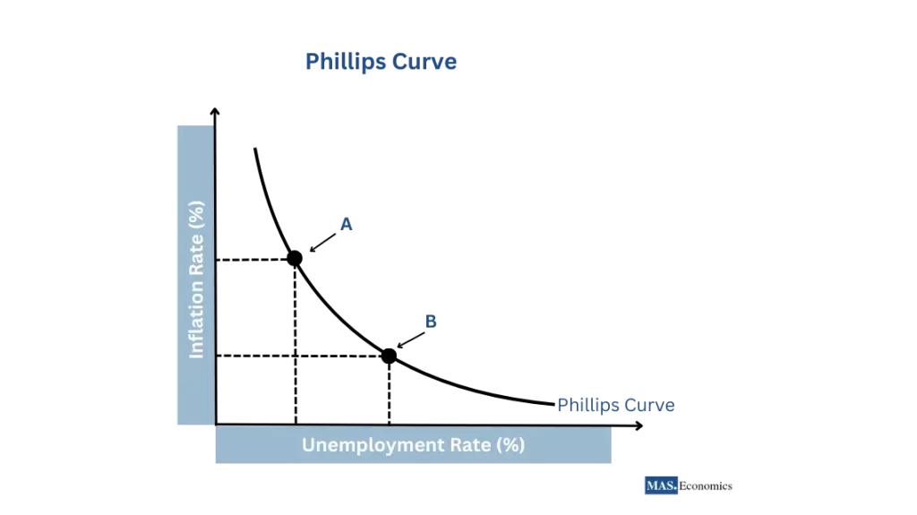
The Phillips curve above shows a downward-sloping curve representing the inverse relationship between the inflation rate (on the vertical axis) and the unemployment rate (on the horizontal axis). Two points are highlighted on the curve (A and B): A indicates high inflation and low unemployment, and B shows low inflation and high unemployment. This visual representation reinforces the concept of the trade-off between the two economic factors. In the long run, the trade-off may not hold. Economists believe that long-run inflation expectations can influence the curve’s position.
While the Phillips Curve was widely accepted in the 1960s, it faced challenges in the following decades. The stagflation of the 1970s, characterized by high unemployment and high inflation, contradicted the traditional Phillips Curve relationship. This led to a reassessment of the curve’s stability and the recognition of other factors, such as inflation expectations and supply shocks, that can influence the unemployment-inflation dynamics.
The Laffer Curve
The Laffer Curve, named after American economist Arthur Laffer, gained prominence in the late 1970s. Laffer’s concept highlighted the relationship between tax rates and government revenue, challenging the prevailing notion that higher tax rates always lead to higher revenue.
The Laffer Curve illustrates that tax revenue initially rises as tax rates increase from zero. However, beyond a certain point (the peak of the curve), higher tax rates may disincentivize work, investment, and production, leading to reduced economic activity and, consequently, lower tax revenue. The curve suggests that an optimal tax rate exists that maximizes government revenue.
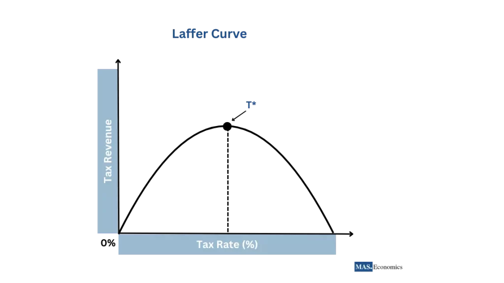
In the Laffer curve above, you can see that the government’s tax revenue also increases as the tax rate increases from zero percent. The upward slope of the curve represents this. The revenue continues to grow until it reaches a point labeled T*, which is the top of the curve. This point represents the optimal tax rate. Beyond T*, increasing the tax rate causes a decrease in tax revenue, as shown by the downward slope of the curve following T*. This decrease is due to the adverse effects of high tax rates on economic behavior, such as reduced work effort, less investment, tax evasion, and other distortions that can lead to a smaller tax base.
The Laffer Curve has been influential in shaping tax policy discussions. Policymakers often seek to find the sweet spot on the curve where tax rates are high enough to generate substantial revenue but not so high as to discourage economic activity. However, the exact shape of the Laffer Curve and the optimal tax rate remain subjects of debate, as they can vary depending on the specific tax, period, and economic conditions.
The J Curve
The J Curve concept emerged in the 1970s as economists observed the delayed effects of currency depreciation on a country’s trade balance. The term “J Curve” was coined due to the shape of the graphical representation of this relationship.
The J Curve describes a country’s trade balance trajectory following a currency depreciation. Initially, the trade balance worsens as imports become more expensive in domestic currency, while exports remain unchanged in foreign currency terms. Over time, as exports become more competitive and demand for imports decreases, the trade balance improves, forming the characteristic J-shaped curve.
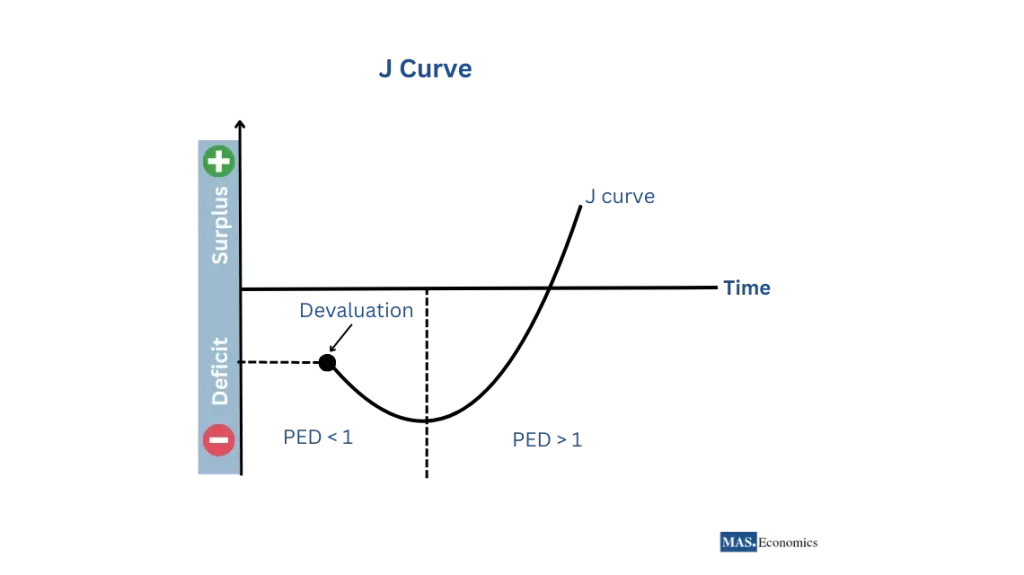
The J Curve above describes how a country’s trade balance (vertical axis) changes after its currency weakens (horizontal axis). The J-shape reflects the initial and eventual effects of depreciation.
Initially, the trade balance worsens (downward part of the J). Imports become more expensive for domestic consumers, while exports remain the same for foreign buyers. This often leads to a trade deficit as import costs outweigh export earnings over time (on the right side of the J), and the picture changes. Cheaper exports become more attractive to foreign buyers, potentially increasing demand. Additionally, domestic consumers may cut back on expensive imports. These factors can lead to a trade surplus, where the value of exports exceeds imports.
The speed and extent of the improvement depend on various factors, such as how sensitive demand is to price changes (elasticity) and the overall economic situation.
The J Curve effect has been observed in various historical and contemporary cases. For example, after the Plaza Accord in 1985, the US dollar depreciated against the Japanese yen, leading to an initial worsening of the US trade balance and an improvement. More recently, the depreciation of the British pound following the Brexit referendum in 2016 exhibited a similar pattern, with an initial deterioration in the trade balance before gradually improving.
The Kuznets Curve
The Kuznets Curve, named after American economist Simon Kuznets, was introduced in the 1950s. Kuznets hypothesized that income inequality follows an inverted U-shaped pattern as an economy develops and industrializes.
The Kuznets Curve suggests that income inequality increases in the early stages of economic development as the economy transitions from a rural agricultural society to an urban, industrial one. As development continues and the benefits of growth spread more widely, income inequality decreases, forming an inverted U-shape.
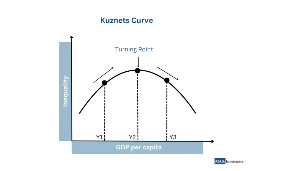
The Kuznets Curve, illustrated above, depicts the relationship between income inequality (vertical axis) and a nation’s economic development, measured by GDP per capita (horizontal axis). The curve follows an inverted U-shape.
A less-developed economy exhibits low-income inequality at the starting point (Y1). As development picks up pace (Y2), the gap between rich and poor widens. This is due to increased specialization and wealth concentration in those who own capital (land, factories). However, the curve starts to bend downwards after reaching a turning point (Y2). As development continues, government policies like redistribution programs, investments in education and training, and technological advancements can help spread the benefits of growth more broadly, ultimately reducing income inequality (Y3).
The Kuznets Curve has been a subject of debate among economists. Some argue that the relationship between economic development and inequality is more complex and varies across countries and periods. Additionally, the curve’s relevance in modern, post-industrial economies has been questioned, as factors such as globalization, technological change, and public policies can significantly influence income distribution.
The Lorenz Curve
The Lorenz Curve, developed by American economist Max Lorenz in the early 20th century, is a graphical representation of income inequality within a population. It has become a foundational tool in studying income and wealth distribution.
The Lorenz Curve plots the cumulative share of total income received by cumulative proportions of the population, ordered from poorest to most affluent. The diagonal line represents perfect equality, where each population gets an equal percentage of income. The greater the distance between the Lorenz Curve and the diagonal line, the higher the income inequality.
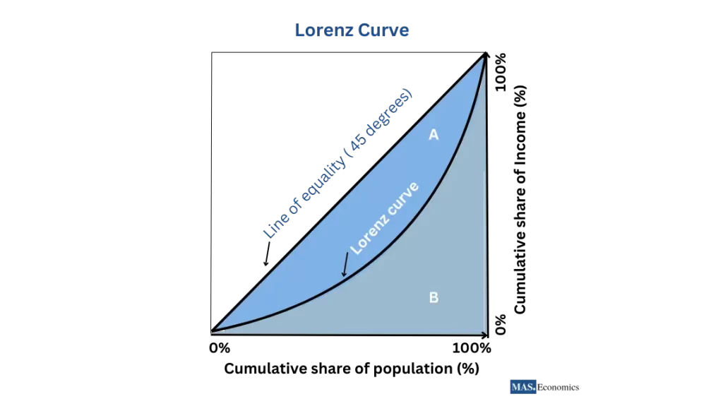
The line of equality (45 degrees) is the diagonal line that represents perfect income equality. If every person earned precisely the same amount, the income distribution would follow this line, meaning that, for example, the bottom 20% of the population would earn 20% of the total income, the bottom 50% would earn 50%, and so on. The bow-shaped line shows the actual distribution of income. It plots the cumulative percentage of total income (on the vertical axis) against the cumulative percentage of the population (on the horizontal axis), starting with the poorest individuals or households.
The area A between the line of equality and the Lorenz Curve represents the extent of income inequality; the more significant the area A, the greater the disparity. The Gini coefficient, another measure of income distribution, can be calculated from the Lorenz Curve as the ratio of area A to the sum of areas A and B.
Conclusion
These key macroeconomic curves—Phillips, Laffer, J, Kuznets, and Lorenz—provide a springboard for analyzing core economic relationships. They simplify complex concepts like inflation, unemployment, and income inequality.
Remember, these are simplified models. The real world is more nuanced, with factors influencing the shape and stability of these curves. Consider the Phillips Curve—it highlights a short-run trade-off, but long-run dynamics and inflation expectations can shift it.
Similarly, the Laffer Curve suggests an optimal tax rate, but economic conditions and tax structures make pinpointing it difficult. The J and Kuznets Curves offer insights into trade and development, but globalization and policy can influence these relationships.
The Lorenz Curve visually depicts income inequality. However, the Gini coefficient provides a single measure, and a deeper understanding requires examining the underlying causes of inequality.
Thanks for reading! If you found this insightful, share the knowledge with friends and spread it on social media!
Happy learning with MASEconomics