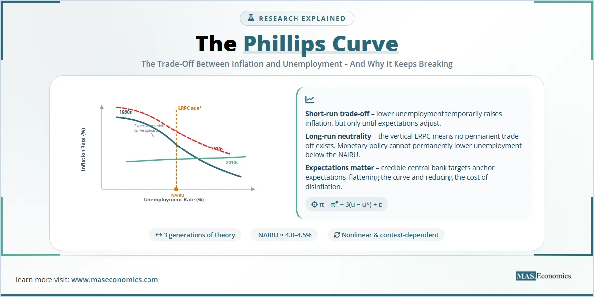
In 1958, a New Zealand-born engineer turned economist named A.W.H. Phillips plotted 97 years of British wage data against unemployment figures and discovered something remarkable: when unemployment was low, wages rose quickly. When unemployment was high, wages barely moved. That single scatter plot launched one of the most influential, most debated, and most frustratingly unstable relationships in the history of economic thought. More than six decades later, central banks around the world still use the Phillips Curve as a core input in their policy models, even though the relationship has broken, reformed, flattened, and steepened in ways that Phillips himself could never have predicted.
An Inverse Relationship Between Inflation and Unemployment
The Phillips Curve describes a negative (inverse) relationship between the rate of inflation (or wage growth) and the rate of unemployment in an economy. The intuition is straightforward: when labour markets are tight (low unemployment), employers must offer higher wages to attract workers, and those higher costs eventually feed through into higher prices. When labour markets are slack (high unemployment), workers have little bargaining power, wage growth stagnates, and inflation falls.
Phillips’s original 1958 paper, published in the journal Economica, examined UK data from 1861 to 1957 and found a stable, negatively sloped curve. Two years later, Paul Samuelson and Robert Solow replicated the finding using US data and gave policymakers what seemed like a powerful menu of choices: you could “buy” lower unemployment by accepting higher inflation, or you could “buy” lower inflation by tolerating higher unemployment.
For roughly a decade, the trade-off held. Then it fell apart spectacularly.
Three Generations of the Phillips Curve
The Phillips Curve has evolved through three distinct mathematical formulations, each responding to the failures of the previous version. Understanding these formulations is essential for anyone working with modern macroeconomic models.
Generation 1: The Original Phillips Curve (1958)
Phillips’s original specification related wage inflation to the unemployment rate:
\frac{\Delta W}{W} = f(u)
$$
Where \(\frac{\Delta W}{W}\) is the rate of change of nominal wages and \(u\) is the unemployment rate. The function \(f\) is decreasing and convex: wage inflation rises at an accelerating rate as unemployment falls below a critical threshold. Samuelson and Solow extended this by substituting price inflation (\(\pi\)) for wage inflation, giving the familiar form:
\pi = \alpha – \beta(u)
$$
Where \(\pi\) is the inflation rate, \(u\) is the unemployment rate, \(\alpha\) is a constant, and \(\beta\) captures the sensitivity of inflation to changes in unemployment (the slope of the curve). The table below defines each variable precisely.
| Variable | Symbol | Definition |
|---|---|---|
| Inflation Rate | \(\pi\) | The percentage change in the general price level over a given period, typically measured by the CPI or GDP deflator. |
| Unemployment Rate | \(u\) | The percentage of the labour force that is actively seeking employment but currently without work. |
| NAIRU | \(u^*\) | The Non-Accelerating Inflation Rate of Unemployment. The unemployment rate at which inflation remains stable. Also called the natural rate. |
| Inflation Expectations | \(\pi^e\) | The rate of inflation that workers, firms, and financial markets expect to prevail in the future. |
| Output Gap | \((Y – Y^*)\) | The difference between actual GDP (\(Y\)) and potential GDP (\(Y^*\)). A positive gap signals overheating; a negative gap signals slack. |
| Supply Shock | \(\epsilon\) | An unexpected change in production costs (e.g., an oil price spike) that shifts the Phillips Curve vertically. |
 | ||
Generation 2: The Expectations-Augmented Phillips Curve (1968)
The original Phillips Curve implied that policymakers could permanently reduce unemployment by accepting permanently higher inflation. In 1968, Milton Friedman and Edmund Phelps independently argued that this was an illusion. Their critique rested on a powerful insight: workers and firms are not fooled forever. Once people expect higher inflation, they adjust their wage demands and pricing behaviour accordingly, eliminating any real gain in employment.
The expectations-augmented Phillips Curve adds an inflation expectations term:
\pi = \pi^e – \beta(u – u^*) + \epsilon
$$
This equation says that actual inflation (\(\pi\)) depends on three things: what people expect inflation to be (\(\pi^e\)), how far unemployment deviates from the natural rate (\(u – u^*\)), and any supply shocks (\(\epsilon\)). The critical implication is that when \(u = u^*\) and there are no supply shocks, actual inflation simply equals expected inflation. There is no long-run trade-off. The long-run Phillips Curve is vertical at \(u^*\).
Friedman called \(u^*\) the “natural rate of unemployment” and argued that any attempt to push unemployment below this level would trigger an accelerating inflation spiral. This is why economists also call \(u^*\) the NAIRU: the Non-Accelerating Inflation Rate of Unemployment. This insight fundamentally reshaped how central banks think about monetary policy tools and the limits of demand management.
Generation 3: The New Keynesian Phillips Curve (1995-present)
Modern macroeconomic models use the New Keynesian Phillips Curve (NKPC), derived from microfoundations by researchers including Jordi Gali, Mark Gertler, and John Roberts. Unlike the backward-looking expectations of Friedman’s version, the NKPC is forward-looking:
\pi_t = \beta E_t[\pi_{t+1}] + \kappa(Y_t – Y^*_t) + \epsilon_t
$$
Here, current inflation depends on expected future inflation (\(E_t[\pi_{t+1}]\)), the current output gap (\(\kappa\) is the slope parameter capturing price rigidity), and a cost-push shock (\(\epsilon_t\)). The parameter \(\beta\) is a discount factor close to 1. This formulation, published in the American Economic Review and the Journal of Monetary Economics, has become the workhorse of central bank models worldwide, including the Federal Reserve’s FRB/US model and the European Central Bank’s NAWM.
The critical insight of the NKPC is that if a central bank credibly commits to a low inflation target, inflation expectations anchor, and the economy can enjoy low inflation without needing high unemployment. Credibility replaces suffering as the mechanism for controlling inflation.
Assumptions and Limitations
Each generation of the Phillips Curve rests on specific assumptions, and the breakdown of these assumptions explains why the curve keeps “breaking.”
The original Phillips Curve assumed that inflation expectations were essentially static, that workers and firms would not adjust their behaviour even as inflation persisted. This assumption held in the 1950s and early 1960s, when inflation was low and stable, but it collapsed in the late 1960s when persistent expansionary policy caused workers to revise their expectations upward.
The expectations-augmented version assumes a stable natural rate of unemployment. In practice, \(u^*\) is not a fixed number. It shifts over time due to changes in demographics (more young workers entering the labour force raises \(u^*\)), labour market institutions (stronger unions raise it, flexible gig markets lower it), and technology (automation displaces workers in some sectors while creating jobs in others). Estimating \(u^*\) in real time is notoriously difficult, and getting it wrong can lead to serious policy errors. This is closely related to the challenge of monetary policy lags, where central banks must act on data that is inherently uncertain and arrives with a delay.
The New Keynesian Phillips Curve assumes rational expectations and Calvo-style price stickiness, meaning that only a random fraction of firms can adjust their prices each period. Critics, including N. Gregory Mankiw and Ricardo Reis, have argued that the pure forward-looking NKPC fails to capture the persistence of inflation observed in the data. This has led to “hybrid” models that include both forward-looking and backward-looking terms, essentially blending Generations 2 and 3.
Empirical Evidence
The empirical history of the Phillips Curve is a story of repeated triumphs and humiliations. The chart below plots the actual US inflation-unemployment relationship across four distinct eras, revealing how dramatically the curve has shifted over time.
Source: US Bureau of Labor Statistics (BLS), Federal Reserve Economic Data (FRED). Each point represents one year’s annual average inflation rate (CPI) and unemployment rate.
The chart reveals four distinct chapters in the Phillips Curve’s empirical life.
The 1960s (dark teal): Phillips’s original insight held beautifully. The data traces a clean downward slope from upper-left (high unemployment, low inflation in the early 1960s) to lower-right (low unemployment, rising inflation by the late 1960s). Policymakers believed they had found a reliable menu. President Kennedy’s Council of Economic Advisors explicitly used the Phillips Curve to justify expansionary fiscal policy, and for a while, it worked.
The 1970s (red): The curve exploded. Successive oil price shocks (1973 and 1979) combined with loose monetary policy to produce stagflation, a condition the original Phillips Curve said was impossible. Unemployment and inflation rose simultaneously. The red cluster sits in the upper-right quadrant of the chart, a zone that should not exist according to the original theory. This is where Friedman and Phelps were vindicated: inflationary expectations had shifted the entire curve upward.
The 2010s (light teal): After the 2008 financial crisis, the US experienced a prolonged period of falling unemployment with almost no increase in inflation. The relationship flattened dramatically. Unemployment fell from 10% to 3.5% while inflation barely budged between 1% and 2.5%. This “missing inflation” puzzle consumed macroeconomists for a decade. Research from the Federal Reserve suggested that globalisation, technology, anchored expectations, and changes in labour market structure had all contributed to flattening the curve.
The 2020s (amber): The COVID-19 pandemic and the fiscal response brought the Phillips Curve roaring back. Massive stimulus combined with supply chain disruptions produced the steepest inflation-unemployment relationship in decades. Inflation surged from 1.2% to 8.0% in just two years as unemployment fell from 8.1% to 3.6%. Then, remarkably, inflation fell sharply from 8.0% back toward 3% without a significant rise in unemployment, challenging the Phillips Curve once again by suggesting a nearly costless disinflation.
Why the Phillips Curve Keeps Changing Shape
The shifting Phillips Curve is one of the most actively researched topics in macroeconomics. Four main explanations compete for attention.
| Explanation | Key Mechanism | Implication for Policy | Key Proponents |
|---|---|---|---|
| Expectations Anchoring | Credible central bank inflation targets anchor expectations, reducing the sensitivity of inflation to unemployment changes. | If expectations are well-anchored, the curve flattens and disinflation becomes less costly. | Bernanke, Mishkin, Woodford |
| Globalisation | International competition restrains domestic price increases even when domestic labour markets are tight. | Domestic unemployment alone may no longer be the right measure of economic slack. | Borio, Filardo (BIS) |
| Labour Market Structural Change | The rise of gig work, declining unionisation, and monopsony power reduce workers’ ability to bargain for higher wages. | The natural rate (\(u^*\)) has fallen, and the curve may have shifted leftward. | Krueger, Autor, Manning |
| Nonlinearity | The curve is steep when unemployment is very low (below \(u^*\)) but nearly flat when there is moderate slack. | The curve has not disappeared. It only appears flat because most of the 2010s data sits in the flat region. | Hooper, Mishkin, Sufi (2019) |
| |||
The nonlinearity explanation deserves special attention because it reconciles the 2010s “flat curve” with the 2020s “steep return.” If the Phillips Curve is convex (steep at very low unemployment, flat at moderate unemployment), then the apparent flattening of the 2010s was simply a sampling artefact: the economy was operating in the flat zone. When the post-pandemic labour market pushed unemployment below the critical threshold, the curve steepened again, exactly as the nonlinear model predicts.
How Central Banks Use the Phillips Curve Today
Despite its turbulent empirical record, the Phillips Curve remains embedded in every major central bank’s forecasting framework. The Federal Reserve’s FRB/US model, the European Central Bank’s NAWM, and the Bank of England’s COMPASS model all contain a Phillips Curve equation at their core. The curve is used not as a mechanical predictor but as a conceptual anchor: it tells policymakers the direction of inflationary pressure given the state of the labour market.
In practice, the Federal Reserve uses the Phillips Curve in two ways. First, it estimates the output gap and the unemployment gap (\(u – u^*\)) to assess whether the economy is running hot or cold. If unemployment is below the estimated NAIRU, the model flags upward inflation risk. Second, it monitors inflation expectations through surveys (the University of Michigan Consumer Sentiment Survey, the New York Fed Survey of Consumer Expectations) and market-based measures (TIPS breakeven rates) to gauge whether expectations are anchored or drifting.
The post-pandemic experience has sharpened the debate. During 2021 and 2022, some economists, notably Lawrence Summers, warned that the massive fiscal stimulus would overheat the economy and trigger Phillips Curve dynamics. Others, including members of the Federal Reserve Board, initially argued that the inflation was driven by supply-side disruptions (the \(\epsilon\) term in the equation) and would be “transitory.” The subsequent surge in inflation to 8% and the Fed’s aggressive rate-hiking cycle vindicated the Phillips Curve framework in broad terms, even if the precise quantitative predictions were imperfect.
For the United Kingdom and Canada, the pattern was similar. The Bank of England raised its base rate from 0.1% to 5.25% between December 2021 and August 2023, explicitly citing Phillips Curve logic: a tight labour market was generating wage pressures inconsistent with the 2% inflation target. The Bank of Canada followed a comparable trajectory, raising its overnight rate from 0.25% to 5.0%. In both cases, the central banks relied on Phillips Curve reasoning combined with the broader IS-LM framework to calibrate their response
Phillips Curve: Still Relevant
The Phillips Curve is not just an academic curiosity. It sits at the centre of some of the most consequential policy decisions in modern economics.
The concept of the NAIRU directly shapes how aggressively central banks respond to falling unemployment. If a central bank overestimates \(u^*\) (thinks the natural rate is higher than it actually is), it will tighten policy too early, killing a recovery and leaving millions unnecessarily unemployed. If it underestimates \(u^*\) (thinks the economy can run hotter than it actually can), it risks letting inflation spiral. The Federal Reserve’s decision to let unemployment fall below 4% in the late 2010s without raising rates was an implicit bet that \(u^*\) had fallen. That bet turned out to be correct, and millions of workers benefited.
The Phillips Curve also frames the central question of disinflation: how much unemployment is required to bring inflation down? The “sacrifice ratio,” defined as the cumulative percentage-point increase in unemployment needed to reduce inflation by one percentage point, depends directly on the slope of the Phillips Curve and the behaviour of expectations. A credible central bank facing well-anchored expectations can achieve disinflation with a smaller sacrifice ratio, meaning less unemployment and less economic pain. This is the practical payoff of the New Keynesian insight that credibility is a policy tool.
The 2022 to 2024 disinflation in the United States provided a remarkable test case. Inflation fell from 8% to approximately 3% with only a modest rise in unemployment (from 3.4% to approximately 4.0%), delivering one of the lowest sacrifice ratios in modern history. Whether this “immaculate disinflation” was due to the resolution of supply shocks, anchored expectations, or favourable labour supply shifts remains one of the most actively debated questions in macroeconomics today. Understanding this debate requires familiarity with both the Phillips Curve and the broader relationship between the demand for money, the quantity theory, and the Keynesian approach.
The Economics Behind the Phillips Curve
Key Takeaway
The Phillips Curve is one of the most important and most frustrating relationships in economics. In its original form, it offered a seductive but ultimately false promise: a stable, exploitable trade-off between inflation and unemployment. The expectations revolution of the 1960s and 1970s destroyed that illusion but replaced it with a more powerful framework, one that places credibility, expectations, and the natural rate at the centre of monetary policy.
Today’s Phillips Curve is not the simple downward-sloping line that Phillips drew in 1958. It is a complex, context-dependent relationship that flattens when expectations are anchored, steepens when the economy overheats, and shifts when supply shocks strike. Understanding it requires moving beyond the introductory textbook version and engaging with the mathematical formulations, the empirical dilemmas, and the ongoing research debates that keep this seven-decade-old idea at the frontier of macroeconomic thinking.
Did you find this article helpful? Share it with someone who loves economics. And remember, at MASEconomics, we make complex ideas simple.