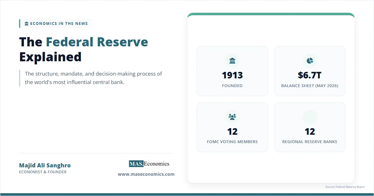
At 2:00 PM Eastern time on the third Wednesday of every March, June, September, and December, the Federal Reserve releases two documents simultaneously. The first is the FOMC statement, the four-paragraph announcement that contains the policy rate decision. The second is the Summary of Economic Projections, a fifteen-page document of charts, tables, and one famous scatter plot. The scatter plot is the dot plot, and in the minutes immediately after release, currency traders, bond desks, and equity analysts will spend more time staring at its arrangement of dots than at any other element of the Fed’s communication. The dot plot FOMC publication is the only public document in which each of the nineteen Federal Open Market Committee participants individually reveals where they think the policy rate should sit at the end of each of the next several years. It is the most direct window the Fed offers into the distribution of views inside the committee, and it has become the primary input into how markets price future monetary policy.
The chart’s design reflects a tension between transparency and the risk of misinterpretation. Its quarterly publication provides a snapshot of individual rate projections, but the dots are neither forecasts nor commitments. Reading the plot well requires distinguishing the median from the distribution, the cyclical from the structural, and the predictive track record from the policy outlook.
The Origins of the SEP and the Dot Plot
The Summary of Economic Projections began in 2007 under Ben Bernanke as part of the broader effort to make Federal Reserve communication more transparent. Before then, FOMC participants submitted their economic forecasts internally, but the projections were not released to the public in any systematic form. The SEP changed this by publishing the central tendency and range of participants’ projections for GDP growth, the unemployment rate, and inflation over a three-year horizon plus the longer run, refreshed at four of the eight FOMC meetings each year.
The dot plot itself was added in January 2012. The motivation was straightforward: the SEP already published participants’ views on the macroeconomic variables that drive policy, but it was silent on what policy itself would look like in response. By asking each participant to provide a projection of the appropriate federal funds rate at the end of each year and over the longer run, the FOMC added a critical piece of forward-looking information. The participant is asked: given your projections of growth, unemployment, and inflation, what level of the federal funds rate would be most consistent with achieving the Fed’s mandate? The answer is a number. The collection of all nineteen numbers is the dot plot.
The publication came at a time when conventional rate policy was at the lower bound, and the Fed was actively using forward guidance to shape expectations. The dot plot was therefore born partly as a transparency tool and partly as a communication device, two functions that have been in tension ever since. The transparency function would be best served by full disclosure of every participant’s identity alongside their dot. The communication function is best served by anonymizing the dots so that markets read the distribution rather than any individual’s views. The Fed has consistently chosen anonymization, which is why the dots in the published chart are never labeled with names.
Anatomy of the Dot Plot
The published dot plot is a scatter chart with quarter-year increments on the horizontal axis and the federal funds rate on the vertical axis. The horizontal axis shows the end of the current calendar year, the end of each of the next two calendar years, and the longer run. The vertical axis is the appropriate rate, typically displayed in quarter-point increments rather than the continuous scale used in most financial charts. Each participant submits one dot for each horizontal position. With nineteen participants and four time horizons, the published plot contains up to seventy-six dots in total, though many overlap at the same rate-time coordinate and appear as a single mark in the published version.
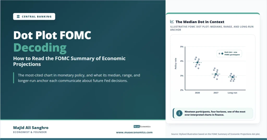
The chart below shows a stylized reconstruction of a recent dot plot, modeled on the structure and dispersion patterns observed in the FOMC’s actual releases. The dots are placed at quarter-point increments along the vertical axis and grouped by time horizon along the horizontal axis. The median for each year is marked, and the central tendency is shaded to make the distribution visible.

Four features of the chart deserve attention. The median dot, highlighted in teal at each horizon, is the most-cited single statistic from the SEP. It is not a forecast of where rates will go, but the middle of the committee’s distribution of views on where rates should be at that horizon. The range, the difference between the highest and lowest dots in any column, tells the reader how united or divided the committee is. The shape of the distribution, whether tightly clustered around the median or spread across a wide band, matters as much as the median itself: a 3.9 percent median surrounded by dots between 3.5 and 4.25 percent conveys very different information from a 3.9 percent median surrounded by dots between 3.0 and 5.0 percent. And the path of medians across horizons, the implied trajectory from year-end 2026 to the longer run, traces the committee’s expected policy normalization.
Dot Plot Interpretation
The single most common mistake market participants make with the dot plot is reading it as a forecast or a commitment. It is neither. Each dot is a participant’s view of what they think the rate ought to be, conditional on each participant’s own projection of growth, unemployment, and inflation. Two participants can have the same dot for different reasons, and two participants with the same macroeconomic outlook can have different dots if they disagree on the appropriate reaction function. The dot plot is therefore a snapshot of opinions, not a probability distribution, and not a binding commitment.
The median dot in particular is fragile. It is the middle of nineteen dots, but the order of dots is not weighted by who casts FOMC votes that year. Only twelve of the nineteen participants have a vote at any given meeting: the seven Board governors, the New York Fed president, and four of the eleven regional Fed presidents on a rotating basis. The other seven participants submit dots that influence the median but cannot influence the actual policy decision. A median shift driven by non-voting participants can be misleading about where votes will actually fall.
The range and the dispersion of dots, therefore, matter at least as much as the median. A tight cluster suggests consensus and high confidence; a wide spread suggests genuine disagreement that can be resolved in either direction depending on incoming data. The 2023 episode of a 100-basis-point range across FOMC participants reflected exactly this kind of fundamental disagreement, with hawks projecting rates above 5.5 percent into 2024 while doves projected below 4.5 percent. The eventual policy path moved through the middle of this range, but the path was not predicted by the median dot at any single SEP release.
| SEP Element | What It Shows | How to Read It |
|---|---|---|
| Median dot (year-end) | Middle of 19 participants’ views on appropriate rate | Central reference, not a forecast or commitment |
| Range of dots | Spread between highest and lowest participant views | Wider range signals committee disagreement |
| Central tendency | Range excluding three highest and three lowest dots | Where the most committee weight sits, less affected by outliers |
| Longer-run dot median | Implicit estimate of the neutral nominal rate | r-star plus 2 percent inflation target, central anchor |
| Year-on-year change in median | Implied policy normalization path | Direction and pace of expected easing or tightening |
| Shift between SEP releases | How committee views have moved meeting to meeting | The most-watched real-time signal of changing committee thinking |
| SEP economic projections | Median forecasts of GDP, unemployment, inflation | Context for whether the dots are consistent with the macro outlook |
|
Source: Federal Reserve Summary of Economic Projections; FOMC procedural documents.
|
||
The longer-run dot deserves particular attention because it is the only element of the dot plot that is structural rather than cyclical. The other dots represent expected policy at specific horizons, conditional on each participant’s view of the path of the economy. The longer-run dot is meant to capture the appropriate rate once the economy has fully normalized: full employment, inflation at target, and no further shocks to work through. Mathematically, the longer-run dot equals the participant’s view of the neutral rate of interest r-star plus the Fed’s 2 percent inflation target. The median longer-run dot is therefore the SEP’s most direct statement about where the committee places r-star, even though no Fed official describes it that way in public.
Dot Plot Predictive Record
The dot plot’s predictive record across the dozen years since its 2012 introduction is mixed and instructive. The chart accurately conveyed committee thinking during periods of stable policy, particularly in the 2014-2019 normalization cycle, when the median dot tracked the actual federal funds rate path within roughly 50 basis points at most horizons. It also conveyed the directional shift toward easing in 2019 when the FOMC pivoted away from further hikes, and the directional shift toward tightening in late 2021 as the inflation surge became clear.
The dot plot’s largest misses have come at turning points. The dots in the December 2015 SEP, taken at face value, suggested the FOMC expected four rate hikes in 2016. The actual outcome was one hike in December 2016. The dots in the December 2021 SEP suggested three hikes in 2022. The actual outcome was seven hikes totaling 425 basis points. The dots in December 2008, before the formal dot plot existed but with similar internal projections circulating, indicated FOMC participants expected to begin tightening within a year of the zero lower bound. The actual hold at zero lasted seven years. In each case, the underlying problem was not committee dishonesty but the inherent difficulty of forecasting policy across cyclical turning points where the macroeconomic outlook itself is uncertain.
This pattern has shaped how analysts read the dot plot in real time. The dots are most reliable when economic conditions are stable, and consensus is high; they are least reliable when the committee itself is uncertain about the direction of risks. A tight cluster around a clear median typically conveys real information about the policy path. A wide spread with material dispersion typically conveys that the committee genuinely does not know yet, and that the path will depend on incoming data rather than on any participant’s current opinion.
The dot plot is not a vote and not a commitment. Each participant submits dots as their best individual view, conditional on their own forecast. The committee does not vote on the dots, and individual participants are not bound by their previous submissions when the next policy meeting arrives. A dot from a non-voting regional Fed president weighs as much in the median as a dot from the Fed Chair, even though their effective influence on policy is very different.
Dot Plot Communication Problem
The dot plot’s transparency creates a communication problem that the FOMC has been struggling with since 2012. Markets read each new median dot as if it were a forecast, even though FOMC participants repeatedly explain that it is not. Chair Powell has used many press conferences to remind reporters that the dots represent appropriate-rate projections conditional on each participant’s own outlook, not a unified committee forecast, and not a commitment to deliver any particular policy path. The reminders have had limited success. The market reaction to a 25 basis point shift in the median dot is often larger than the reaction to comparable changes in the macroeconomic projections, even though the macroeconomic projections are the underlying drivers of the dots.
This is a structural feature of the chart rather than a bug. The dot plot is the most concrete element of the SEP. It produces a single number, the median, that can be quoted in a news headline. The macroeconomic projections are six different time series across nineteen participants with central tendencies and ranges that do not fit cleanly into a single quote. Markets default to the most quotable summary, and the median dot has become that summary. Several proposals have been floated to reform the SEP, including showing only the central tendency rather than the median, providing more conditional language about the dots’ meaning, or eliminating the dot plot entirely. None has been adopted, and the chart in its 2012 form remains the dominant signal.
The 2025 framework review touched on this issue without resolving it. The current consensus inside the FOMC is that the dot plot’s benefits as a transparency tool outweigh its costs as a misinterpreted signal, and that better communication around the dots is preferable to changing the chart itself. This is consistent with how the related tool, forward guidance, has evolved: softer in form, more conditional in language, but still public and still detailed.
How Markets and Analysts Use the Dots
The dot plot has become the most-cited single chart in monetary policy commentary. Fixed-income desks price the federal funds futures curve partly against the median dot, looking at the gap between market expectations and the FOMC’s published projections. When the futures curve sits below the dots, markets are betting the Fed will be more dovish than the dot plot suggests. When the futures curve sits above the dots, markets expect more hawkish outcomes. Either direction creates trading opportunities if the analyst’s view of where the dots will move next differs from the market consensus.
The dot plot has also become a tool for analyzing committee composition. Each member’s individual votes are public, but their dots are anonymized. Analysts attempt to identify hawks and doves by comparing successive SEP releases against speeches and votes by individual participants. The exercise is imperfect, but it has produced reasonably stable categorizations: certain regional Fed presidents are widely viewed as the most hawkish or most dovish in the committee, and shifts in the dot plot are often attributable to specific known hawks or doves. The Federal Reserve does not endorse this analysis, but it does not actively discourage it either.
The most sophisticated use of the dot plot involves comparing the dots not against forecasts but against the implied paths from the Fed’s own macroeconomic projections. If the median dot for year-end 2026 is 3.9 percent, and the median GDP, unemployment, and inflation projections imply that a Taylor-rule-style reaction function would produce 4.2 percent, the gap reveals something about how the committee is weighting non-Taylor considerations: financial stability, the impact of balance-sheet policy, asymmetric risks around the lower bound, or the legacy of the average inflation targeting framework. This kind of decomposition exercise, popular in central bank watching since the mid-2010s, has produced a small literature on how to extract structural information from the dots beyond their face value.
Limitations of the Dot Plot
Several genuine limits of the dot plot are worth acknowledging.
The dot plot is published only four times a year, at the March, June, September, and December FOMC meetings. Between SEP releases, market views about policy can move considerably, and the dot plot does not update. By the time the next SEP arrives, the dots have often been overtaken by speeches, data releases, and changes in committee composition. The chart is a quarterly snapshot, not a continuous indicator.
The dot plot does not show uncertainty around each dot. A participant’s projection is a single point estimate, not a distribution. If a participant believes the appropriate year-end 2027 rate is most likely 3.0 percent but could plausibly be anywhere from 2.0 percent to 4.0 percent, the dot plot shows only the 3.0 percent point. The Fed publishes separately an “uncertainty and risks” section in the SEP that describes participants’ views on the distribution of outcomes, but this is rarely cited and seldom incorporated into market interpretations.
The dot plot does not capture conditional reaction functions. Each dot is a participant’s view of the appropriate rate conditional on their own forecast, but it does not show how the participant would adjust if the forecast were wrong. Two participants with the same dot might react very differently to a 1 percentage point upside inflation surprise, depending on their underlying reaction functions. The dot plot conveys the conditional path but not the conditional response.
Finally, the dot plot does not include the staff forecasts that the FOMC reviews internally. Each participant submits their own projections, but the Fed staff also prepares a comprehensive forecast in the Greenbook (now called the Tealbook). This staff forecast is more rigorously model-based than any individual participant’s view and is often considered the most accurate single forecast of the US economy. It is published with a five-year lag, which is too long for real-time use. The dot plot is a public substitute, but it is not a substitute for the rigor of the underlying staff work.
Explains
Three concepts behind the dot plot
From the dot plot to the broader toolkit of central bank communication and the structural concepts behind monetary policy.
Explore the MASEconomics BlogConclusion
The dot plot FOMC communication device has become the most-cited and most-studied chart in modern monetary policy. It is the public face of the Federal Reserve’s quarterly self-portrait, and it is the most direct view markets have into the distribution of policy views inside the committee. The median dot, the range, the central tendency, and the longer-run dot each communicate distinct pieces of information, and reading the chart well requires reading all of them together. The dots are not forecasts and not commitments. They are conditional point estimates, anonymous, subject to revision, and most reliable when committee opinion is stable.
The chart’s history since 2012 has been one of growing market attention and persistent miscommunication. The FOMC has consistently described the dots as conditional and individual, and markets have consistently treated them as collective forecasts. The dot plot is one of the cleanest examples of a transparency tool whose published form has been more interpreted than its publishers intended. The benefits of publishing the chart still outweigh the costs of misinterpretation, which is why the format has survived. But the careful reader of the dot plot will remember that the median is one summary statistic among several, that the range and the dispersion tell their own story, that the longer-run dot is the only one that maps directly onto a structural concept, and that the predictive record across cyclical turning points is honestly mixed. With these caveats in hand, the dot plot is one of the most useful communication tools any central bank publishes.
Frequently Asked Questions
What is the FOMC dot plot?
The dot plot is a chart published quarterly as part of the Federal Reserve’s Summary of Economic Projections. Each of the nineteen FOMC participants submits one dot for each of several future time horizons, indicating the federal funds rate level that participant thinks would be appropriate at that horizon. The chart displays all the dots anonymously, with the median highlighted for each year.
When was the dot plot introduced?
The dot plot was added to the Summary of Economic Projections in January 2012 under Chair Ben Bernanke. The broader SEP had been published since 2007, but it had not previously included projections of the policy rate itself. The dot plot was added to provide more direct information about the committee’s expectations for policy, in part to support the forward guidance the Fed was using during the lower-bound era.
Is the median dot a forecast?
No. The median dot is the middle of nineteen participants’ views on the appropriate rate at a given horizon. It is not a unified committee forecast and not a commitment to deliver any particular policy path. Individual participants base their dots on their own projections of growth, unemployment, and inflation, which can differ across the committee. The median changes when participants update their views, but each dot remains an individual conditional projection rather than a Fed forecast.
Who casts the dots?
All nineteen FOMC participants submit dots, including the seven Board governors and the twelve regional Federal Reserve Bank presidents. However, only twelve participants vote on policy at any given meeting: the seven governors, the New York Fed president, and four of the eleven other regional presidents on a rotating basis. The dot plot includes views from all nineteen, but only twelve of those views translate into binding policy votes.
How accurate has the dot plot been historically?
The record is mixed. The dots have tracked the actual rate path reasonably well during periods of stable policy and clear consensus, often within 50 basis points. The largest misses have come at cyclical turning points, including the December 2015 dots that anticipated four 2016 rate hikes against the one that occurred, and the December 2021 dots that anticipated three 2022 hikes against the seven that occurred. The chart is most reliable when conditions are stable; it is least reliable when the committee itself is uncertain about the direction of risks.
What is the longer-run dot?
The longer-run dot is each participant’s view of the appropriate federal funds rate once the economy has fully normalized. It equals the participant’s view of the neutral real rate r-star plus the Fed’s 2 percent inflation target. The median longer-run dot is the SEP’s most direct public statement about where the committee places r-star, even though it is not described that way in Fed communication. Recent longer-run medians have sat around 2.9 to 3.0 percent, implying an r-star around 0.9 to 1.0 percent.
Thanks for reading! If you found this helpful, share it with friends and spread the knowledge. Happy learning with MASEconomics