In late 2023, the gap between yields on 10-year and 2-year US Treasury notes turned negative for the longest stretch in more than four decades, reaching levels last seen in the early 1980s. This persistent inversion of the yield curve, one of the most closely watched signals in financial markets, reignited a debate that recurs every cycle: whether the curve’s track record as a recession indicator still holds in the post-pandemic policy regime. The yield curve does not forecast with certainty, but its track record as a leading indicator of economic turning points is stronger than almost any other single market-based measure. Understanding why the curve takes the shape it does, and why that shape changes, requires a look at the structure of fixed-income markets, the mechanics of monetary policy, and the expectations of millions of borrowers and lenders.
The yield curve sits at the intersection of macroeconomics and finance. It is a daily snapshot of the cost of borrowing across different time horizons, from overnight loans to thirty-year bonds. Its slope reflects the collective judgment of market participants about growth, inflation, and the future path of central bank policy. A steep curve signals optimism and expansion. A flat or inverted curve signals caution, and often, contraction.
What the Yield Curve Is
The yield curve is a line graph that plots the interest rates, or yields, of bonds of the same credit quality but different maturities at a single point in time. For sovereign borrowers like the United States, the United Kingdom, Canada, or Australia, the benchmark yield curve is constructed from the yields on government debt securities ranging from short-term Treasury bills to long-term bonds. The horizontal axis shows time to maturity, from one month to thirty years. The vertical axis shows the yield to maturity, the annualised return an investor earns by holding the bond until it matures, assuming all coupon payments are reinvested at the same rate.
The yield to maturity for a bond with price \( P \), face value \( F \), annual coupon \( C \), and maturity \( T \) is the discount rate \( y \) that satisfies:
This equation is the foundation of bond pricing. For zero-coupon bonds, which pay no coupon and simply return the face value at maturity, the yield is the rate that makes the present value of that single future payment equal to today’s price. The yield curve is a plot of these yields for each available maturity.
In practice, most government yield curves are upward-sloping: short-term yields are lower than long-term yields. This is the normal shape, and it reflects several fundamental economic forces. Lenders demand higher compensation for tying up their money for longer periods, a premium known as the term premium. Long-term bonds are more exposed to inflation risk, since even moderate inflation can erode the real value of fixed payments over decades. And in a growing economy, the expectation of rising short-term interest rates, driven by a central bank that tightens policy as the expansion matures, pushes long-term yields above short-term yields.
When the curve flattens, the gap between short and long yields narrows. When it inverts, short-term yields exceed long-term yields. An inverted yield curve is unusual because it implies that investors expect short-term rates to fall, typically because they expect the central bank to cut rates in response to an economic slowdown. The curve can also take a humped shape, where medium-term yields are the highest, reflecting uncertainty about the timing of policy shifts or inflation peaks. Each shape tells a story, and the stories are rooted in the economic theories of the term structure of interest rates.
How the Yield Curve Works
Three broad theories explain why the yield curve takes the shape it does. The expectations hypothesis holds that long-term yields are simply the average of expected future short-term rates over the life of the bond, plus a possible term premium. If investors expect the central bank to raise short-term rates from 2 percent to 4 percent over the next two years, the two-year yield today will be approximately 3 percent, the average of 2 and 4. Under this theory, an inverted curve means that markets expect short-term rates to decline, which typically happens when the central bank is expected to ease policy in response to a weakening economy. The expectations hypothesis provides the core logic linking the yield curve to future economic activity: an inverted curve signals expected rate cuts, and rate cuts signal expected weakness.
The liquidity preference theory, developed by John Hicks and others, adds a term premium that increases with maturity. Investors prefer short-term, liquid assets and must be compensated for holding longer-dated bonds. Even if expected future short rates are flat, the curve will be upward-sloping because of the term premium. In this framework, an inversion is a particularly powerful signal because it means that the expected fall in short rates is large enough to overcome the positive term premium. A flat curve, with the term premium stripped away, implies that expected future short rates are already below current short rates.
The market segmentation theory and its modern variant, the preferred habitat theory, recognise that different investors have preferred maturity ranges and do not freely arbitrage across the entire curve. Pension funds and insurance companies demand long-dated bonds to match their long-term liabilities, pushing down long-term yields relative to what the expectations hypothesis alone would predict. Banks and money market funds concentrate at the short end. Central bank asset purchases, such as quantitative easing, can alter the supply of bonds at specific maturities and change the shape of the curve through a portfolio balance channel. These segmentation effects mean that the yield curve reflects not only expectations but also the balance of supply and demand for bonds across the maturity spectrum.
The interaction of these three forces produces the shape observed on any given day. In normal times, expectations of stable or mildly rising short rates, combined with a positive term premium and strong demand for long-dated assets from institutional investors, produce an upward-sloping curve. When the central bank raises short-term rates aggressively to contain inflation, the curve flattens because short-term rates rise relative to long-term rates. If the market comes to believe that the tightening will cause a recession and force subsequent easing, long rates may not rise as much, and the curve can invert. This dynamic was visible throughout 2022 and 2023, when the Federal Reserve raised the federal funds rate by more than 500 basis points, and the 2-year yield rose above the 10-year yield.
Central banks influence the yield curve directly through their policy rate, which anchors the very short end, and indirectly through forward guidance and asset purchases. The monetary policy tools available to the Federal Reserve, European Central Bank, and Bank of England all operate through the yield curve. A change in the policy rate immediately moves short-term yields and, through the expectations channel, affects longer-term yields. Forward guidance about the future path of rates shapes expectations directly. Asset purchases, or quantitative easing, reduce the supply of long-duration bonds held by the public and compress the term premium, flattening the curve. The opposite process, quantitative tightening, allows the term premium to rise and steepens the curve. In this sense, the yield curve is both a transmission mechanism for monetary policy and a barometer of its expected effects.
The Yield Curve as a Recession Predictor
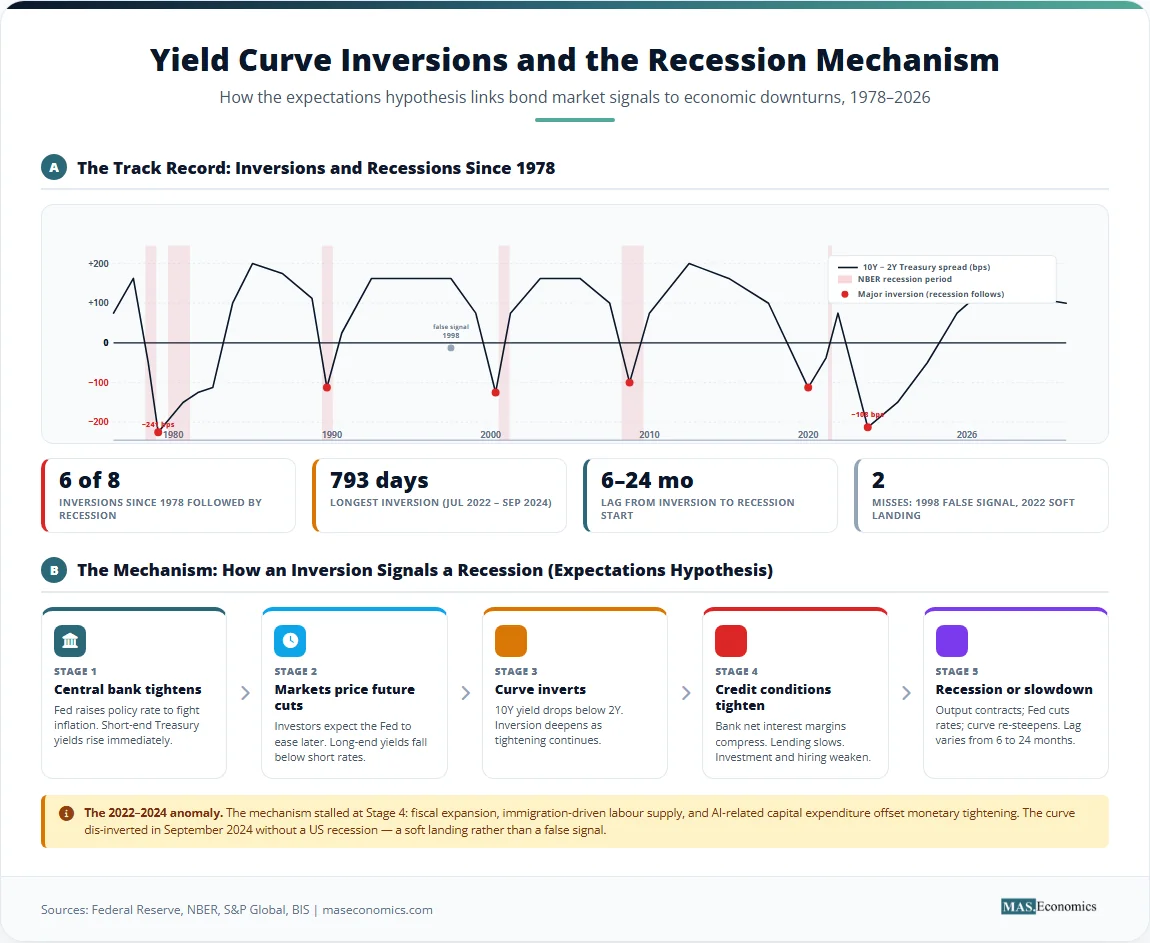
The yield curve’s reputation as a recession predictor rests on a straightforward observation: every US recession since the late 1960s has been preceded by an inversion of the spread between the 10-year and 2-year Treasury yields, with no false positives when the inversion is sustained, and the spread moves decisively below zero. The 10-year/3-month spread, favoured by some researchers including those at the Federal Reserve, has an even stronger empirical record. The logic, grounded in the expectations hypothesis, is that an inversion signals that markets expect future short-term rates to be lower than current short-term rates, which is the path that occurs when the central bank is forced to ease in response to a downturn.
The table below documents the major US yield curve inversions since the 1970s and the recessions that followed. The 10-year/2-year spread is used as the benchmark, with negative values indicating an inverted curve.
| Date of First Inversion | Minimum 10Y-2Y Spread (bps) | Recession Start | Lag from Inversion (months) | Recession Duration (months) |
|---|---|---|---|---|
| December 1978 | -241 | January 1980 | 13 | 6 |
| September 1980 | -169 | July 1981 | 10 | 16 |
| December 1988 | -45 | July 1990 | 19 | 8 |
| May 1998 (brief) | -7 | No recession (false signal) | — | — |
| February 2000 | -51 | March 2001 | 13 | 8 |
| December 2005 | -19 | December 2007 | 24 | 18 |
| August 2019 | -5 | February 2020 | 6 | 2 |
| July 2022 | -107 | None (soft landing) | — | — |
 | ||||
Sources: Federal Reserve Bank of St. Louis (FRED), National Bureau of Economic Research (NBER). The 1998 brief inversion was associated with the Long-Term Capital Management crisis but did not precede a recession; it is considered a false positive. The 2022–2024 inversion did not produce a recession; the curve dis-inverted in September 2024.
Several features of this historical record stand out. First, the lag between inversion and recession is variable, ranging from six months to two years. The curve is a leading indicator with a long and uncertain lead time, making it a blunt instrument for market timing but a useful input for recession probability models. Second, the depth of the inversion has historically correlated with the severity of the subsequent downturn, though the relationship is far from perfect. Third, the 2019 inversion was unusually shallow and brief, but it was still followed by the pandemic-induced recession of 2020, a reminder that the curve can signal vulnerability even when the proximate trigger is an exogenous shock.
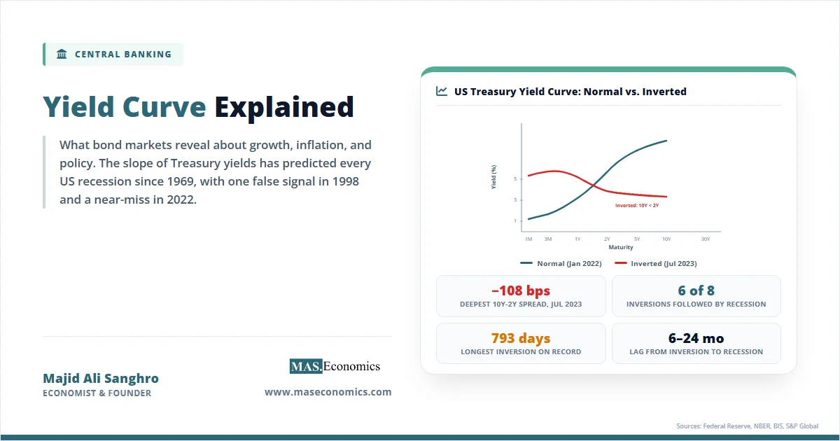
The chart below shows the shape of the US Treasury yield curve on two dates: 15 January 2022, before the Federal Reserve began its tightening cycle, when the curve was still upward-sloping; and 30 June 2023, when the curve was deeply inverted after more than a year of rate hikes.
US Treasury yield curves on two dates, illustrating the change from a normal upward-sloping curve to an inverted curve. Source: US Department of the Treasury, Federal Reserve.
The January 2022 curve was mildly upward-sloping, with the 2-year at 1.05 percent and the 10-year at 1.78 percent. By June 2023, after the federal funds rate had been raised above 5 percent, the short end of the curve had jumped sharply while the long end remained anchored by expectations of eventual easing and structural demand for long-dated bonds. The result was the deepest inversion since the early 1980s, with the 2-year yield exceeding the 10-year yield by over 100 basis points. This inversion persisted for 793 days through September 2024, the longest stretch on record, before the curve re-steepened in late 2024.
The inversion of 2022–2024 did not, however, produce a recession in the United States. As of early 2026, the economy had continued to grow, albeit at a moderating pace, and the soft landing rendered the inversion a near-miss. The episode has shown that no single variable can capture the full complexity of a modern economy. The aggressive tightening of monetary policy was accompanied by a substantial easing of fiscal policy, a strong labour market supported by immigration, and a surge in productivity linked to artificial intelligence investment. The term premium, depressed by years of quantitative easing and by global demand for safe dollar assets, may have mechanically flattened the curve without signalling the kind of growth collapse that historically followed inversions. The episode has forced economists to refine their models, not abandon the indicator, but it has also underscored the point that no single variable can capture the full complexity of a modern economy, though the 2022 inversion tested that point more severely than any previous cycle.
The experience of other advanced economies broadens the picture. The United Kingdom’s yield curve inverted in 2022 and remained inverted through much of 2023 and 2024, yet the British economy skirted a formal recession, though growth was anaemic. The German yield curve, measured by the spread between 10-year and 2-year Bund yields, inverted in late 2022 and stayed inverted as the eurozone stagnated but did not contract sharply. The Bank of Canada and the Reserve Bank of Australia both faced yield curve inversions that were followed by slowdowns rather than recessions. The common theme across these cases is that yield curve signals must be interpreted alongside fiscal stance, net migration, energy price shocks, and structural changes in bond markets. An inverted curve remains a warning, but it is not a verdict.
Limitations and Criticisms
The yield curve’s track record as a recession predictor is impressive, but it is not infallible, and relying on it without context invites error. The most important limitation is the variable and often long lag between inversion and recession. If the lag is two years, as it was before the 2007–2009 recession, a policymaker or investor who acts on the signal immediately may be dangerously early. The curve is a leading indicator in the statistical sense, but it does not provide a precise date. It tells you that the economy is vulnerable; it does not tell you when the vulnerability will be realised.
A second limitation is the risk of false positives. The 1998 inversion, though brief and shallow, was not followed by a recession. The 1966 inversion was also followed by a slowdown, but not a formal recession. Structural changes in the bond market, particularly the compression of the term premium since the global financial crisis, have made inversions more likely for a given set of expectations. If the term premium is negative or very low, the curve can invert even when expected future short rates are only slightly below current short rates, a configuration that would not have produced an inversion in earlier decades when term premiums were larger. Some researchers at the Federal Reserve and the Bank for International Settlements have argued that the threshold for a recession signal should be adjusted downward when the term premium is low.
A third limitation is that the yield curve reflects expectations that can be wrong. Market participants are not omniscient, and their forecasts of future monetary policy and economic growth are subject to the same errors and biases as any other forecast. The yield curve embeds the market’s best guess, but that guess can be distorted by risk aversion, regulatory constraints on bond holdings, and the activities of foreign official investors such as central banks managing foreign exchange reserves. The large accumulation of US Treasury securities by China, Japan, and oil-exporting countries over the past two decades has exerted a persistent downward pressure on long-term yields that is unrelated to US economic fundamentals. This global savings glut effect, identified by Ben Bernanke and others, means that the US yield curve is influenced by foreign capital flows as much as by domestic expectations.
A fourth limitation concerns the specific segments of the curve used. The 10-year/2-year spread is the most commonly cited in financial media, but the Federal Reserve’s own research has found that the 10-year/3-month spread has a stronger statistical relationship with subsequent recessions. In 2022 and 2023, the 10-year/3-month spread inverted earlier and more deeply than the 10-year/2-year spread, and its inversion attracted less public attention. The choice of spread matters for the signal, and focusing on a single measure can obscure a more complex picture.
Finally, the yield curve does not directly measure recession risk; it measures the expected path of short-term interest rates, adjusted for risk premiums. The link to recessions is indirect: rate cuts typically occur when the economy is weakening, and expectations of rate cuts are what invert the curve. But rate cuts can also occur for other reasons, such as a desire to boost inflation from below-target levels or to offset an external shock that does not cause a domestic recession. The yield curve is best understood as a measure of the stance of monetary policy expectations, not as a standalone recession probability gauge. Its signal must be combined with other indicators, from the comprehensive dashboard of economic indicators that includes labour market data, business surveys, and financial conditions indices, to produce a reliable assessment.
MASEconomics Explains
Four economic concepts behind the yield curve
Conclusion
The yield curve is a snapshot of the entire term structure of interest rates, a daily report on the collective expectations of bond market participants about growth, inflation, and the future path of monetary policy. An upward-sloping curve is the norm, reflecting term premiums and expectations of a growing economy. An inverted curve is a warning that markets expect rate cuts, which historically have coincided with economic downturns. The empirical record is strong, but the lags are variable, false positives occur, and structural changes in bond markets have altered the mapping from curve shape to recession probability. The yield curve is one of the most valuable indicators available, not because it is foolproof, but because it consolidates a large set of information into a single, testable, and daily updated line.
Did you find this article helpful? Share it with someone who loves economics. And remember, at MASEconomics, we make complex ideas simple.