In February 1942, the United States banned the production of civilian cars. Assembly lines that had turned out sedans were retooled to build tanks, aircraft engines, and trucks for the war. The country did not suddenly own more factories or workers that month. It simply moved them from one use to another, and every extra tank meant a car that would not be built. That choice, made with a fixed pool of resources, is exactly what the production possibilities frontier is built to describe.
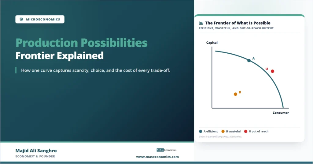
The production possibilities frontier, often shortened to PPF, is a curve that shows the maximum combinations of two goods an economy can produce when it uses all of its resources fully and efficiently. It turns four of the most important ideas in economics, scarcity, choice, opportunity cost, and efficiency, into a single picture that a reader can take in at a glance.
What the Frontier Actually Plots
Picture an economy that makes only two things: capital goods, such as machines and factories, and consumer goods, such as food and clothing. Put consumer goods on the horizontal axis and capital goods on the vertical axis. Every point in that space is a possible mix of the two. The frontier is the outer boundary of what the economy can reach when no resource sits idle, and each resource is used where it works best.
The boundary exists because resources are scarce. There is a fixed quantity of labor, land, capital, and skill available at any moment, and a fixed level of technology for turning those inputs into output. Once everything is in use, the only way to make more of one good is to pull resources away from the other. The frontier draws the edge of the possible, and the space underneath it holds every combination the economy could manage with room to spare.
The model keeps two assumptions in the background. The quantity of resources is fixed for the period under study, and the state of technology is given. Relax either one and the whole curve moves, which is the subject of a later section. Hold both fixed, and the frontier stays put, marking the line between what an economy can and cannot do right now.

Points On, Inside, and Beyond the Curve
A single diagram carries three distinct messages depending on where a point falls. A point on the frontier, such as point A in Figure 1, is productively efficient. The economy is getting the most output it can from its resources, and the only way to gain more consumer goods is to accept fewer capital goods.
A point inside the frontier, such as point B, is attainable but wasteful. The economy could produce more of both goods at once, so something is sitting idle. The usual culprit is unused labor and capital during a downturn, which is why a deep recession is often described as the economy operating well inside its frontier. The article on types of unemployment explains the forms that idleness can take.
A point beyond the frontier, such as point U, is simply unattainable with today’s resources and technology. It is not forbidden by any rule; the economy just cannot get there yet. Reaching it requires the frontier itself to move outward, which only happens with growth. The gap between where an economy produces and the frontier it could reach is the practical cost of recessions and underused capacity.
Why the Frontier Bows Outward
Most textbook frontiers are drawn as a curve that bulges away from the origin rather than a straight line. The shape is not decoration. It reflects the law of increasing opportunity cost: as an economy produces more of one good, the amount of the other good it must give up for each additional unit keeps rising.
The reason is that resources are not equally good at everything. Some workers, machines, and parcels of land are well suited to making consumer goods, while others are better at building capital equipment. Start from a point where the economy makes only capital goods and then begin shifting toward consumer goods. The first resources moved are the ones already well suited to consumer production, so the early trade is cheap. Keep going, and the economy is eventually forced to reassign resources that were highly productive at making capital goods and are clumsy at making anything else. Each extra unit of consumer goods then costs more and more capital goods, and the frontier bends.
The slope of the frontier at any point measures this cost directly. Economists call it the marginal rate of transformation, the rate at which one good can be turned into the other along the boundary. If moving from one combination to the next adds \( \Delta C \) consumer goods while subtracting \( \Delta K \) capital goods, the opportunity cost of those consumer goods is
A steeper section of the curve means a higher opportunity cost; a flatter section means a lower one. Because a bowed frontier grows steeper as it moves to the right, each step toward consumer goods is more expensive than the last. The link between slope and cost is the same marginal logic that runs through marginal analysis across the rest of economics.
A Production Schedule in Numbers
The bowed shape is easier to trust once it is written out as a schedule. The table below lists six efficient combinations for a small economy, from all capital goods at one extreme to all consumer goods at the other. The final column records the opportunity cost of each additional unit of consumer goods, measured in the capital goods sacrificed to get it.
| Combination | Capital goods | Consumer goods | Capital goods given up for the last consumer good |
|---|---|---|---|
| A | 15 | 0 | n/a |
| B | 14 | 1 | 1 |
| C | 12 | 2 | 2 |
| D | 9 | 3 | 3 |
| E | 5 | 4 | 4 |
| F | 0 | 5 | 5 |
|
|
|||
The first consumer good costs only one capital good, because the economy reassigns the resources that were least useful for capital production. By the time it reaches the last consumer good, the cost has climbed to five capital goods, because the resources being moved were the best capital producers it had. Plot these six points and connect them, and the result is the outward-bowing curve that the schedule predicts. A straight line would require every step to cost the same, which only happens under conditions the next section sets out.
When Opportunity Cost Stays Flat
A straight-line frontier is not wrong; it is a special case. It describes an economy whose resources are equally productive in both goods, so reassigning them carries the same cost no matter how much has already been moved. The opportunity cost is constant, and the slope never changes.
This case is the backbone of the simplest trade models. When each country faces a constant opportunity cost, the analysis of comparative advantage becomes clean: a country gains by specializing completely in the good it produces at lower relative cost and trading for the rest. The straight-line frontier is precisely the geometry behind the Ricardian model of trade, where labor is the only input and moves between sectors at a fixed rate. The bowed frontier and the straight one are two ends of the same idea, separated only by how specialized an economy’s resources are. The rising-cost shape in Figure 2 also mirrors the way production costs in microeconomics climb as output is pushed toward a limit.
Guns, Butter, and Pandemic Vaccines
The classic illustration pairs guns with butter, a shorthand for the choice between military and civilian production. The United States in 1942 is the real version of that diagram: civilian manufacturing was compressed so that war output could expand, a deliberate move down the frontier toward one good and away from the other. The economy did not gain resources overnight, so more guns meant less butter.
The same logic showed up during the COVID-19 pandemic, when hospitals and manufacturers redirected staff, supplies, and factory time toward vaccines, testing, and emergency care. Resources pulled into the pandemic response were resources unavailable for elective procedures and ordinary output, a textbook trade-off playing out in real time. A government weighing healthcare against infrastructure, or a household deciding between work hours and study hours, faces the same curve in miniature. In each case the relevant question is not whether a trade-off exists but how steep it is, and the slope of the frontier answers that.
When the Whole Curve Moves Out
Everything so far holds the economy’s resources and technology fixed. Release that assumption and the frontier itself shifts. Economic growth is, in the language of this model, an outward shift of the entire curve, which lets the economy reach combinations that were unattainable before, the point U of Figure 1 included.
Three forces push the frontier out. More resources, such as a larger workforce or a bigger capital stock, raise what the economy can produce. Better technology lets the same resources produce more, which is the engine behind the Solow-Swan growth model. And the original mix matters: an economy that chooses point A’s neighbor toward more capital goods today builds more machines and factories, which tends to push the frontier out faster in the future than one that devotes everything to immediate consumption. Growth can also be lopsided. If a new technology improves only consumer-goods production, the frontier stretches further along that axis than the other, a result close in spirit to the Rybczynski theorem on how factor growth reshapes output.
Where the Model Stops Being Realistic
The frontier earns its place by being simple, and that simplicity is also its limit. Real economies make millions of goods, not two, so the curve is a drastic compression of a far wider choice. It says nothing on its own about which point an economy should pick; that requires judgments about what society values, the territory of welfare economics and Pareto efficiency. A point can be productively efficient and still be a poor choice if it produces the wrong mix of goods.
The model also treats resources and technology as given for the period, which hides the very forces that matter most over the long run. It does not explain how institutions, incentives, or trade reshape the frontier, only that they do. And it assumes the economy can reach its boundary at all, when frictions, coordination failures, and slow adjustment often keep real economies somewhere inside. None of this makes the frontier wrong. It makes the frontier a starting point, a frame that later models, including those that measure the gains from trade, build on rather than discard.
MASEconomics Explains
Four economic concepts behind the production possibilities frontier
These concepts are explored in depth across our educational articles library.
Explore the MASEconomics BlogConclusion
The production possibilities frontier compresses the core logic of scarcity into one curve: a fixed pool of resources, a boundary on what they can produce, and a cost attached to every choice along that boundary. Points on the frontier are efficient, points inside reveal waste, and points beyond it wait on growth. The outward bow of the curve records the law of increasing opportunity cost, while a straight-line version captures the constant-cost world of the simplest trade models.
What makes the model durable is that the same picture serves a wartime production board, a pandemic health system, and a student dividing study time, because each one allocates scarce resources between competing ends. The frontier does not decide which combination is best, and it does not explain what moves the curve over decades. It sets the terms of the problem clearly enough that every richer model of efficiency, growth, and trade can begin from it.
Frequently Asked Questions
What does the production possibilities frontier show?
It shows the maximum combinations of two goods an economy can produce when all of its resources are used fully and efficiently. The curve illustrates scarcity, the need to choose, and the opportunity cost of every choice, all in one diagram.
Why is the production possibilities frontier curved instead of straight?
It bows outward because of increasing opportunity cost. Resources are not equally suited to every good, so as an economy produces more of one good it must reassign resources that are less and less suited to it, raising the amount of the other good given up for each extra unit. A straight line appears only when opportunity cost is constant.
What does a point inside the production possibilities frontier mean?
A point inside the curve is attainable but inefficient. The economy could produce more of both goods at the same time, which means some resources are idle or misused. Unemployment and unused capacity during a recession are the usual reasons an economy operates inside its frontier.
What causes the production possibilities frontier to shift outward?
An outward shift represents economic growth. It comes from an increase in resources, such as a larger labor force or capital stock, from improvements in technology, or from investment in capital goods that raises future productive capacity. The shift lets the economy reach combinations that were previously unattainable.
What is the difference between the production possibilities frontier and opportunity cost?
The frontier is the whole curve of possible output combinations, while opportunity cost is the trade-off between two specific points on it. The slope of the frontier at any point measures the opportunity cost of producing one more unit of the good on the horizontal axis in terms of the good on the vertical axis.
Thanks for reading! If you found this helpful, share it with friends and spread the knowledge. Happy learning with MASEconomics