
In the autumn of 1973 the University of California at Berkeley admitted forty-four percent of the men who applied to its graduate programmes and thirty-five percent of the women, a gap large enough that the university expected to be sued. When the statisticians it asked to look at the numbers broke them down by department, the gap disappeared, and in several of the largest departments women were admitted at a higher rate than men. Both sets of figures were correct. Women had applied in greater numbers to the departments that rejected almost everyone, and the campus-wide total had averaged that choice into the appearance of a bias. This is Simpson’s paradox: a relationship that holds inside every group and reverses when the groups are combined. It is not a rare curiosity. It appears whenever a total is built from parts whose weights differ between the things being compared, which describes tax rates, wage averages, productivity growth and most cross-country comparisons, and the question it forces is not which number is correct but which question each number answers.
What Reverses When Groups Are Combined
The arithmetic is a weighted average. Any overall rate, whether an admission rate, an average wage or an aggregate productivity level, is the sum of group rates multiplied by group shares. When two populations or two years are compared, the comparison can differ from every group-level comparison as long as the shares differ, because the shares are doing part of the work.
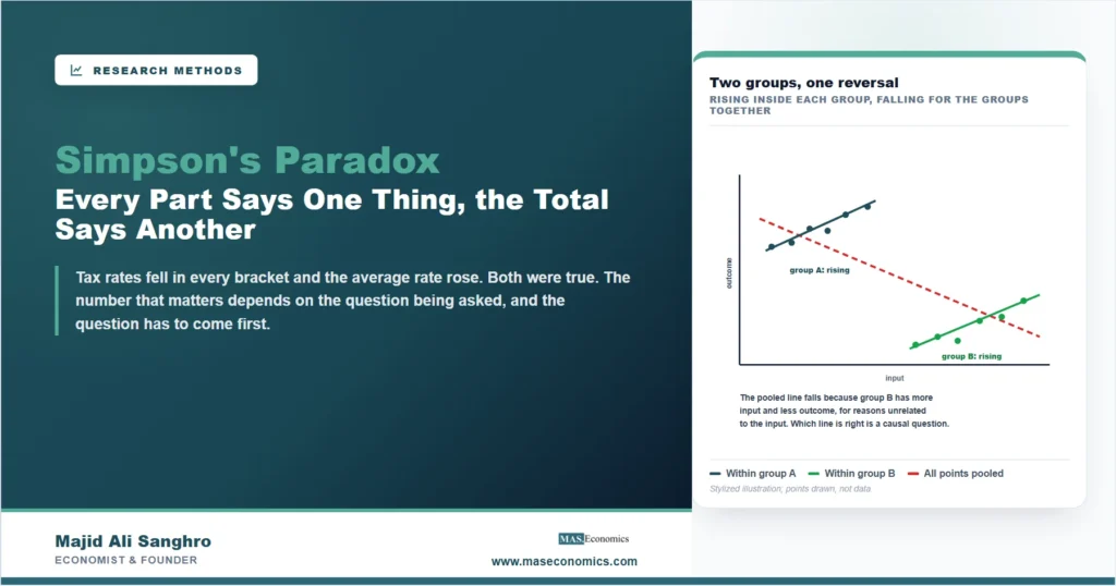
If men and women had applied to Berkeley’s departments in the same proportions, the campus total would have reproduced the departmental pattern. They did not, so the total reflected where people applied as much as how they were treated once they had. The same structure appears in a scatter plot, and the plot is the quickest way to see that nothing mysterious is happening.
Inside each cluster, more input goes with more outcome. Pooled, the relationship runs the other way, because group B has more of the input and less of the outcome for reasons that have nothing to do with the input at all. Edward Simpson described the reversal in 1951, and Udny Yule had noticed it half a century earlier, which is why it is sometimes called the Yule-Simpson effect. Neither man thought it paradoxical. What makes it feel like one is the habit of reading a pooled relationship as if it were a within-group relationship, when the two are answers to different questions.
Where It Shows Up in Economic Data
The cleanest economic case is in tax statistics. Clifford Wagner showed in 1982 that between the mid-1970s and the late 1970s the effective United States federal income tax rate fell within every income bracket while the overall effective rate rose. Nothing in the tax code had gone up. Inflation had pushed taxpayers into higher brackets, so the weights on the high-rate groups had grown, and the average of falling bracket rates rose. A politician could say truthfully that rates had been cut for everyone, and a taxpayer could say truthfully that the country was paying a larger share of its income in tax, and the arithmetic supported both.
The pandemic produced the largest recent example in wage data. In April 2020 more than twenty million American jobs disappeared in a single month, concentrated among low-paid workers in restaurants, shops and hotels. Average hourly earnings jumped, and the jump said nothing about anyone’s pay. The people whose wages were averaged had changed: the low end of the distribution had left the sample, so the average of those who remained was higher even though few of them had received a raise. Statistical agencies flagged the composition effect at the time, and the subsequent fall in average earnings as those workers returned was the same effect running backwards.
Productivity accounting has a version that runs for decades rather than months. When labour shifts from a high-productivity sector to a low-productivity one, aggregate productivity growth can fall short of every sector’s own growth, because the weight is moving toward the sector with the lower level. Economies whose workforces have moved from manufacturing into services can record steady productivity gains in both and a slower aggregate, and a debate about whether productivity has “really” slowed is often a debate about which level of aggregation a person has in mind.
| Sector | Productivity, year 1 | Employment share, year 1 | Productivity, year 2 | Employment share, year 2 | Sector growth |
|---|---|---|---|---|---|
| Manufacturing | 100 | 60% | 110 | 40% | +10% |
| Services | 50 | 40% | 55 | 60% | +10% |
| Whole economy | 80 | 100% | 77 | 100% | −3.75% |

|
|||||
The numbers in the table are invented to be checkable. The whole-economy figure is the employment-weighted average of the sector figures, sixty percent of a hundred plus forty percent of fifty in the first year, forty percent of a hundred and ten plus sixty percent of fifty-five in the second. Every sector became more productive and the economy, measured as the average worker’s output, became less so. No error has been made anywhere. The two statements describe different things.
Cross-country work is exposed in a subtler way. A relationship that holds within every country can reverse across countries, and the reverse is equally possible. William Robinson made the general point in 1950 with literacy and immigration in the United States: across states, the share of immigrants was positively related to literacy, because immigrants had settled in states with good schools; within states, immigrants were less literate than the native-born. Reading a between-country correlation as a statement about individuals is called the ecological fallacy, and it is Simpson’s paradox with countries as the groups. The panel data distinction between within and between variation exists partly to keep these two relationships apart.
Which Number Is Right?
The instinct is to say that the disaggregated number is the true one and the pooled number is the artefact. That instinct is wrong about half the time, and the way to tell which half is to ask what caused the grouping. The rule, set out most clearly by Judea Pearl, is that the choice of level is a causal decision, not a statistical one. If the grouping variable is a confounder, something that influences both the input and the outcome and was settled before either, then the within-group comparison is the one that isolates the effect, and the pooled figure is contaminated by the same mechanism our article on omitted variable bias describes. If instead the grouping variable is a mediator, a step on the path from the input to the outcome, then conditioning on it removes part of the effect being measured, and the pooled figure is the honest answer to the question of total effect.
Berkeley shows the two answers side by side. Department is a mediator of the path from applicant’s sex to admission, because women chose the departments they applied to. The within-department comparison answers whether admissions committees treated men and women differently once they were in the same room, and the answer was no. The pooled comparison answers whether being a woman lowered the chance of admission to Berkeley, and the answer was yes, through the route of which departments had places to offer. The statisticians who did the analysis were careful to say that the second question was worth asking, and that it pointed at the departments’ funding rather than their committees. A causal diagram makes the distinction mechanical: draw the arrows, and whether to condition on the group follows from where the grouping variable sits.
The tax case reads the other way. The bracket a taxpayer is in is a consequence of income, and income rose with inflation; nobody chose a bracket. If the question is whether the code became more or less demanding, the bracket rates answer it, and they fell. If the question is what the country paid, the pooled rate answers it, and it rose. Neither figure is the artefact. The artefact is the sentence that uses one of them to answer the other’s question, which is the failure the distinction between correlation and causation was drawn to prevent.
How to Catch It Before It Catches You
Because the paradox is arithmetic, it can be decomposed, and the decomposition is the practical defence. Any change in a weighted average splits into the part due to changes in the group rates, holding the weights fixed, and the part due to changes in the weights, holding the rates fixed. The first is the within effect and the second is the composition effect, and reporting them separately is what prevents a composition effect from being read as a change in behaviour.
Applied to the wage jump of April 2020, the within term was small and the composition term was almost everything, which is the finding that statistical agencies reported in words. Applied to the tax rates, the within term was negative and the composition term was larger and positive. Shift-share and Oaxaca-style decompositions are elaborations of the same two lines, and a result that arrives without one is a result whose level of aggregation has been chosen for the reader without telling them.
Three habits catch the rest. Plot the groups before pooling them, because a reversal is visible in a scatter long before it is visible in a regression coefficient. Check whether the weights differ between the things being compared, since without a difference in weights there can be no reversal, and a large difference is a warning. And model the group structure explicitly rather than hoping a pooled regression will handle it; the interaction terms that let a slope differ across groups are the regression form of the within-group lines in the figure. The paradox also cuts the other way, as a temptation rather than a trap. A researcher who can choose the level of aggregation after seeing the results can often choose the sign, which is one of the hidden decisions our article on p-hacking lists, and the remedy is the same: decide the question, and therefore the level, before looking.
MASEconomics Explains
3 concepts behind the reversal
These concepts are explored in depth across our educational articles library.
Conclusion
Simpson’s paradox is a property of weighted averages, and economic statistics are made of weighted averages. Whenever the shares behind a total differ between the things being compared, the total can move against every one of its parts, and it does so in tax rates, average wages, productivity growth and cross-country correlations often enough that the reversal should be expected rather than discovered. The arithmetic is never wrong. What goes wrong is the sentence that takes a pooled figure and reads it as a statement about what happens inside groups, or takes a within-group figure and reads it as a statement about the whole.
The resolution is not statistical. The disaggregated number is right when the grouping variable is a confounder, and the pooled number is right when it is a mediator, and telling the two apart requires a claim about what caused what. That claim can be drawn, defended and disputed, which is more than can be said for the instinct that smaller groups are always closer to the truth. Decompose the change into a within part and a composition part, plot the groups, choose the level of aggregation before seeing the result, and the paradox stops being a trap and becomes what it always was, a reminder that a number is an answer to a question, and the question has to be stated first.
Frequently Asked Questions
What is Simpson’s paradox?
A reversal in which a relationship that holds inside every subgroup of the data disappears or changes sign when the subgroups are combined. It arises because an overall figure is a weighted average of group figures, and when the weights differ between the things being compared the composition of the groups can move the total against every part.
Is the disaggregated number always the correct one?
No. If the grouping variable is a confounder, something that affects both the input and the outcome and was determined beforehand, the within-group comparison isolates the effect. If it is a mediator, a step on the causal path, conditioning on it removes part of the effect and the pooled figure answers the total-effect question. The choice depends on the causal structure, not on the data.
Where does Simpson’s paradox appear in economics?
In effective tax rates that fall within every bracket while the overall rate rises as inflation moves taxpayers up; in average wages that jump when low-paid workers lose their jobs, as in April 2020; in aggregate productivity that grows more slowly than every sector because employment shifts toward lower-productivity sectors; and in cross-country correlations that reverse within countries, which is the ecological fallacy.
What is the ecological fallacy, and how is it related?
The ecological fallacy is reading a relationship observed across groups, such as countries or states, as if it held for the individuals inside them. It is Simpson’s paradox with places as the groups. Robinson’s 1950 example found immigration and literacy positively related across American states and negatively related within them, because immigrants settled where schooling was good.
How can a composition effect be separated from a real change?
By decomposing the change in the weighted average into a within-group part, computed with the weights held fixed, and a composition part, computed with the group rates held fixed. Shift-share and Oaxaca-style decompositions do exactly this. A large composition part means the population being averaged changed, which is a different finding from the people in it changing.
How is the paradox handled in a regression?
By modelling the group structure rather than pooling over it: including the group as a control when it is a confounder, allowing slopes to differ across groups with interaction terms, and using within-group variation in panel settings. The pooled regression coefficient corresponds to the dashed line in the figure and can carry the wrong sign for the within-group question.
Thanks for reading! The total and the parts were both telling the truth, and the only mistake available was to make one of them answer the other’s question. Happy learning with MASEconomics