In the summer of 2026 two of the most respected institutions in economics published forecasts for global growth in the same year. One said 3.1 percent. The other said 2.5 percent. Neither made an error, neither revised, and both figures are still in print. Conflicting economic statistics of this kind are not rare, and they are almost never the result of one side being wrong.
They happen because a number is not a fact on its own. It is a fact plus a set of choices: what to weight, what to net out, what to divide by, and which month to stop counting. Change any of those and the number changes while the underlying reality does not. The useful skill is not deciding which institution to believe. It is learning to see the choices.
What follows is four real cases from reports published in 2026, each with a different mechanism behind it. Three of them will appear in headlines that ordinary readers meet.
Case One: The World Grew 3.1 Percent, and Also 2.5 Percent
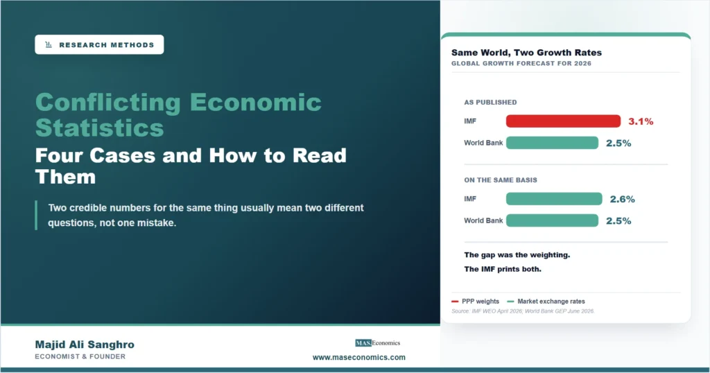
The International Monetary Fund’s April 2026 forecast for global growth in 2026 was 3.1 percent. The World Bank’s June 2026 forecast was 2.5 percent. Six tenths of a percentage point separates them, which at global scale is an enormous amount of output, and the gap has launched a great many articles about institutional disagreement.
There is no disagreement. The two institutions are adding up countries differently.
To produce a single world growth rate you have to combine national growth rates into an average, and that requires deciding how much each country counts. One method converts every economy to a common currency at market exchange rates. The other uses purchasing power parity, which adjusts for the fact that the same haircut costs less in Manila than in Zurich. Because prices for non-traded goods are lower in poorer countries, purchasing power parity gives those economies a larger weight. Poorer economies also tend to grow faster. So a purchasing-power-weighted world grows faster than a market-rate-weighted one, mechanically, every year, with no dispute about any individual country.
The clinching detail is that the IMF publishes both figures in the same table. Its headline 3.1 percent uses purchasing power parity weights. A memo line in the same table gives the market exchange rate figure: 2.6 percent. The World Bank’s 2.5 percent also uses market rates. Compared on the same basis the two institutions are one tenth of a point apart, which is well inside the noise of any forecast. The United Nations Conference on Trade and Development, also using market rates, published 2.6 percent.
Almost nobody reads the memo line. The article on purchasing power parity sets out the theory behind the adjustment, and the guide to measuring national income covers why cross-country aggregation is harder than it looks.
The rule this case teaches: when two aggregates for the same thing differ, check the weighting before checking the analysis. And note which direction the choice pushes. An institution that wants to emphasize the developing world will find purchasing power parity congenial, and one focused on financial flows will prefer market rates, because that is the basis on which debt is actually repaid. Neither is cheating. Both are choosing.
Case Two: $28 Trillion, or $390 Billion
The second case has a gap of a different order. Annual stablecoin transaction volume for 2025 has been reported at about $28 trillion. It has also been reported at roughly $390 billion. That is a factor of about seventy, for the same activity in the same year.
The difference is netting. The larger figure counts every transfer recorded on the blockchain. The smaller one removes transfers between wallets owned by the same party, along with other automated and internal movements that shift a balance without anyone buying anything. A single payment that is routed through several intermediate wallets appears several times in the gross count and once in the adjusted one.
Which is right depends entirely on the question. If you want to know how much load the network carries, gross is the correct measure. If you want to know how much economic activity is being settled in stablecoins, gross is badly misleading, and every headline of the form “stablecoins now settle more than a major card network” is built on it.
The second half of this case is about denominators, and it is the more useful half. The Bank for International Settlements makes the comparison itself in its Annual Economic Report 2026: even at $28 trillion, annual stablecoin volume is less than three business weeks of settlement in the largest United States wholesale payment systems. The Clearing House Interbank Payments System alone clears around $2.2 trillion every business day. Stablecoin market capitalisation stood at roughly $320 billion at the end of May 2026, against trillions in ordinary bank deposits.
So the impressive number and the deflating number are both about the same instrument, and the honest description needs both. The comparison to central bank digital currencies and stablecoins and the broader treatment of cryptocurrency as an economic system both depend on getting this scale question right before anything else is argued.
The rule this case teaches: ask what was netted out, then ask what the number is being compared with. A large figure with no denominator is a rhetorical device, not a measurement.
Case Three: A Report That Disagrees With Itself
The first two cases involve different institutions, which makes them easy to dismiss as rivalry. The third does not.
The BIS Annual Economic Report 2026 describes the price effects of the energy supply disruption that began in early 2026. Its overview, on page one, states that the prices of plastics and fertilisers rose by 30 percent and 50 percent respectively. Its first chapter, on page eighteen, states that the prices of plastics and fertilisers were both up by 50 percent.
Same report, same subject, two figures for plastics. This is not an institution with an agenda. It is the ordinary friction of a long document written by many people, where a summary and a chapter are drafted against different cuts of the data and the summary is finalised first.
The case is worth including precisely because it is undramatic. Most conflicting numbers in circulation are not the product of anyone trying to mislead. They are the product of a figure travelling: from a dataset to a chapter, from a chapter to a summary, from a summary to a press release, from a press release to a headline. Each hop is an opportunity for a rounding, a rebasing, or a different cut-off date.
The rule this case teaches: cite the chapter and the page, not the summary. If you are quoting a number from a report you have not opened, you are quoting a press release.
Case Four: A Population, and Why It Changes Everyone’s Income Figure
The fourth case is the one with the largest consequence, and it demonstrates the quietest mechanism of the four: a denominator changing a headline that appears to be about something else.
Two institutions publish population estimates for Pakistan for 2025. The IMF’s April 2026 database gives 240.5 million. The World Bank gives 255.2 million. The gap is close to 15 million people, which is a difference the size of a substantial country.
Here there is a way to settle it, and it is the reason this case is instructive rather than merely awkward. Pakistan conducted a census in 2023 and published the result: 241,499,431, with an intercensal growth rate of 2.55 percent a year against the 2017 count of 207,684,626. That series is internally consistent. Project the 2017 figure forward at 2.55 percent for six years and it gives 241,556,282 against a counted 241,499,431, a discrepancy of about 57,000 on 241 million.
Project the census forward to 2025 at its own measured rate and it gives roughly 254.0 million. The World Bank’s 255.2 million sits within half a percent of that. The IMF’s 240.5 million for 2025 is below the number the country counted two years earlier, which is not a plausible path for a growing population.
Now the part that reaches beyond Pakistan. Income per head is output divided by population, so a population estimate that is too low makes a country look richer than it is. The IMF’s GDP per capita for Pakistan in 2025 at purchasing power parity is $5,992. Recomputed on the census projection it is $5,674. The published figure is overstated by about 5.6 percent, and nothing about the output measurement changed. Only the denominator did.
That is a general lesson rather than a local one. Every per-capita statistic, in every country, is a ratio of two separately estimated quantities, and the one in the denominator is usually the one nobody checks. Comparisons of living standards across countries, of GDP per head over time, and of who has overtaken whom all inherit whatever population series the compiler happened to use. The article on what GDP is and is not covers the numerator carefully, and this is the reminder that the denominator deserves the same attention.
The rule this case teaches: where a national statistical office and an international institution disagree about that country, the national primary source usually decides, because it is the body that actually did the counting. And when a per-capita figure moves, check whether the population estimate moved first.
| The quantity | Number A | Number B | What actually differs |
|---|---|---|---|
| Global growth, 2026 | 3.1% (IMF) | 2.5% (World Bank) | Weighting. At market rates the IMF’s own figure is 2.6% |
| Stablecoin volume, 2025 | About $28 trillion | About $390 billion | Netting. Gross on-chain transfers against transfers between distinct owners |
| Plastics price rise, 2026 | 30% (BIS overview) | 50% (BIS Chapter I) | Nothing conceptual. Two drafting stages of one report |
| Pakistan population, 2025 | 240.5 million (IMF) | 255.2 million (World Bank) | Source. The 2023 census implies about 254.0 million for 2025 |

|
|||
The Four Questions That Resolve Most of These
The cases above look unrelated and are not. Each one comes down to a choice that was made before the number reached you, and there are only a handful of such choices in common use.
Weighted how. Any figure covering more than one country, one household or one sector required a decision about relative importance. Purchasing power parity against market exchange rates is the most consequential example, but the same issue produces the gap between a median country and a weighted world average, where the median can barely move while the aggregate moves a great deal because the largest economies dominate it.
Netted how. Gross flows count every transaction; net flows count only those that change something between distinct parties. The seventyfold stablecoin gap is the extreme version, but trade statistics, capital flows and financial market turnover all carry the same ambiguity.
Divided by what. Ratios inherit the errors of both parts. Per capita, as a share of GDP, per worker, per household: in each case a change in the denominator moves the headline without anything happening to the thing being measured.
Which vintage. Almost every important series is revised. A figure for the same quarter can legitimately differ depending on whether it was published before or after a benchmark revision, and a report finalised in January describes a different world from one finalised in June, particularly in a year with a large mid-year shock. The discussion of what GDP growth does and does not tell us covers why revisions to that series in particular are routine and large.
There is a fifth question that is not technical, and it belongs on the list. Somebody chose which of the available numbers to show you. That choice is usually made in good faith, and it is still a choice. A figure that is quoted without its alternative has been selected.
What This Does Not Mean
The natural overreaction to a list like this is to conclude that economic statistics are unreliable and that everyone is spinning. That conclusion is wrong, and it is worth setting against the evidence in the cases above.
In three of the four cases both figures are correct. The IMF and the World Bank are measuring different things and both publish their method. The gross and net stablecoin figures answer different questions and both have a legitimate use. Only the third case is an error, and it is a small drafting inconsistency in an otherwise careful document.
The fourth is the only one where a preference can be stated, and it can be stated because there is an underlying count to appeal to. A census is a measurement rather than an estimate, and when an international projection contradicts a national enumeration the enumeration usually wins. That is not a criticism of the modelling. It is an ordering of evidence.
Statistics that disagree are a sign of a system that publishes its assumptions, not of one that hides them. The IMF’s market-rate figure is right there in the table. The netting methodology is documented. The census is public. Everything needed to reconcile these cases was published by the institutions themselves. The failure, where there is one, happens downstream, in the transmission from report to headline, and that is a failure a reader can correct on their own.
MASEconomics Explains
3 economic concepts behind numbers that disagree
These concepts are explored in depth across our educational articles library.
Conclusion
Conflicting economic statistics usually reflect different questions rather than different competence. A world growing at 3.1 percent and a world growing at 2.5 percent are the same world weighted two ways, and the institution accused of optimism prints the other figure in the same table. A payments network settling $28 trillion and one settling $390 billion are the same network counted gross and net. A country of 240 million and a country of 255 million are the same country, and there a census exists to settle it.
The practical value of noticing this is not scepticism. It is the ability to ask four questions quickly: how was it weighted, what was netted out, what is it divided by, and when was it cut off. Those four resolve the large majority of contradictions a reader will meet, and they take a few seconds once the habit is formed.
The case that repays the most attention is the fourth, because it is the quietest. A population estimate is not a headline anywhere, and yet it silently sets every per-capita figure a country is judged by, including comparisons of living standards that carry real political weight. When a statistic about people changes, check whether the count of people changed first.
Frequently Asked Questions
Why do the IMF and the World Bank publish different global growth forecasts?
Mainly because of weighting. The IMF’s headline uses purchasing power parity weights, which give faster-growing developing economies more importance. The World Bank uses market exchange rates. On the same basis the two are close: the IMF’s own market-rate figure for 2026 was 2.6 percent against the World Bank’s 2.5 percent.
Which growth measure should be used, PPP or market exchange rates?
It depends on the question. Purchasing power parity is better for comparing living standards and real output. Market exchange rates are better for anything involving cross-border payments, trade values or debt, because those are settled at market rates rather than adjusted ones.
Why are stablecoin transaction volumes reported so differently?
Because of netting. Gross on-chain volume counts every transfer, including movements between wallets owned by the same party. Adjusted figures remove those. For 2025 the gross figure was about $28 trillion and the adjusted figure roughly $390 billion.
Can a per capita income figure be wrong even when GDP is measured correctly?
Yes. Income per head is a ratio, so an inaccurate population estimate distorts it even when output is measured well. A population estimate that is too low makes average income look higher than it is, with no error in the output data at all.
When two sources disagree about a country, which should be preferred?
Generally the national primary source, particularly when it rests on an enumeration such as a census rather than a model. International institutions project between national data points, so where a projection contradicts a recent national count, the count is the stronger evidence.
Thanks for reading! Once you start reading the memo line under the table, a surprising share of the arguments in economic commentary turn out to be about arithmetic rather than about the world. Happy learning with MASEconomics