
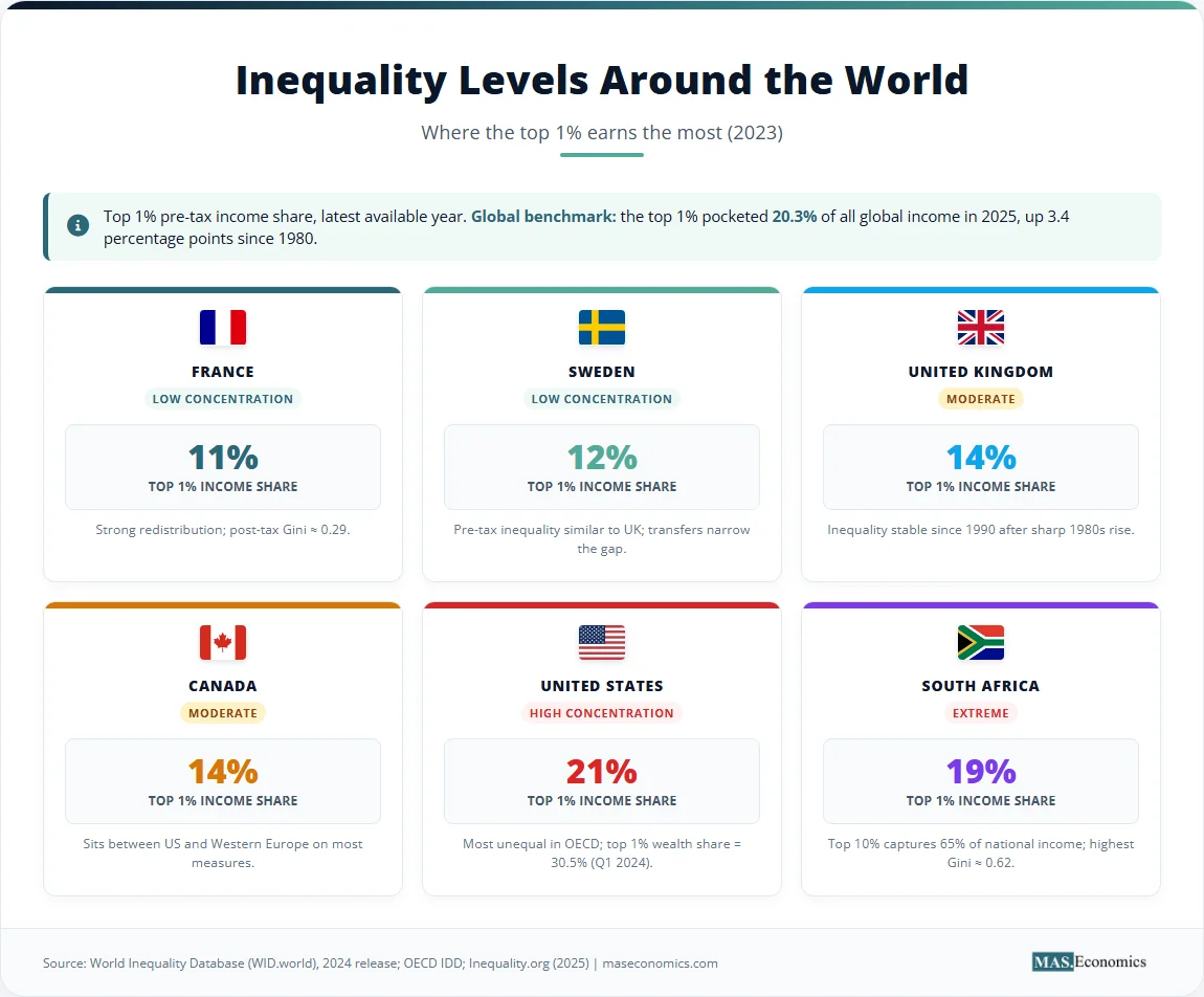
In 2024, the World Inequality Database released figures showing the top 1% of US earners take home 21% of national income, the same share as Mexico and a higher share than South Africa. The US top 1% wealth share reached 30.5% in the first quarter of 2024, while the bottom 50% of US households held 2.5%, according to Federal Reserve data. Globally, the richest 1% pocketed 20.3% of total income in 2025, up 3.4 percentage points since 1980, according to Inequality.org’s reading of the World Inequality Report.
The Economics of Inequality is the field that measures and explains how income and wealth are distributed across people, regions, and countries. Three tools dominate the measurement side: the Lorenz curve, which plots cumulative income against cumulative population, the Gini coefficient, which summarises the curve in a single number between 0 and 1, and top-share metrics, which track the fraction of income or wealth held by the top 1%, 10%, or 0.1%.
What follows defines each metric, presents current data from the United States, Sweden, and South Africa, and explains why pre-tax versus post-tax differences and survey-versus-tax-record sources can change the answer significantly.
What Inequality Measurement Means
Inequality measurement has two distinct objects. Income inequality looks at the flow of money received over a year through wages, self-employment, capital income, and transfers. Wealth inequality looks at the stock of assets held at a single point in time, net of debt: housing, financial assets, business equity, and pensions. The two move together but not identically. Wealth is more concentrated than income in every country with reliable data, because savings compound and assets are passed across generations.
Three central metrics measure these distributions. The Lorenz curve plots the cumulative share of population on one axis against the cumulative share of income or wealth on the other, giving a visual picture of the full distribution. The Gini coefficient compresses that picture into a single number between 0 and 1, where 0 is perfect equality, and 1 is one person holding everything. Top-share ratios report the fraction of national income or wealth held by the top 1%, top 10%, or top 0.1%.
Each metric depends on definitional choices that change the result. Pre-tax income gives a different Gini from post-tax income. Individual income gives a different Gini from household income, even for the same country. Wealth measures depend on whether pension entitlements, the value of public services, or offshore assets are included. The Kuznets curve hypothesis about inequality and growth is sensitive to all of these choices, which is one reason it has been hard to settle empirically.
How the Three Metrics Work
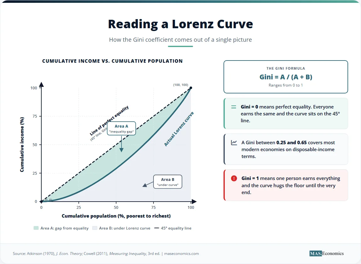
The Lorenz curve is built directly from the underlying data. Sort the population from poorest to richest. On the horizontal axis, plot the cumulative share of people, from 0% on the left to 100% on the right. On the vertical axis, plot the cumulative share of total income that those people receive. If everyone earned the same amount, the curve would be the 45-degree diagonal: the bottom 50% of people would receive 50% of the income, the bottom 90% would receive 90%, and so on. In real economies, the curve sags below the diagonal, because lower percentiles receive less than their proportional share. The deeper the sag, the more unequal the distribution.
The Gini coefficient turns that sag into a number. It is twice the area between the 45-degree line of perfect equality and the actual Lorenz curve, divided by the total area under the diagonal. Equivalently, if the area between the two curves is A and the area under the actual Lorenz curve is B, then Gini = A / (A + B). A Gini of 0 means the two curves coincide and everyone earns the same. A Gini of 1 means one person earns everything, and the Lorenz curve sits on the floor until the very last point. Most modern economies fall between 0.25 and 0.65 on disposable-income Gini indices. According to OECD analysis, the OECD average Gini has risen from 0.29 in the early 1980s to about 0.32 today.
Top-share metrics report a single slice of the distribution rather than its overall shape. The top 1% income share is the fraction of national income received by the highest-earning 1% of adults. Verified data from the World Inequality Database shows a large variation across countries. The US top 1% pre-tax income share is 21% as of 2023, the same as Mexico (21%), and higher than South Africa (19%), according to the World Inequality Database. France sits at 11%, Sweden at 12%, the United Kingdom and Canada at about 14%. The US top 10% income share reached 47% in 2023, a post-WWII peak, up from 34% in 1980.
Wealth concentration is more extreme everywhere. Federal Reserve data show the US top 1% wealth share at 30.5% in Q1 2024, while the bottom 50% of households held 2.5%. The OECD reports that the top 1% in the United States holds 40.5% of national wealth on a different methodology, with no other industrial nation exceeding 27.1%. Globally, the wealth Gini sits near 0.80 while the global income Gini sits near 0.65, according to standard estimates from Davies and co-authors and the work of Branko Milanovic. Wealth inequality is closely tied to wealth concentration in housing markets, where capital gains have accrued mainly to existing homeowners.
The three metrics complement rather than substitute for each other. The Gini gives one comparable number across countries. The Lorenz curve shows the full shape. Top shares isolate concentration at the top, where survey data is least reliable, and tax records matter most.
Three Country Cases
The United States shows the largest divergence among rich economies. Between 1980 and 2022, the bottom 90% of US earners had wage growth of 36%, compared to 162% for the top 1% and 301% for the top 0.1%, based on Economic Policy Institute analysis of Social Security Administration data. Worker productivity rose 80.9% from 1979 to 2024, while average hourly compensation rose only 29.4%. The decline in union coverage from over 30% of the workforce in the 1950s to 10.1% in 2022 sits alongside this divergence, alongside changes in tax policy and the rising education premium. The result is a top 1% income share of 21%, a top 10% share of 47%, and a top 1% wealth share of 30.5%.
South Africa records the highest national-level inequality on most measures. The richest 10% capture 65% of national income, with the bottom 50% receiving very little of the total. The country’s Gini coefficient sits around 0.62, the highest in any major economy. The Lorenz curve there bows almost to the floor for the bottom 80% of the population before climbing steeply at the top, reflecting structural divides in land ownership, education access, and labour-market institutions inherited from apartheid. The contrast with the United States is instructive: the US has a higher top 1% share than South Africa (21% vs. 19%), but South Africa’s bottom is far poorer in absolute terms, and its overall Gini is much higher.
The Nordic countries occupy the other end of the distribution. Sweden’s pre-tax inequality is similar to the United Kingdom’s, but its post-tax disposable-income Gini is substantially lower, in the 0.27 to 0.30 range. Active fiscal redistribution, comprehensive social insurance, and strong wage compression through collective bargaining all narrow the gap. Inequality in Sweden has risen since the 1980s alongside tax reforms, but the level remains well below US figures. The Nordic model shows that high redistribution can coexist with high productivity and growth. Even so, the post-tax Gini in Sweden has drifted upward by close to 10 points from its 1980s lows, the largest increase recorded in any OECD country.
The same logic shapes inequality outcomes through other channels. The gender pay gap, the strength of labour-market institutions, and the wage-profit dynamics running through the price level all show up in the same metrics from different angles.
The Data in One Picture
The chart below shows the top 1% pre-tax income share for ten countries in 2023, ranging from 11% in France to 23% in Brazil. The horizontal line at 10% marks the typical level for OECD countries in 1980. Every country in the chart sits above that benchmark, but the spread is wide.
Source: World Inequality Database (WID.world), 2024 release; Our World in Data; OECD Income Distribution Database. Top 1% pre-tax income share, individual adults, latest available year (2023).
Two patterns stand out. The teal bars (France, Sweden, Germany, the UK, Australia, Canada) cluster between 11% and 14%, the level of inequality typical of social-market economies. The red bars (South Africa, the United States, Mexico, Brazil) sit between 19% and 23%, a different regime altogether. The United States, despite being far richer than Mexico or South Africa, sits with them on this measure rather than with its Western European peers. The chart also shows that no major country today is at or below the 10% benchmark that was typical of OECD economies in 1980.
The branded table below summarises what each metric measures, where it comes from, and where it falls short. No single number captures the whole distribution, which is why economic inequality reports usually present the Gini, the Lorenz curve, and at least two top-share ratios side by side.
Table 1. Three Inequality Metrics: Coverage and Limits
| Metric | What It Measures | Range | Best Source | Limitation |
|---|---|---|---|---|
| Gini coefficient | Overall income (or wealth) concentration | 0 (equal) to 1 (one person) | OECD, World Bank | Single number obscures distribution shape |
| Lorenz curve | Full distribution shape | Visual, 0 to 100% on each axis | OECD, WID | Hard to compare across countries at a glance |
| Top 1% share | Concentration at the top | 0 to 100% | WID (tax-record based) | Misses undeclared and offshore income |
| Bottom 50% share | Concentration at the bottom | 0 to 100% | WID, household surveys | Surveys miss top earners |
| Pre-tax vs. post-tax gap | Effect of redistribution | Difference in Gini, in points | OECD Income Distribution Database | Requires consistent definitions across years |

|
||||
What the Metrics Cannot Tell You
Each metric has a cost. The Gini coefficient is not decomposable in a simple way. Two countries can have the same Gini with very different distributions, one with a thin top and a poor bottom, the other with a fat top and a comfortable middle. The single number gives a useful summary but conceals the shape. The Lorenz curve solves that problem, but is harder to compare across many countries on one page.
Top-share metrics rest on tax records, which capture high incomes far better than household surveys do. They miss undeclared income and capital gains held in offshore accounts. Estimates by Zucman and others suggest that adding offshore wealth to the standard top 0.1% wealth share raises the figure by a meaningful margin, particularly in Latin America, the Gulf, and parts of Eastern Europe. The figures presented above are best read as lower bounds on top concentration.
Pre-tax versus post-tax Gini can differ by 0.10 points or more in countries with active redistribution. Sweden’s pre-tax Gini is close to the UK’s, but its post-tax Gini is much lower because of large transfers and progressive taxation. Comparisons that ignore the difference can give misleading rankings. For OECD work, the standard approach is to publish both and report the gap.
Wealth Gini is particularly sensitive to debt definitions. Households with mortgage debt are recorded as having low net wealth even when they own substantial housing assets, which is one reason the bottom of the wealth distribution looks worse than the bottom of the income distribution in countries with widespread homeownership. The point is not that the metrics are wrong but that each carries a definitional choice that should be checked before drawing conclusions, especially when discussing post-pandemic K-shaped recovery patterns where asset-holders pulled away from wage-earners.
MASEconomics Explains
Four economic concepts behind the Economics of Inequality
Conclusion
The Economics of Inequality uses the Lorenz curve, the Gini coefficient, and top-share metrics to measure who gets what across people and countries. The Lorenz curve plots the full distribution, the Gini compresses it into one number between 0 and 1, and top-share ratios isolate concentration at the top. Each metric has a definitional choice attached: pre-tax versus post-tax, individual versus household, survey versus tax record. The current US top 1% income share is 21%, the same as Mexico and higher than South Africa, while the US top 1% wealth share is 30.5%, and the bottom 50% holds 2.5%. Globally, the wealth Gini sits near 0.80 against an income Gini near 0.65, confirming that wealth is more concentrated than income in every reliable dataset.
Did you find this article helpful? Share it with someone who loves economics. And remember, at MASEconomics, we make complex ideas simple.