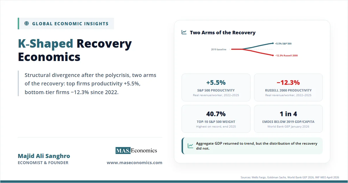
By April 2026, the S&P 500 was trading near record highs, and the Nasdaq-100 had returned roughly 21% in 2025, while more than one-quarter of emerging market and developing economies still had per capita incomes below their 2019 levels. The same gap appears inside national economies. Wells Fargo equity analysis found that productivity for the S&P 500 rose 5.5% from late 2022 to late 2025, while productivity for the small-cap Russell 2000 fell 12.3% over the same period. Two indices, one global economy, two completely different stories.
This is the empirical signature of a K-shaped recovery economics: a structural divergence, not a temporary bounce, in which one set of firms, sectors, regions, and households accelerated through the post-2020 polycrisis while another stagnated or fell behind. The pattern crosses borders, balance sheets, and skill levels. It has reshaped how economists think about recoveries, asset markets, and the distributional effects of monetary and fiscal policy.
Understanding the K shape matters because it changes the diagnosis. A standard recession ends when GDP returns to trend. A K-shaped recovery hides that aggregate trend recovery while leaving large segments of the economy structurally weaker, and it pushes the policy debate toward reskilling, competition policy, digital inclusion, and tax reform rather than further demand stimulus.
What the K‑Shape Means
A K-shaped recovery is a post-recession path in which different parts of the economy recover at sharply different speeds, with some segments rising rapidly while others stagnate or decline. Plotted on the same axes, the upper arm of the letter K traces the rebound of the leading sectors, firms, and households; the lower arm traces those left behind. Aggregate GDP can return to its pre-crisis trend even when large parts of the economy have not.
The shape is best understood by contrast with the four standard recovery paths economists use:
- V-shaped: a sharp drop followed by a rapid, broadly distributed rebound. The 1953 and 1990 US recessions broadly fit this pattern.
- U-shaped: an extended trough before output returns. The 1981–82 recession had a U-like profile.
- L-shaped: output falls and stays below trend for years, with no clear recovery path. Japan’s 1990s “lost decade” is the textbook case.
- W-shaped: a double-dip, with a partial recovery interrupted by a second downturn. The early 1980s in the US and parts of the eurozone after 2010 fit this profile.
The K is different in a fundamental way. The other shapes describe the path of aggregate output. The K describes the distribution of the recovery. It is possible, and in 2020–2026 has been observed, for the global economy to print V-like aggregate growth while the underlying composition is sharply K-shaped.
The post-2020 period is structurally distinct because of an unusual combination of three forces hitting simultaneously: monetary expansion at a scale unseen outside wartime, fiscal transfers calibrated to household income rather than employment, and a technology shock in artificial intelligence that arrived on top of an already digital-skill-biased economy. Each force, separately, would have been redistributive. Stacked together, they produced the divergence visible in equity returns, productivity figures, and per capita income data across the world.
AI Widens the K‑Gap
The clearest analytical core of the K-shaped recovery is the divergence opened by artificial intelligence. The pattern is documented across firm size, sector, and country, and the gap is widening rather than closing.
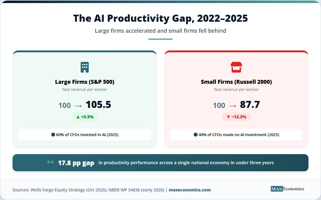
The headline firm-size figure comes from US equity data. Wells Fargo analysis found that real revenue per worker rose 5.5% for S&P 500 constituents between the late-2022 release of ChatGPT and late 2025, while it fell 12.3% for the small-cap Russell 2000 over the same period. That is a 17.8 percentage point productivity gap within a single national economy in less than three years, almost entirely associated with the unequal capacity to deploy AI tools.
The international evidence points in the same direction. A pair of NBER working papers released in early 2026 surveyed nearly 6,000 executives across the US, UK, Germany, and Australia, and almost 750 corporate CFOs. The CFO data show implied annual labour productivity gains of roughly 0.8% in high-skill services such as finance, with smaller but positive gains of about 0.4% in low-skill services, manufacturing, and construction. Among the executive sample, 89% reported no measurable impact of AI on their firm’s labour productivity over the prior year. Forty percent of CFO respondents had made no AI investment in 2025 at all.
This is what skill-biased technology change looks like in real time. The gains are not absent. They are concentrated. The productivity surplus accrues to firms that were already large, profitable, and digitally capable, and to workers whose tasks complement rather than compete with the technology. The OECD’s 2025 review of small and medium enterprise AI adoption documented a J-shaped productivity dynamic at the firm level, where output per worker often falls before it rises, because complementary investments in data infrastructure, workflow redesign, and worker training are needed before AI yields measurable returns. Firms without the cash flow or technical capacity to fund those complements stay on the flat part of the curve.
At the macro level, the divide shows up in three ways that mirror the analytical themes covered in the AI productivity paradox and the broader effects of AI on jobs and growth:
- Profit concentration. The top tech stocks accounted for 53% of the S&P 500’s return in 2025, according to Goldman Sachs Research. The top 10 firms reached 40.7% of total S&P 500 weight at the end of 2025, the highest concentration on record and roughly double the 2015 level.
- Capital intensity divergence. Hyperscaler capital expenditure on AI infrastructure as a share of US GDP is now well above the levels reached at the peak of the 1990s telecoms boom. That capital is generating value for firms that can monetise compute, and is largely unavailable to firms that cannot.
- Skill wage dispersion. Sector-level US productivity readings showed labour productivity rising 4.9% in Q3 2025 against an annual average of 2.0% since 2019, but with the gain heavily concentrated in technology-adjacent industries.
The macroeconomic implication is that aggregate productivity readings can rise even as the productivity distribution widens. The headline number conceals the structural gap.
Monetary Policy and Asset Prices
The second arm of the K is built by the asset price channel. Central bank rate cuts and large-scale asset purchases after 2020 transmitted to the real economy primarily through asset valuations, and asset valuations are unevenly held.
The distributional fact is straightforward. The top 1% of US households own roughly half of all equities, and the top 10% own about 87%. When monetary easing pushes equity and real estate prices higher, the resulting wealth effect is concentrated in households that already have significant balance sheets. Households without meaningful asset positions experience the same monetary easing primarily through cheaper credit, but cheaper credit does not produce the same balance-sheet repair as a 50% rise in stock prices.
This channel explains one of the strangest features of the post-2020 recovery: consumer sentiment readings hit record lows even as equity indices hit record highs. The two are not contradictory. They reflect two different economies, sharing the same currency and central bank but holding very different mixes of assets. The top 10% of US consumers now drive roughly half of all retail sales, which means consumption aggregates can hold up even when median sentiment is poor.
The asset price channel also intersects with monetary policy normalisation. As covered in the analysis of quantitative tightening, the unwinding of central bank balance sheets has been slower and more cautious than the easing phase, partly because policymakers feared dislocating asset prices that had already become structurally important to household consumption. The same reasoning is laid out in the article on asset price inflation: standard CPI measures missed much of what happened to balance sheets between 2020 and 2024, because the largest price changes were in stocks, houses, and other assets that consumer price indices are not designed to track.
Real estate followed the same logic. Falling mortgage rates in 2020–2021 and limited supply combined to push house prices up sharply across most advanced economies. Existing owners saw equity gains. Renters and first-time buyers saw the affordability gap widen. By 2024, US median house price-to-income ratios were near historic highs, and the wealth gap between owners and renters had widened in absolute terms, even where headline incomes were converging.
Labour Market Polarisation
The labour market expression of the K is polarisation rather than simple inequality. Earnings did not rise everywhere or fall everywhere. They diverged systematically by task type and remote-work feasibility.
The simplest split is between roles that can be performed remotely and roles that cannot. High-skill workers in software, finance, professional services, and management retained or expanded their earnings during 2020–2022, often capturing real-wage gains as labour markets tightened. Workers in in-person, low-wage roles in hospitality, retail, transport, and personal services experienced sharper income volatility, with employment falling during lockdowns, partially recovering during the “great resignation” wage surge of 2021–2022, and then re-fragmenting as platform-mediated work expanded. The detailed dynamics behind these moves are unpacked in the discussion of jobs reports and labour markets and the analysis of the gig economy.
The deeper pattern is skill-biased technical change accelerated by AI. Routine cognitive tasks are increasingly automatable, but so are some non-routine ones that previously required experienced human judgment. The result is a hollowing-out of mid-skill roles, with employment growing at the high-skill and low-skill ends and stagnating in the middle. A World Economic Forum survey of employers in early 2025 found that roughly 40% of firms expected to reduce headcount over the following five years in roles where AI could automate tasks, with the share rising in clerical, customer service, and routine analytical work.
This pattern is not new. It extends a labour market trajectory that has been documented across advanced economies since the 1980s. What is new is the speed. Earlier waves of skill-biased technical change unfolded over decades, giving education systems and labour-market institutions time to adapt. The AI wave is compressing the same adjustment into a few years, which is one of the structural reasons the recovery is K-shaped rather than U-shaped.
Geographic Divergence
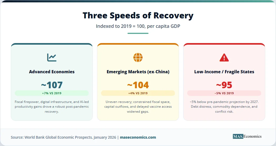
The K shape is also the shape of the global economy. Advanced economies recovered first and fastest. Emerging markets and developing economies recovered partially. Low-income and fragile states have not recovered at all in per capita terms.
The numbers are stark. According to the World Bank’s January 2026 Global Economic Prospects, advanced economies have recovered robustly, while more than one-quarter of emerging market and developing economies, particularly low-income countries and those affected by fragility and conflict, still have per capita incomes below pre-pandemic levels. The Bank’s chief economist projects that, on current forecasts, the average growth rate of the 2020s will be the lowest since the 1960s, with nearly all high-income economies richer in per capita terms than before the pandemic, but one in four developing countries poorer. Real per capita income growth in low-income countries is projected at about 2.8% per year in 2026–27, leaving real per capita incomes in low-income countries roughly 5% below pre-pandemic projections by 2027, with fragile states lagging further.
Three structural factors drove the divergence. Advanced economies had the fiscal firepower to run deficits of 10–15% of GDP in 2020–2021, the monetary credibility to cut rates aggressively without triggering capital flight, and the digital infrastructure to make remote work viable for a meaningful share of the workforce. Many emerging and developing economies had none of these. Fiscal space was already constrained before the pandemic. Capital outflows during 2020 forced procyclical rate hikes in some countries. Vaccine access lagged advanced economies by 12–18 months. Digital infrastructure for remote work was thin outside major cities.
The debt overhang is now binding. CEPR’s 2026 analysis documented that across 111 lower- and middle-income countries excluding China, external public debt has risen sharply, and a substantial fraction face elevated debt-distress risk. The dynamics behind this are explored in detail in the article on sovereign debt sustainability. The April 2026 IMF World Economic Outlook noted that pressures from the latest commodity-price shock are concentrated in commodity-importing emerging market and developing economies with pre-existing vulnerabilities.
The same divergence is reshaping global trade patterns, which is a separate question from whether the world is fragmenting. The data on trade volumes, examined in the analysis of deglobalization, show that global trade is being reorganised rather than collapsing, but the reorganisation is not neutral. Friend-shoring and supply-chain restructuring tend to favour middle-income economies with stable institutions and existing manufacturing bases, and to disadvantage low-income exporters of primary commodities.
The K‑Shape in Data
The K shape can be visualised by indexing the post-2020 recovery paths of leading and lagging segments to a common 2019 baseline. The chart below tracks four trajectories from 2019 through 2025: the Nasdaq-100, US large-cap S&P 500 productivity, US small-cap Russell 2000 productivity, and real per capita GDP in low-income countries.
Sources: S&P Dow Jones Indices, Wells Fargo Equity Strategy (October 2025), World Bank Global Economic Prospects (January 2026). Series indexed to 100 in 2019.
The two outer lines are the arms of the K. The Nasdaq-100 more than doubled. Low-income country real per capita GDP has barely cleared its 2019 level, and not at all once population growth and lost trend are accounted for. The middle two lines show the same divergence playing out inside a single national economy: large US firms gained ground, small US firms lost it, and the gap widened every year after 2022.
A complementary way to see the divergence is to compare structural indicators across leading and lagging segments. The table below summarises pre-crisis and post-crisis readings on five indicators where the divergence is clearest.
| Indicator | Leading segment, 2019 | Leading segment, 2025 | Lagging segment, 2019 | Lagging segment, 2025 |
|---|---|---|---|---|
| Real revenue per worker (US, indexed) | 100 (S&P 500) | 105.5 | 100 (Russell 2000) | 87.7 |
| Top-10 share of S&P 500 weight | ~22% | 40.7% | n/a | n/a |
| Real GDP per capita vs 2019 baseline | 100 (advanced economies) | ~107 | 100 (low-income countries) | ~95 |
| CFO survey: AI investment, 2025 | n/a | 60% adopters | n/a | 40% non-adopters |
| Equity ownership share, US | Top 10%: ~84% | Top 10%: ~87% | Bottom 90%: ~16% | Bottom 90%: ~13% |

|
||||
Analytical Limits of the K‑Shape
The K-shape framework is useful, but it has analytical limits worth naming. Three stand out.
The framework risks treating two arms as if they were homogeneous. They are not. The “upper arm” of US technology firms includes both AI-platform firms with sustainable cash flows and speculative names whose valuations could compress sharply if AI productivity gains disappoint. The “lower arm” of low-income economies includes commodity exporters that have benefited from elevated coffee, gold and precious metal prices, and commodity importers that have been squeezed. Aggregating across either arm hides important within-group variation.
The framework can also overstate persistence. There is a positive case for spillovers. Research on US technology hubs has found that each new technology job tends to be associated with several additional jobs in adjacent retail, education, and healthcare sectors. If those multipliers hold, productivity gains at the top of the K could, in time, lift wages and employment more broadly. The K-shape is then a phase, not a destination. Whether that happens depends on whether AI productivity gains diffuse beyond their initial firm-level concentration, which is precisely what the OECD evidence on small and medium enterprises suggests is not yet happening at scale.
And the K-shape framework is not a theory of causation. It describes a pattern. Causal attribution to monetary policy, fiscal transfers, technology, or trade requires careful identification, and different studies attribute different shares of the divergence to each force. The best honest summary is that all four contributed, and that their interaction was more important than any single one alone.
Policy Lessons from the K‑Shape
If the K shape is structural rather than cyclical, the policy agenda is different from what would follow a standard recession. Stimulus does not narrow the gap on its own because the binding constraints are skill, capital access, infrastructure, and market structure rather than aggregate demand.
Four policy areas have moved to the front of the debate. Reskilling and continuous-education programmes target the labour-market polarisation directly, focusing on transitions out of automatable mid-skill roles. Digital inclusion policy aims to lower the cost barrier to AI adoption for small and medium enterprises, recognising that the productivity gap between large and small firms is partly a complementary-investment gap. Competition policy is being rethought to account for the durable market power of platform incumbents whose moats include data, compute, and network effects rather than just price. Progressive tax reform, including capital gains and digital services taxes, is being considered in several jurisdictions as a partial offset to the asset price channel that drives the wealth divergence.
None of these tools is sufficient on its own. Each has well-documented trade-offs. Reskilling programmes have a mixed evaluation record. Digital inclusion subsidies risk being captured by larger firms. Competition policy in technology markets is moving slowly relative to the underlying market dynamics. Progressive taxation faces the standard incidence and capital-mobility constraints. The structural nature of the K shape means that policy needs to operate on several margins at once, which is harder politically and administratively than choosing a single instrument.
Demographics adds a further dimension. The analysis of the silver economy shows that ageing populations in advanced economies will tighten labour markets at the bottom of the K just as automation reduces demand for routine roles, with ambiguous net effects on wages. In emerging economies with younger populations, the binding constraint is job growth at a sufficient scale to absorb new entrants, which the World Bank’s projections currently suggest will not happen at the required pace.
MASEconomics Explains
4 economic concepts behind the K-shaped recovery
Conclusion
K-shaped recovery economics describes a structural divergence in which leading firms, sectors, regions, and households accelerated through the post-2020 polycrisis while others stagnated or fell behind. The pattern is documented in equity returns, productivity data, asset ownership, and per capita income figures across both advanced and developing economies. Three forces drove the divergence: monetary expansion that was transmitted through asset prices, fiscal transfers calibrated to income rather than employment, and an AI-led technology shock that accrued to firms with the scale and digital capacity to deploy it. The result is a gap that is widening rather than narrowing on current trends, with the top 10 firms now accounting for 40.7% of S&P 500 weight, low-income country per capita incomes still about 5% below pre-pandemic projections, and a 17.8 percentage point productivity gap between US large-cap and small-cap firms over three years. The structural nature of the divergence means standard demand-management tools are not enough; the binding constraints are skill, capital access, market structure, and infrastructure.
Did you find this article helpful? Share it with someone who loves economics. And remember, at MASEconomics, we make complex ideas simple.