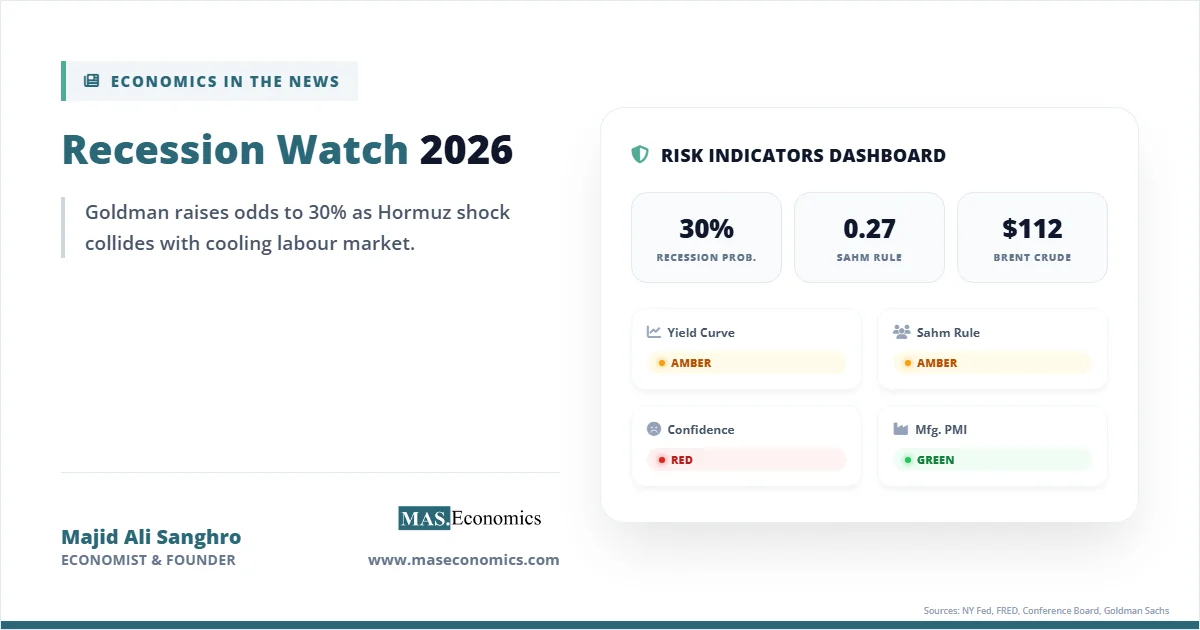
On March 24, 2026, Goldman Sachs raised its twelve‑month US recession probability from 25% to 30%. JPMorgan was already sitting at 35%. Brent crude broke past $112 per barrel after Iranian forces mined the Strait of Hormuz in late February, and the 10‑year/3‑month Treasury spread briefly slipped back into negative territory after spending most of late 2025 in positive ground. Recession watch headlines now dominate financial news in a way they have not since the autumn of 2022.
Goldman’s economists raised their odds because the Hormuz disruption pushed Brent toward $115, February payrolls fell by 92,000 (the first non‑recession monthly payroll loss since 2020), and the labour market that had buffered the economy for three years suddenly looked thinner. None of this guarantees a recession. The yield curve flashed red for 27 straight months between 2022 and 2024, and no recession arrived. The Sahm Rule triggered in July 2024 at 0.53, and the economy kept growing. Forecasters have been wrong, often, in the same direction.
Whether the indicators are flashing a real warning, or whether 2026 will join 2023 and 2024 as years without the predicted recession, depends on how each indicator works, where it fails, and how the war in Iran has changed the macro backdrop in ways the standard models do not fully capture.
How We Got Here
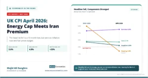
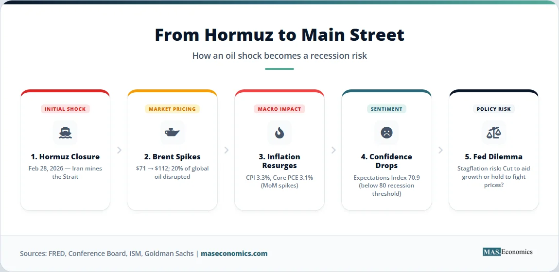
The chain reaction started on February 28, 2026, when US and Israeli forces began coordinated strikes on Iranian nuclear and missile sites. Iran responded by mining the Strait of Hormuz and harassing tanker traffic with fast attack boats. Around 20% of global oil and roughly a quarter of liquefied natural gas pass through that 21-mile channel. Within 72 hours, Brent crude jumped from near $71 to above $100, and by late March, it had cleared $112. For a deeper look at how energy shocks propagate through the macroeconomy, see our analysis of oil price shocks and the strategic stakes covered in our piece on the Strait of Hormuz.
An oil shock is not just a headline. It is an input cost rising across the entire economy at the same time. Diesel prices feed into trucking and freight. Jet fuel feeds into airline tickets and air cargo. Petrochemicals feed into plastics, fertilisers, and pharmaceuticals. The ISM Manufacturing Prices Paid Index hit 78.3 in March 2026, its highest reading since June 2022 and a 19.3-point jump in two months. Two-thirds of survey respondents reported negative comments, with about 40% citing the Iran war and 20% citing tariff uncertainty. The price pressure is real and broad-based.
From there, the shock cascades. Higher fuel prices cut into household budgets. The March 2026 Consumer Price Index report showed a 0.9% monthly jump, pushing headline inflation to 3.3%, the highest in nearly two years. Core PCE held at 3.1%. With real wages compressed, consumer spending slows. The Conference Board Consumer Confidence Expectations Index dropped to 70.9 in March, well below the 80 threshold that historically signals impending recession. Business investment freezes because firms cannot price contracts in a regime where energy costs swing 50% in six weeks. And mortgage rates, which had eased toward 6.4% in late 2025, climbed back above 7.1% as the 10-year Treasury yield surged past 4.30% on inflation fears, tightening the housing channel covered in our housing affordability analysis.
A geopolitical shock has become a macro-financial shock. The mechanism is older than the data: 1973, 1979, 1990, and 2008 all involved oil disruptions that translated into recessions. The question is whether 2026 will follow the same script.
How Economists Predict Recessions
Economists have spent half a century building tools to anticipate downturns. None of them works perfectly. Each captures part of the economy and misses other parts, which is why professional forecasters watch a dashboard rather than a single dial.
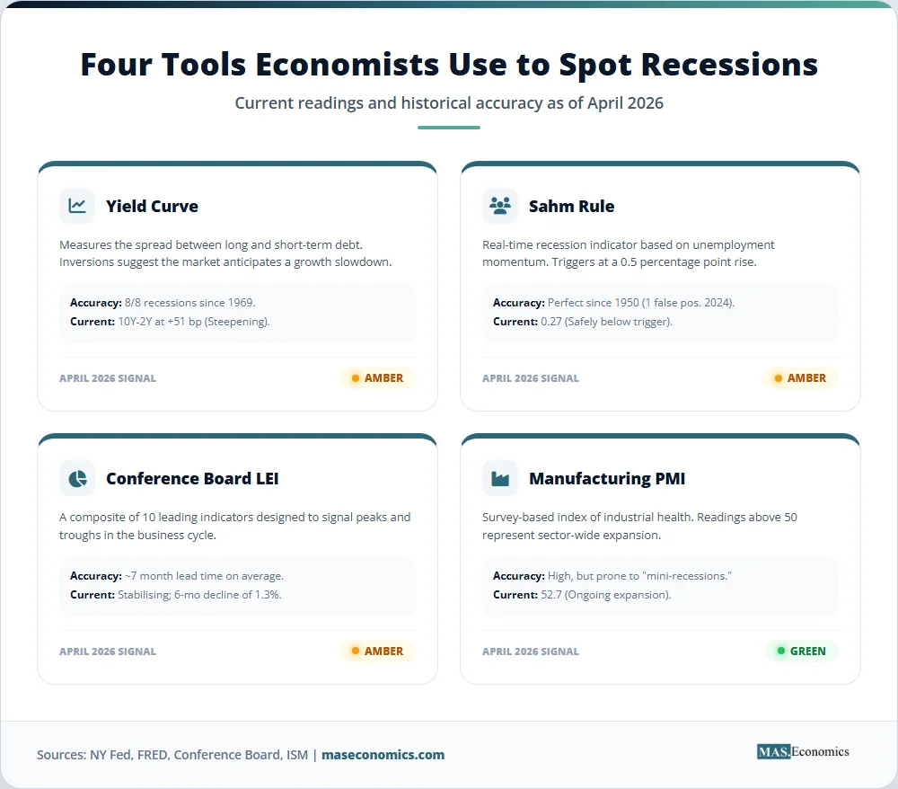
The most-watched leading indicator is the Treasury yield curve. The standard measure is the spread between the 10-year and 2-year Treasury yields. When short rates exceed long rates (an inverted curve), markets are pricing in expected rate cuts, usually because investors anticipate weaker growth or recession. The New York Fed’s yield curve model, which uses the 10-year/3-month spread, currently assigns roughly a 25% probability of recession by November 2026. The track record is striking: an inverted curve has preceded each of the last eight US recessions. The lead time averages 11 to 18 months from first inversion. After the curve inverts, recessions have historically arrived within 4 to 12 months. The curve inverted in late 2024 after a record 27-month inversion. By that timing, late 2025 to mid-2026 was always going to be the danger zone.
The second tool is the Sahm Rule, developed by economist Claudia Sahm in 2019. The rule signals recession when the three-month moving average of the unemployment rate rises 0.5 percentage points or more above its low in the prior twelve months. The FRED real-time Sahm Rule reading for February 2026 sat at 0.27, below the 0.5 trigger, but climbing. The rule is simple, uses one data series, and is triggered in the early months of every US recession since 1950, with only one false positive (1959). The exception came in July 2024, when the rule triggered at 0.53 against a backdrop of GDP still growing at 4.4% annualised. No recession followed. Sahm herself argued the trigger was distorted by post-pandemic labour force re-entry, where rising unemployment reflected new workers searching rather than job losses.
The third tool is the Conference Board Leading Economic Index (LEI). The LEI bundles ten components, including building permits, the S&P 500, the interest rate spread, average weekly manufacturing hours, ISM new orders, and consumer expectations. The LEI fell 0.1% in January 2026 to 97.5, declining for the 23rd month in 27 (the rebased index uses 2016 = 100). The Conference Board’s “3Ds” recession rule (duration, depth, diffusion) had been triggered for much of 2023 and 2024, predicting a recession that never came. The index now sits in a “weak but stabilising” zone, which is why the Conference Board itself recently downgraded 2026 GDP growth to 2.0% rather than calling outright contraction.
Then there are the PMI surveys. The ISM Manufacturing PMI hit 52.7 in March 2026, the third straight month of expansion and the strongest reading since 2022. The Services PMI registered 54.0. Both are above the 50 expansion threshold and well above the 47.5 level that historically signals overall economic contraction. Yet the internals are uneasy: the Manufacturing Employment Index has been in contraction for 30 consecutive months, and the Services Employment Index dropped to 45.2 in March from 51.8 in February. PMIs have generated false positives twice in the past decade, particularly in 2015 and 2022, when manufacturing weakness did not translate into broader recessions.
Other indicators round out the dashboard: jobless claims, credit spreads, the National Financial Conditions Index, the New York Fed’s Weekly Economic Index, and consumer credit delinquency rates. No single number gives a verdict. The professional approach is to watch the cluster and weight signals based on how the broader economy is behaving.
What Makes Recessions Hard to Predict
Forecasting recessions is hard because the economy is not a machine. It is a complex adaptive system in which firms, workers, central banks, and markets all react to each other in real time. A signal that worked in 1980 may not work in 2026 because the underlying structure has changed.
The shift from manufacturing to services is one example. In 1970, manufacturing accounted for 24% of US GDP. In 2025, it accounted for around 10%. Indicators built on factory data (PMIs, industrial production, durable goods orders) now capture a smaller slice of the economy. Services, which dominate household spending and employment, are inherently harder to measure with timely data. A manufacturing recession in 2015 to 2016 did not become a broader recession because the service sector kept growing. The same may be happening now in reverse: service employment is softening while manufacturing expands.
Globalisation is another structural shift. US recessions used to be largely domestic affairs. Now, supply chains run through Vietnam, Mexico, China, and Germany. A recession in Europe or a property crisis in China can soften US export demand without showing up in domestic indicators until quarters later. The yield curve and the Sahm Rule were calibrated on a more closed economy.
Monetary policy frameworks have changed as well. The Federal Reserve adopted explicit inflation targeting in 2012 and flexible average inflation targeting in 2020. Forward guidance, quantitative easing, and quantitative tightening shape long-term yields in ways that distort the yield curve’s traditional signal. Goldman Sachs economists argued in 2023 that much of the inversion reflected investors pricing in low long-run real rates rather than recession odds. They were partly right: the recession did not come.
The 2022 to 2024 episode is the most recent humility lesson. The yield curve inverted in July 2022. The Sahm Rule triggered in July 2024. The LEI flashed recession warnings continuously from late 2022 through 2024. Goldman, JPMorgan, and the Fed itself all raised recession odds above 50% at various points. None of it materialised. Real GDP grew 2.5% in 2023 and 2.8% in 2024. Unemployment rose modestly but stayed below 4.5% for most of the period. The economy absorbed the most aggressive Fed tightening cycle since the 1980s without breaking. Why?
Three answers stand out. First, household and corporate balance sheets entered the cycle unusually strong, thanks to pandemic-era fiscal transfers and locked-in low mortgage rates. Second, immigration boosted labour supply, which kept wage growth from spiralling and gave the Fed room to slow without triggering layoffs. Third, the AI investment boom (covered in our piece on the AI productivity paradox) added a new source of business investment that the historical models did not anticipate. The lesson is not that the indicators are useless. It is that they are conditional on a backdrop that can shift faster than the indicators do.
The Indicator Dashboard
The chart below tracks the 10-year minus 2-year Treasury spread from 1980 to early 2026, with NBER recessions shaded and the Sahm Rule reading overlaid as a secondary line. The pattern is unmistakable: every recession since 1980 was preceded by an inversion of the yield curve and (since 1990) a Sahm Rule trigger. The 2022 to 2024 false alarm shows up as the deepest and longest inversion of the modern era, followed by no recession.
Sources: Federal Reserve Bank of St. Louis (T10Y2Y series), FRED Real-time Sahm Rule Recession Indicator, NBER recession dating committee. Data through March 2026.
Table 1 below summarises the current status of the main recession indicators as of late April 2026, with a verdict for each. Red means historical thresholds breached. Amber means warning territory. Green means no signal.
Table 1 below summarises the current status of the main recession indicators as of late April 2026, with a verdict for each. Red means historical thresholds breached. Amber means warning territory. Green means no signal.
| Indicator | Latest Reading | Threshold | Status | Verdict |
|---|---|---|---|---|
| 10Y-2Y Treasury spread | +51 bp (April 2026) | Negative = inversion | Un-inverted after 27 months; 10Y-3M briefly negative again in March | Amber |
| NY Fed yield-curve recession model | ~25% probability by Nov 2026 | Above 30% = elevated | Elevated but not red | Amber |
| Sahm Rule (real-time) | 0.27 (Feb 2026) | Trigger at 0.50 | Below trigger; rising | Amber |
| Conference Board LEI (6-mo change) | -1.3% (Jul 2025 to Jan 2026) | 3Ds rule at -4.1% | Weak but moderating; below recession trigger | Amber |
| ISM Manufacturing PMI | 52.7 (March 2026) | 50 = expansion | Third month of expansion | Green |
| ISM Services PMI | 54.0 (March 2026) | 50 = expansion | 70th straight month of expansion | Green |
| Consumer Confidence Expectations | 70.9 (March 2026) | Below 80 = recession warning | Below threshold | Red |
| Brent crude price change (3-mo) | +58% (Jan to Apr 2026) | +50% historically precedes recession | Threshold breached | Red |
| Goldman Sachs recession probability | 30% (March 2026) | Above 35% = elevated | Below elevated; rising | Amber |
 | ||||
Table 1. Recession Indicator Dashboard: Status of Key Signals as of April 2026. Data sourced from the Federal Reserve Bank of New York, the Conference Board, the Institute for Supply Management, FRED, and Goldman Sachs Global Investment Research.
The dashboard tells a coherent story. No single indicator is screaming red across the board, but the cluster has tilted from green-amber in late 2025 to amber-red in early 2026. Two things stand out. The hard data on activity (PMIs, employment in services until February) had been resilient. The forward-looking and price data (consumer expectations, oil prices, and ISM prices paid) have deteriorated sharply. That divergence is exactly what the early phase of a recession looks like, but it is also what stagflation looks like, and it is also what a brief energy shock looks like before activity rebounds.
Inflation, Rates, and the Fed
The Federal Reserve faces the worst kind of policy problem: a supply shock that pushes inflation up and growth down at the same time. The textbook response to inflation is to raise rates. The textbook response to slowing growth is to cut them. The Fed cannot do both. For background on how the Fed and other major central banks are navigating this, see our piece on central bank interest rate decisions.
Three historical episodes show the dilemma. From 1973 to 1974, the OPEC oil embargo quadrupled crude prices. The Fed under Arthur Burns kept rates accommodative to protect employment. The result was the Great Inflation of the 1970s, with CPI peaking near 14% by 1980. In 1990, Saddam Hussein’s invasion of Kuwait doubled oil prices over six weeks. The Fed under Alan Greenspan held rates steady. A short, mild recession arrived in 1990 to 1991, lasting eight months. In 2008, oil prices spiked to $147 per barrel just as the housing market was unraveling, covered in our piece on the 2008 financial crisis. The Fed cut rates aggressively, but the financial crisis swamped the supply shock, and the economy contracted by 4.3%.
The 2026 setup most closely resembles 1990. The shock is geopolitical and energy-driven. The Fed funds rate sits at 3.50% to 3.75%, lower than at the start of past oil shocks but higher than the post-pandemic floor. Inflation is running at 3.3% headline and 3.1% core PCE, well above the 2% target. CPI, PCE, and PPI reports all point in the same direction. If the Fed cuts to support growth, it risks unanchoring inflation expectations that have only recently stabilised. If it holds or hikes to fight inflation, it risks tipping a fragile economy into recession.
Markets are currently pricing the Fed to hold through mid-2026 and cut roughly 50 basis points by year-end, conditional on the Hormuz disruption easing. That pricing assumes a roughly six-week supply shock, the same baseline Goldman uses. A longer disruption (say, six months) would force the Fed to choose. The historical record suggests that when central banks face such a choice in a high-inflation regime, they protect price stability and accept the recession. Paul Volcker did exactly that in 1981.
What a Recession Would Look Like
If a recession does arrive, the path is reasonably well-mapped from past experience. Recessions in the post-1990 era have averaged 10 months in length. Real GDP typically contracts by 1.5% to 4% peak-to-trough. Unemployment rises by 2 to 4 percentage points; for context, see jobs reports and labour markets for how to read the underlying data. Consumer spending falls by 1% to 3%. Business investment falls by 5% to 15%. Stock markets typically decline 20% to 35% peak-to-trough, and credit spreads widen sharply.
The fiscal impact is substantial. Recessions reduce tax revenues and increase outlays on unemployment insurance, food assistance, and Medicaid. The Congressional Budget Office estimates that a moderate recession would push the federal deficit by an additional $1.5 trillion over two years. Federal debt held by the public would rise by 4 to 6 percentage points of GDP. State and local governments, which generally cannot run deficits, would cut spending and lay off workers, which historically deepens the downturn.
Housing typically falls in real terms by 5% to 15%, though regional patterns vary. Mortgage delinquencies rise. Auto loan delinquencies rise faster, and credit card delinquencies rise fastest. The 2008 to 2009 episode was an outlier in housing because of the leverage built up during the bubble years; the 2026 housing inventory is much tighter, which would limit the price decline. GDP growth data usually confirms a recession only after the fact, with the NBER’s official dating typically arriving 6 to 18 months after the recession begins.
Two things differentiate the current setup from past recessions. First, federal debt sits at roughly 100% of GDP, the highest peacetime level since World War II, which limits fiscal space for stimulus. Second, the Fed’s balance sheet is still elevated from quantitative easing, which limits how aggressively it can use balance sheet tools. A 2026 recession, if it happens, would be a recession the policy toolkit is less prepared for than the 2008 or 2020 versions.
MASEconomics Explains
4 economic concepts behind recession watch
Conclusion
The recession watch of 2026 sits in genuinely uncertain ground. The yield curve, the Sahm Rule, the LEI, consumer expectations, and oil prices have all moved into amber or red territory. The PMIs and the headline unemployment rate have not. Goldman puts the odds at 30%. JPMorgan at 35%. The New York Fed model at 25%. Prediction markets cluster around 26%. The base case among professional forecasters remains slow growth, not contraction, but the range of plausible outcomes has widened sharply since the Hormuz closure.
Three variables will decide the outcome. The first is the duration of the oil shock. A six-week disruption is absorbable. A six-month disruption forces the Fed into a stagflation choice. The second is the labour market. The February payroll loss may be a statistical anomaly, or it may be the first month of a deteriorating trend. The March and April reports will be telling. The third is the credit cycle. Recessions in the post-war era have always involved a credit squeeze, and credit spreads remain narrow. If they widen sharply, the warning shifts from amber to red.
Economic forecasting is humbler in 2026 than it was in 2007. The 2022 to 2024 episode demonstrated that the standard indicators can flash for years without delivering the recession they predict. The current cluster of warnings is real, but so is the possibility that a soft landing, a mild slowdown, or even a stagflationary muddle is the actual destination. The dashboard does not yield a verdict. It points to elevated risk and a wider distribution of outcomes than at any point since 2008.
Did you find this article helpful? Share it with someone who loves economics. And remember, at MASEconomics, we make complex ideas simple.