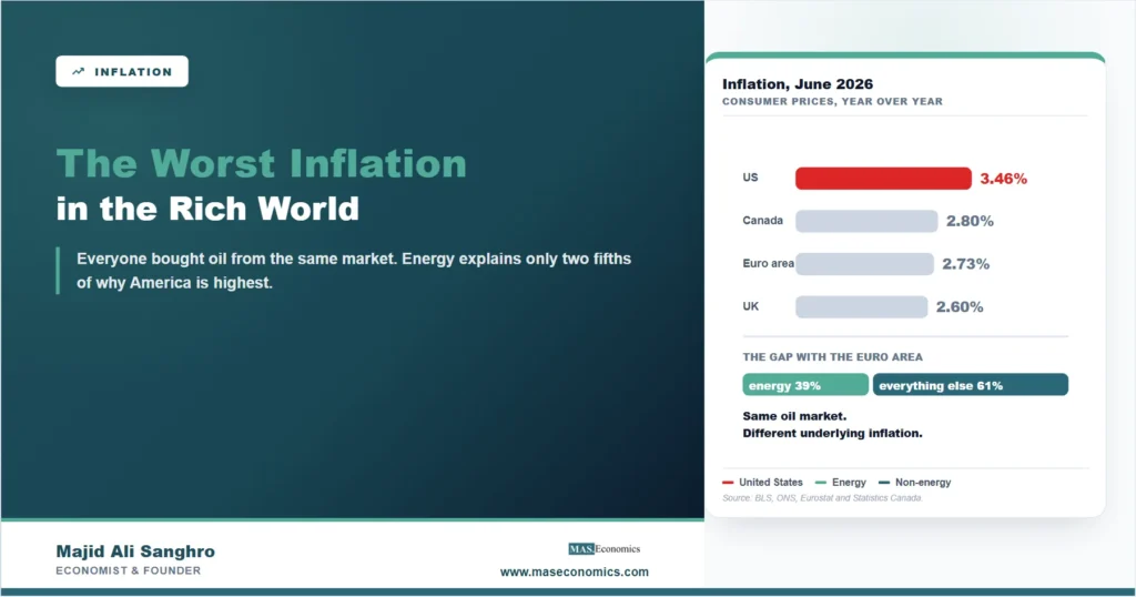
Three years ago the United States was the disinflation success story. In June 2023 American consumer prices were rising at 3.07 percent while Britain was still at 7.90 percent and the euro area at 5.51 percent, and the American experience was cited as evidence that a central bank could bring prices down without a recession. That ranking has now inverted. In June 2026 US inflation was 3.46 percent, against 2.80 percent in Canada, 2.73 percent in the euro area and 2.60 percent in the United Kingdom. Of the four largest rich economies, the United States now has the fastest rising prices.
The explanation that follows almost automatically is oil. The Middle East war that began on 28 February 2026 sent Brent crude from about $72 to $118 a barrel within a month, American gasoline went from $2.78 a gallon in January to $4.50 in May, and the timing fits the inflation data almost perfectly. That explanation is correct about why American inflation rose. It is not sufficient to explain why American inflation is higher than everybody else’s, and the difference between those two questions is the whole of this article.
The Rise Really Is Energy, and the Dates Are Unusually Clean
Start with the part that holds up, because it holds up well.
| Month | Headline CPI, year over year | Energy CPI, year over year |
|---|---|---|
| January 2026 | 2.39% | −0.30% |
| February 2026 | 2.43% | +0.40% |
| March 2026 | 3.29% | +12.59% |
| April 2026 | 3.78% | +17.54% |
| May 2026 | 4.17% | +22.97% |
| June 2026 | 3.46% | +15.45% |

|
||
In February, energy prices were essentially flat against a year earlier and headline inflation was 2.43 percent, close enough to target that the argument had moved on to other things. The war began on 28 February. By May, energy was up almost 23 percent over the year and headline inflation was 4.17 percent. Two months of a commodity shock added roughly a point and three quarters to the measured inflation rate of the largest economy in the world.
The pump price makes the same point in a unit people actually handle. Regular gasoline bottomed at $2.779 a gallon on 12 January 2026 and reached $4.500 on 11 May, a rise of 61.9 percent inside four months. It has since eased to $4.079. For a household driving 12,000 miles a year in a vehicle doing 25 miles to the gallon, the move from January to May was about $825 a year in additional fuel spending, arriving without warning and without any change in behaviour that could avoid it. The broader consequences of that shock across the world economy are covered in the article on how the Hormuz crisis reshaped the global economy.
So the rise is energy. That much is settled, and the monthly dates settle it without any modelling.
But the Euro Area Bought Oil From the Same Market
Here is where the usual account stops and where the interesting question starts.
Oil is priced globally. The war did not raise the price of crude for Americans and leave it unchanged for Germans. Every economy in the comparison imports oil at a world price that moved by the same percentage on the same days. If the shock alone explained why American inflation is highest, it would have to be true that the shock hit America harder, and that is a claim which can be tested rather than assumed.
Look at the last six months of the chart. All four lines turn upward after the war, which is what a common global shock should do. But the American line turns up further and stays higher, and by June it sits about seven tenths of a point above the next economy on the list. Something beyond the shared oil price is doing work.
The Last Time This Happened It Was Europe’s Turn
Before going further it is worth looking at the mirror image, because the current situation has a recent precedent running in the opposite direction, and it tells you something about how these episodes end.
American inflation peaked at 8.98 percent in June 2022. Euro-area inflation peaked four months later at 10.62 percent, and British inflation at 11.10 percent in the same month. By June 2023 the American rate had fallen to 3.07 percent while the euro area was still at 5.51 and the United Kingdom at 7.90. The United States peaked earlier, peaked lower, and came down faster, and a great deal was written at the time about what American policy had done right.
Some of that was policy. A good deal of it was the composition of the shock. Europe’s 2022 inflation was, to an unusual degree, an energy event: the loss of piped Russian gas hit European electricity and heating prices far harder than anything the United States experienced, and gas contracts repriced slowly, so the shock took much longer to work through the annual comparison. The American inflation of 2021 and 2022 had a larger demand component and a shorter-lived goods component, and both faded sooner.
The lesson is not that Europe was worse at managing inflation. It is that the country whose price index contains the largest exposure to whichever commodity has just moved will look worst for about a year, and will then look better, largely independently of what its central bank did. In 2022 that was Europe and gas. In 2026 it is the United States and oil, for the straightforward reason that Americans consume far more fuel per person and pay far less tax on it, so the pre-tax crude price is a larger share of what they hand over at the pump.
That is a reason to expect the energy portion of the current American gap to close on its own timetable. It is not a reason to expect the rest of it to.
The Standard Test Is Core Inflation, and It Cannot Answer This
The instinct at this point is to look at core inflation, which strips out food and energy precisely so that a temporary commodity move does not distort the picture. The reasoning behind that measure is set out in the article on why the Federal Reserve looks through food and energy. It is the right instinct and, for this particular comparison, it does not work.
The reason is that core does not mean the same thing in each of these four countries.
| Economy | Core rate, June 2026 | What the official core measure excludes |
|---|---|---|
| United Kingdom | 2.60% | Energy, food, alcohol and tobacco |
| United States | 2.57% | Food and energy |
| Euro area | 2.36% | Energy, food, alcohol and tobacco |
| Canada | 2.14% | The eight most volatile components, and the effect of changes in indirect taxes |
|
|
||
American core excludes food and energy. British and euro-area core also strip out alcohol and tobacco, which are heavily taxed and move with duty changes rather than with demand. Canada’s headline core measure removes the eight most volatile components and then adjusts for indirect taxes as well. Ranking those four numbers against each other is not a comparison of underlying inflation. It is a comparison of four national conventions about what counts as noise. This is the same problem as the four cases described in the piece on how to read conflicting economic statistics, and the discipline it recommends applies here: find the measure that is defined identically before drawing the league table.
That measure exists. Every one of these statistical agencies publishes an index for all items excluding energy alone, on a common definition, and it is the right instrument for this question because energy is exactly what the shock moved.
Energy Explains Two Fifths of the Gap, Not All of It
Comparing the United States with the euro area on that basis produces the central result of this article.
| Measure | United States | Euro area | Difference |
|---|---|---|---|
| Headline inflation | 3.46% | 2.73% | 0.73 points |
| Inflation excluding energy | 2.63% | 2.18% | 0.45 points |
| What energy contributes | 0.84 points | 0.55 points | 0.28 points |
|
|
|||
Energy is adding 0.84 points to American inflation and 0.55 points to euro-area inflation. So the shock did land somewhat harder on the United States, which is consistent with an economy that consumes more fuel per person and taxes it far less, so that a given move in the crude price passes through to the pump as a larger percentage change.
But that difference is 0.28 points, and the total gap is 0.73. Energy accounts for about two fifths of the distance between American and euro-area inflation. The remaining three fifths is everything else. Excluding energy entirely, American prices are rising at 2.63 percent and euro-area prices at 2.18 percent. The United States has more underlying inflation as well, and that part has nothing to do with the war.
This is the sentence that most coverage of the June figures did not contain, and it changes what the number means. An energy shock is a price level event that passes out of the annual comparison twelve months later without anyone doing anything. Underlying inflation running four tenths of a point above your peers does not pass out of anything on its own.
The Obvious Objection, Tested and Rejected
There is a good objection to that conclusion and it deserves to be taken seriously rather than waved away, because if it held, the finding above would dissolve.
American and European inflation are not measured on the same basket. The United States consumer price index includes owners’ equivalent rent, an estimate of what homeowners would pay to rent their own homes, and it is one of the largest single components of the index. The euro area’s harmonised index excludes owner-occupied housing altogether. American house prices and rents have been strong for years. So perhaps the entire non-energy gap is a housing artefact rather than an economic fact.
The test is straightforward. Strip shelter out of the American index and see what happens to the gap. If the objection is right, the gap should shrink.
It does the opposite. American inflation excluding shelter is 3.58 percent, which is higher than the 3.46 percent headline. Shelter is currently pulling the American index down by about a tenth of a point, not pushing it up, with owners’ equivalent rent rising 3.25 percent against a headline of 3.46. Removing the component that the euro area does not measure widens the gap over the euro area from 0.73 points to 0.84.
The housing explanation is not merely insufficient. It runs the wrong way. Whatever is keeping American inflation above its peers, it is not the rent that only American statisticians count.
What This Means for the Rate Decision
The practical consequence is a policy setting that looks strange when the two facts are placed side by side.
The Federal Reserve has been easing. The effective federal funds rate has fallen 170 basis points since September 2024, to 3.63 percent in July 2026. The European Central Bank’s deposit rate is 2.25 percent. So the United States has both the higher policy rate and the higher inflation, and it is the one that has been cutting into a rising price level. The article on why those cuts have not reached the mortgage market covers what happened to the rates households actually pay, which is a separate failure and a compounding one.
A central bank is generally right to look through an energy shock. Raising rates does not produce oil, the price effect drops out of the annual comparison after twelve months, and tightening into a supply shock buys lower output for very little lower inflation. That case is sound, and the reasoning about why policy cannot correct a supply disturbance is set out in the discussion of why central banks struggle to time their responses.
The difficulty is that looking through the shock does not dispose of the 0.45 points that are not the shock. And there is a second-round risk that the decomposition sharpens rather than settles. A fuel price that rises 62 percent in four months is the most visible price in the economy, posted in large numbers on every main road. It moves what people expect future inflation to be, and expectations feed into wage bargaining and price setting, which is the mechanism described in the article on how inflation expectations work. A temporary shock becomes permanent through that channel, or it does not, and which one happens is partly a matter of whether the central bank is seen to be responding.
Why the American Number Travels
An American inflation rate is not a domestic statistic, and the channel by which it reaches other countries is more direct than most readers assume.
The Federal Reserve’s decisions are taken with reference to American conditions and transmitted to the world through the dollar. When American inflation runs above its peers, the expected path of American interest rates shifts, the dollar moves against other currencies, and every country that imports goods priced in dollars sees its own import costs change without any domestic policy decision. Oil is priced in dollars, so an economy importing crude faces both the commodity move and the currency move, and for most countries those compound rather than offset. The mechanics of how the major central banks transmit these decisions are covered in the piece on how the Fed, the ECB and the Bank of England shape your economy.
There is a further consequence for anyone reading economic coverage from a distance. Because the four economies publish core measures on four different definitions, cross-country inflation comparisons in the press are frequently not comparisons at all. The remedy is unglamorous and reliable: check what the measure excludes before believing a ranking, and prefer a series defined identically across the countries being compared, even if it is less familiar than the one everyone quotes.
MASEconomics Explains
3 economic concepts behind the inflation ranking
These concepts are explored in depth across our educational articles library.
Conclusion
US inflation at 3.46 percent is the highest of the four largest rich economies, ahead of Canada at 2.80, the euro area at 2.73 and the United Kingdom at 2.60. That is a reversal of the 2023 position, when the United States had the lowest rate of the four and was held up as the example of a successful disinflation.
The reason American inflation rose is the energy shock, and the monthly data establish it without argument: energy went from flat in February to almost 23 percent above its year-earlier level by May, and headline inflation followed it from 2.43 to 4.17 percent. The reason American inflation is higher than everybody else’s is only partly that shock. Splitting the gap on an identically defined measure puts energy at about two fifths of the difference with the euro area, and the other three fifths is underlying inflation that the war did not cause. Stripping out shelter, the component that only the American index contains, widens that gap rather than closing it.
The distinction matters because the two halves behave differently. The energy half will leave the annual comparison of its own accord roughly twelve months after the price stopped rising, and no policy is needed to remove it. The other half will not. Anyone tracking whether American inflation is genuinely converging on its peers should watch the series excluding energy rather than the headline, because that is where the answer will appear first, and it will appear there some months before it appears anywhere else.
Frequently Asked Questions
Which rich economy has the highest inflation right now?
The United States. In June 2026 American consumer prices were 3.46 percent above a year earlier, against 2.80 percent in Canada, 2.73 percent in the euro area and 2.60 percent in the United Kingdom. The American figure is the highest of the four by about seven tenths of a point.
Is high US inflation just the oil shock?
Partly. Energy contributes 0.84 points to American inflation and 0.55 points to euro-area inflation, so it explains about two fifths of the 0.73 point gap between them. The other three fifths is non-energy inflation: excluding energy, American prices are rising 2.63 percent against 2.18 percent in the euro area.
Why can’t core inflation settle the comparison?
Because core is defined differently in each country. American core excludes food and energy. British and euro-area core also exclude alcohol and tobacco. Canada’s measure removes the eight most volatile components and adjusts for indirect taxes. Ranking those four is a comparison of national conventions, not of underlying inflation. A measure excluding energy alone is defined the same way everywhere and is the correct instrument here.
Is American inflation higher only because US statistics count housing differently?
No, and the test runs the other way. The American index includes owners’ equivalent rent while the euro area’s excludes owner-occupied housing. But American inflation excluding shelter is 3.58 percent, higher than the 3.46 percent headline, because shelter is currently pulling the index down. Removing it widens the gap over the euro area from 0.73 to 0.84 points.
How much did gasoline prices rise in 2026?
Regular gasoline went from $2.779 a gallon on 12 January 2026 to $4.500 on 11 May, a rise of 61.9 percent in four months, and has since eased to $4.079. For a household driving 12,000 miles a year at 25 miles per gallon, the January to May move was roughly $825 a year in extra fuel spending.
Should the Federal Reserve raise rates because of this?
Central banks generally look through energy shocks, because higher interest rates cannot produce more oil and the price effect leaves the annual comparison after twelve months. That case is sound for the energy component. It does not address the non-energy gap, and the risk that a highly visible fuel price shifts inflation expectations is the reason the decision is not straightforward.
Thanks for reading! Whenever two countries appear to have different inflation, it is worth checking whether they are counting the same things before deciding why. Happy learning with MASEconomics