Two households own the same land, work the same hours and face the same prices. One holds enough savings to buy a cow; the other does not. Ten years later the first has a herd and the second is still selling labour by the day. Nothing separated them except a starting stock that sat on the wrong side of a threshold, and that is the entire content of a poverty trap: a situation in which being poor is itself the reason for staying poor, so that identical people with different starting points converge to permanently different outcomes. The model matters because it changes what policy is for. If poverty is a slow climb, help speeds it up. If it is a trap, help that is too small does nothing at all, and the same money delivered as one large transfer can change everything.
What Makes a Trap a Trap
Standard growth models predict the opposite of a trap. In the Solow-Swan model, capital has diminishing returns, so a poor economy with little capital earns a high return on each additional unit and grows faster than a rich one. Poor countries should catch up, and poor households should converge on rich ones. That prediction is the benchmark a poverty trap has to break.
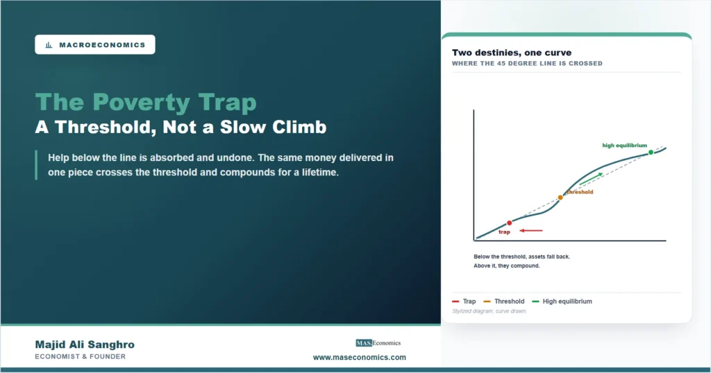
It breaks when returns to capital are low at low levels of capital rather than high. That single reversal produces everything else. Suppose a household’s income depends on its assets, that it saves a fraction of income, and that assets next year are savings plus what is left after depreciation. Plot next year’s assets against this year’s, and compare that curve with the 45 degree line where assets are unchanged. If the relationship is a straight concave curve, it crosses the line once and every household converges to the same place. If it is S-shaped, low at the bottom, steep in the middle, flattening at the top, it crosses three times, and the middle crossing is a threshold that divides the world in two.
Read the diagram from any starting point and the logic is inescapable. Below the threshold, next year’s assets are lower than this year’s, so the household slides back to the low crossing and stays there. Above it, assets grow until the high crossing. The threshold itself is an equilibrium nobody rests at, because the smallest push in either direction sends a household away from it. Two households a hair apart end up in different worlds, and the difference is not effort, ability or prices. It is the initial stock.
Where the S Shape Comes From
The model is only as good as the reason for the S, and there are several, each with different policy implications. The oldest is a coordination story. Ragnar Nurkse described a vicious circle in which low income means low saving, low saving means little investment, little investment means low productivity, and low productivity returns you to low income. Paul Rosenstein-Rodan’s version was about scale: a single factory in a poor region fails because there is no market for its output and no supplier for its inputs, while many factories built at once become each other’s customers. Neither firm moves alone, so the economy stays at the low equilibrium. The prescription that follows is the big push, an investment large enough and broad enough to move the whole system past the threshold, and it is the intellectual ancestor of every industrial strategy since, including the argument in our article on the revival of industrial policy.
The second family is about the human body and the household balance sheet. Below a certain level of nutrition, a worker cannot supply much physical labour, so income stays too low to buy the food that would raise it. The same shape appears without biology when assets are lumpy: a rickshaw, a sewing machine or a cow cannot be bought in fractions, so a household saving toward one earns nothing on its partial savings and is repeatedly knocked back by shocks before reaching the purchase. Credit would dissolve the problem, which is exactly why it does not exist for these households, for the reasons set out in credit rationing: lenders who cannot tell borrowers apart ration credit rather than raise rates, and the poorest are the first to be rationed out. Insurance is missing for the same reason, so a bad harvest is absorbed by selling the productive asset, which returns the household below the threshold it spent years crossing.
A third family works through people rather than capital. Where schooling and health are the assets, as in our explainer on human capital, poor parents underinvest in children who then earn too little to invest in theirs, and the trap runs across generations rather than within a lifetime. A fourth is geographic and institutional: a landlocked region with disease burden and no road earns low returns on any investment, and an economy whose institutions do not protect returns produces the same flatness at the bottom for entirely different reasons.
| Mechanism | Why returns are low at the bottom | What the policy has to do | Evidence at household level |
|---|---|---|---|
| Coordination and scale | One firm has no market and no suppliers; many firms together do | Move many sectors at once: the big push | Indirect; the case rests on regional and historical episodes |
| Nutrition and lumpy assets | Partial savings earn nothing, and shocks reset them before the asset is bought | Transfer the whole asset at once, and protect it against shocks | Strongest; asset-transfer programmes show threshold behaviour |
| Missing credit and insurance | The poorest are rationed out, so the gap cannot be bridged by borrowing | Credit or insurance where it can be delivered; otherwise transfers | Strong on rationing, mixed on whether microcredit alone lifts households out |
| Human capital across generations | Poor parents underinvest in children, who repeat the pattern | Schooling, health and nutrition aimed at the child, not the earner | Strong on returns to schooling; slow, since the payoff is a generation away |

|
|||
The Evidence Is Strong for Households and Weak for Countries
The honest summary of forty years of work is that the model is well supported at one level of aggregation and poorly supported at another, and conflating the two is the most common error made with it.
At the level of whole countries, the trap is hard to find in the data. If poor countries were caught at a low equilibrium, growth rates should be systematically lowest among the poorest and the world income distribution should be pulling apart into two clumps. Neither pattern is clean. Many of the poorest countries have grown, some spectacularly, and the countries that stagnated are not reliably the ones that started poorest, which points to policy, conflict and institutions rather than to a mechanical threshold. The influential critique in this literature makes precisely that point: the aggregate evidence for a poverty trap at country level is thin, and what looks like a trap is usually a long list of ordinary problems. That is also why the pattern in our data article on lost income convergence is read as a change in conditions rather than as proof of a trap.
At the level of households, the evidence is much stronger, and it comes from the kind of work described in our article on field experiments. Programmes that hand very poor households a productive asset together with training, a stipend during the transition and basic health support have been evaluated with randomised designs across several countries, and they show the signature the model predicts: recipients do not merely enjoy a one-off boost that fades, they move onto a higher path and stay there years after the support ends. That is what a threshold looks like from the outside. Smaller transfers, by contrast, are consumed and leave the household where it started, which is the same evidence read from the other side.
What the Model Changes About Policy
Three consequences follow, and they are the reason the model is worth understanding rather than merely knowing.
The first is that size matters more than duration. Under diminishing returns, a small amount of help every year for ten years and a large amount once are close substitutes. Under a threshold they are not: the small annual amount is absorbed and undone, while the single large transfer crosses the line and compounds. Aid and welfare designed to be gentle and continuous can therefore fail on exactly the households a threshold model says are most rescuable.
The second is that protection is part of the intervention. A household pushed above the threshold and then hit by an uninsured illness or a failed harvest sells the asset and returns to the trap, so the transfer has to be paired with something that absorbs shocks. This is why the graduation programmes bundle consumption support and health access with the asset rather than handing over the cow and leaving.
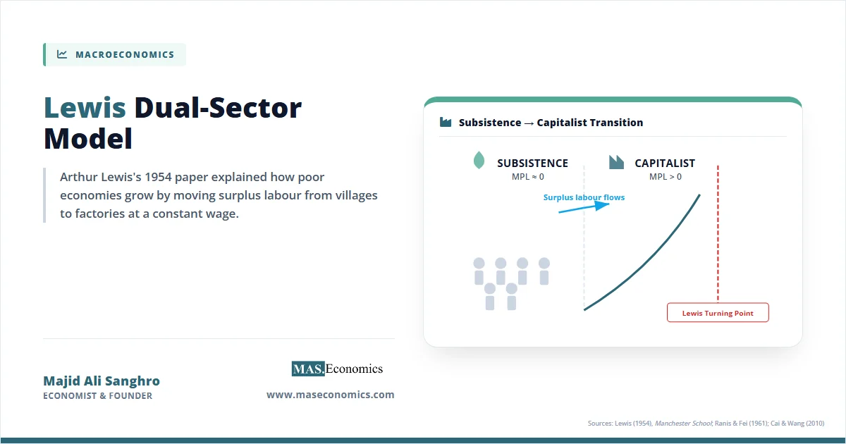
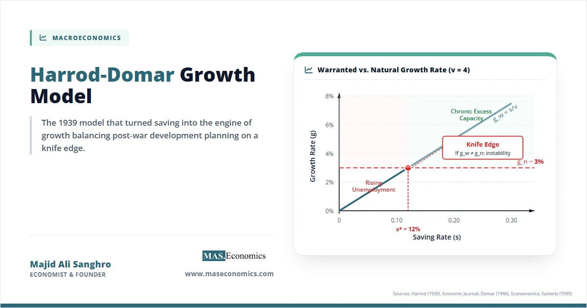
The third is that the trap has to be demonstrated, not assumed. Because the model justifies large, lumpy, expensive interventions, it is attractive to anyone seeking a large budget, and the same observation, a poor region that stays poor, is equally consistent with bad policy, insecurity or geography that no transfer will fix. The empirical claim is specific and testable: identical units with different starting stocks should diverge permanently, and the relationship between assets held and assets accumulated should be S-shaped rather than concave. Where that is shown, the case for a big push is strong. Where it is asserted, the more likely explanations are the ordinary ones, and our articles on the Lewis dual-sector model and the Harrod-Domar model cover the alternative accounts of why poor economies grow slowly.
MASEconomics Explains
3 economic concepts behind the poverty trap
These concepts are explored in depth across our educational articles library.
Conclusion
A poverty trap is a self-reinforcing low equilibrium: returns to assets are low precisely where assets are scarce, so accumulation cannot start, and identical households with different starting stocks end up permanently apart. The diagram makes the claim precise. An S-shaped relationship between assets held and assets accumulated crosses the 45 degree line three times, and the middle crossing is a threshold that decides which of the two stable outcomes a household reaches. The mechanisms that bend the curve into that shape are distinct, coordination failure, nutrition and lumpy assets, missing credit and insurance, and human capital across generations, and each implies a different intervention.
The evidence has a clear shape of its own. At country level the trap is difficult to find, and stagnation is better explained by conflict, policy and institutions than by a mechanical threshold. At household level the evidence is strong, and asset-transfer programmes that are large enough, protected against shocks and combined with training produce exactly the persistence the model predicts, while smaller transfers are consumed and change nothing. That contrast is the practical lesson. A threshold turns the usual intuition about generosity upside down: help that is spread thin can be entirely wasted, and the same total delivered in one piece can be the difference between two lives.
Frequently Asked Questions
What is a poverty trap in economics?
A self-reinforcing situation in which being poor is itself the cause of staying poor, because returns to assets are low exactly where assets are scarce. Formally it is a model with multiple equilibria: a low stable point, a high stable point, and an unstable threshold between them, so two otherwise identical households starting on either side of the threshold converge to permanently different outcomes.
Why does the poverty trap diagram have an S-shaped curve?
Because returns to assets must be low at low asset levels for a trap to exist, which is the opposite of the diminishing returns assumed in standard growth models. That flat bottom, followed by a steep middle and a flattening top, is what makes the curve cross the 45 degree line three times instead of once, and the middle crossing is the threshold.
What is the big push theory?
The argument, associated with Rosenstein-Rodan, that a poor economy needs a large and broad investment across many sectors at once, because a single firm fails for want of customers and suppliers while many firms built together supply each other. It is the coordination version of the trap, and its defining feature is that a smaller push does not deliver a proportionally smaller result.
Is there evidence that poverty traps actually exist?
The evidence is strong at household level and weak at country level. Randomised evaluations of asset-transfer programmes show recipients moving onto a higher path and staying there after support ends, the signature of a threshold. Across countries the picture is different: many of the poorest have grown, and stagnation tracks conflict, policy and institutions rather than initial income alone.
How does a poverty trap differ from simply being poor?
Ordinary poverty under diminishing returns is a slow climb, and any help speeds it up. A trap has a threshold, so help below it is undone while help above it compounds. The testable difference is divergence: in a trap, identical units with slightly different starting stocks end up permanently apart, which does not happen when the climb is merely slow.
Why can microcredit fail to lift households out of a trap?
Because loan sizes are often below the threshold, repayment starts before the asset produces income, and the loan does nothing about the shocks that reset a household’s assets. Credit rationing also excludes the poorest borrowers first, which is precisely the group the model is about. Programmes that transfer the asset outright and add consumption support during the transition perform better in evaluations.
Thanks for reading! A threshold turns generosity upside down: spread the help thin and it vanishes, deliver it in one piece and it compounds for a lifetime. Happy learning with MASEconomics