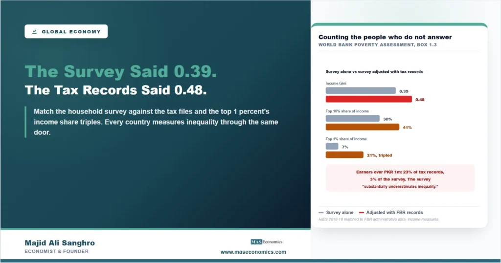
Every inequality statistic the public sees begins with a knock on a door. A household survey enumerator asks a family what it earns and spends, the answers are aggregated, and out comes the Gini coefficient that headlines carry. The method has one systematic blind spot, known for decades and rarely quantified: the people at the top of the distribution are the least likely to open the door, the least likely to answer, and the most likely to understate. Pakistan has now produced one of the cleanest published measurements of how much that blind spot hides, because the World Bank matched the household survey against the tax authority’s administrative records and printed both answers side by side. The survey-based income Gini is 0.39. Adjusted with the Federal Board of Revenue’s records on top incomes, it is 0.48, a 23 percent increase in measured inequality from a single correction. The top 10 percent’s share of income rises from 30 to 41 percent, and the top 1 percent’s share triples, from 7 to 21 percent. The World Bank’s own words are that the survey substantially underestimates inequality, and the mechanism it documents is not Pakistani. Every country measures inequality through the same door-knocking method, and every country’s top decile answers the door the same way.
What the Matching Exercise Found
The comparison is direct enough to summarize in two sentences. Individuals with incomes above one million Pakistani rupees make up 23 percent of all individuals in the tax records but only 3 percent of individuals in the household survey, so at the entry point to affluence the survey sees roughly one person for every eight the tax authority sees. Higher up it is worse: very high earners, above nine million rupees, not only appear far more often in the tax records than in the survey, but the incomes recorded for them are about ten times as large. The correction follows mechanically. Reweight the survey so that high earners appear at their administrative frequency, adjust their incomes toward their administrative magnitudes, and the distribution’s whole upper tail changes shape: top 10 percent from 30 to 41 percent of income, top 1 percent from 7 to 21 percent, Gini from 0.39 to 0.48. Nothing else about the country changed between the two numbers. The poor were counted the same way in both, the middle was counted the same way in both; what changed is that the top was counted at all. For readers who want the machinery of these measures, our guide to Gini, Lorenz and the top 1 percent builds them from the ground up.
Why the Top Is Invisible to a Survey
The mechanics of the blind spot are worth spelling out, because they are structural rather than sloppy. A survey samples households and depends on participation, and non-response rises with income: the affluent are harder to find at home, likelier to refuse, and likelier to live in gated properties an enumerator never reaches. Those who do respond understate, sometimes from privacy, sometimes because genuinely complex incomes, business profits, rental streams, capital gains, do not fit a questionnaire built around wages. And even a perfectly executed survey faces a small-numbers problem at the extreme: the top 1 percent of a country is rare in any sample, and the very top of that percentile may not appear in it at all. Administrative tax data has the opposite profile. It misses the informal economy and the poor, who file nothing, the same unobserved layer our piece on the cash economy maps from the monetary side, but it sees high formal incomes exhaustively, because employers withhold, banks report and filing is compulsory precisely at the top. The two sources fail in opposite places, which is what makes matching them so productive: each covers the other’s blind spot, and the joint is better than either. That, and not any scandal, is the story here; it is the same class of measurement problem our piece on conflicting economic statistics catalogs across four other cases, and the reason the international literature on top incomes moved to tax data a generation ago.
One necessary caution keeps the numbers honest, and it involves not mixing two different Ginis. The 0.39-to-0.48 correction is an income Gini. Pakistan’s more commonly cited inequality number, the 29.0 that appears in the World Bank’s fiscal incidence work, is a consumption Gini, built from spending rather than earnings, and consumption is always distributed more equally than income because the rich save and the poor cannot. The two measures answer different questions and neither converts into the other, so the right sentence is not “Pakistan’s inequality was revised from 29 to 48” but “Pakistan’s income inequality, measured properly at the top, is 0.48, while consumption inequality is measured separately and lower.” Confusing the two is the most common error this finding will suffer in circulation, and any use of it should say which Gini is meant. The distinction matters doubly here because the fiscal analysis built on the consumption measure is itself affected by the blind spot: a survey that cannot see top incomes also cannot see how much redistribution the top could bear, which links this measurement directly to our companion analysis of Pakistan’s tax base.
What Changes When the Denominator of Privilege Doubles
Measured top income shares are not trivia; they are inputs into live policy arithmetic, and tripling the top 1 percent’s share changes the answers. Tax capacity is the clearest case. A state that believes its top percentile earns 7 percent of national income will conclude that even steep taxes on the top raise little, and that revenue must come from broad consumption taxes instead, the exact structure whose consequences for the poor are documented in our explainer on tax incidence. A state that knows the top percentile earns 21 percent faces a different feasibility frontier: there is roughly three times as much income at the top as the survey implied, and progressive instruments reach correspondingly further. The same revision rewrites debates about who gained from growth, since growth accruing to a top the data cannot see registers as growth that vanished, the distributional question our article on trade and inequality pursues through a different channel, and it changes the international league tables in which countries compare themselves, because a country that measures its top and one that does not are not reporting the same statistic. None of this required new economics, only a better count, which is the general lesson: distributional numbers are only as good as their coverage of the tail, and the tail is precisely where household surveys fail by construction.
The finding travels because the method does. Household surveys underpin inequality statistics nearly everywhere, and the top-income correction has been run in enough countries to know the direction is always the same; what varies is the size, and Pakistan’s published exercise is valuable because it puts a magnitude on it for an economy with a large informal sector and a narrow filing base, conditions that describe much of the developing world. There is also a self-referential twist worth savoring: Pakistan’s tax records, drawn from a filing population that is itself famously narrow, still see eight times as many affluent people as the survey does. The instrument everyone criticizes for missing taxpayers turns out to be the best available instrument for finding them, at least relative to the alternative. For the reader outside Pakistan the take-home is a discount rule: whenever a headline says “the top 1 percent earns X percent of income” and the source is a household survey, X is a floor, not an estimate, and in the one South Asian economy where the correction has been printed, the floor was off by a factor of three.
MASEconomics Explains
3 economic concepts behind the correction
These concepts are explored in depth across our educational articles library.
Explore the MASEconomics BlogConclusion
Pakistan’s matching of its household survey against tax records is one of the cleanest published demonstrations of how much top incomes escape the standard measurement of inequality. Adjusted with the Federal Board of Revenue’s administrative data, the income Gini rises from 0.39 to 0.48, a 23 percent increase; the top 10 percent’s share of income moves from 30 to 41 percent, and the top 1 percent’s share triples from 7 to 21 percent. The driver is coverage, not scandal: earners above one million rupees are 23 percent of individuals in the tax records and 3 percent in the survey, and the highest incomes on file are around ten times their survey counterparts. The World Bank’s summary, that the survey substantially underestimates inequality, is a statement about an instrument, and the instrument is in use nearly everywhere.
Two disciplines make the number usable. Keep the Ginis apart, because the 0.48 is an income measure and Pakistan’s familiar consumption Gini is a different statistic that is lower by construction and was never revised. And carry the correction as a general discount rule: survey-based top-income shares are floors, and policy arithmetic built on them, about tax capacity above all, inherits the undercount. A state that thinks its top percentile holds 7 percent of income and one that knows it holds 21 percent will reach for different revenue instruments, and the difference lands, through the structure of taxation, on everyone else. The measurement is the story, and better measurement, here as in most of economics, turned out to be the cheapest reform available.
Frequently Asked Questions
What did the World Bank’s matching exercise do?
It compared Pakistan’s household income survey with the Federal Board of Revenue’s administrative tax records, then adjusted the survey so that high earners appear at their administrative frequency and magnitude. The adjusted numbers: income Gini up from 0.39 to 0.48, top 10 percent share from 30 to 41 percent, top 1 percent share from 7 to 21 percent.
Why do surveys miss the rich?
Non-response rises with income, respondents understate complex incomes such as business profits and capital gains, and the extreme top is too rare for any household sample to capture. In Pakistan’s case, individuals earning above PKR 1 million were 23 percent of all individuals in the tax records but only 3 percent in the survey, and the very highest recorded incomes were about ten times their survey counterparts.
Is the 0.48 comparable with Pakistan’s usual Gini of about 29?
No, and mixing them is the most common error this finding invites. The 0.39 and 0.48 are income Ginis; the 29.0 used in Pakistan’s fiscal incidence work is a consumption Gini, built from spending. Consumption is always distributed more equally than income because the rich save, so the two measures answer different questions and neither converts into the other.
Why does the correction matter for policy?
Because top income shares feed tax arithmetic. A state that believes its top percentile earns 7 percent of income concludes that progressive taxes raise little and leans on broad consumption taxes; one that knows the share is 21 percent faces roughly three times as much taxable income at the top. The revision also rewrites who-gained-from-growth debates and cross-country comparisons.
Does this finding apply outside Pakistan?
The direction does, everywhere household surveys are the source, which is nearly everywhere. Top-income corrections using tax data consistently raise measured inequality; what varies is the size. Pakistan’s published exercise is valuable for putting a magnitude on the bias in an economy with a large informal sector, and it implies a reading rule: survey-based top shares are floors, not estimates.
Thanks for reading! When a survey and a tax file disagree about the rich, believe the instrument that sees them, and treat the other as a floor. Happy learning with MASEconomics