Put the United States, the United Kingdom, the euro area and Canada side by side in June 2026 and the table appears to settle an argument. American inflation is 3.46 percent against 2.60 in Britain, 2.73 in the euro area and 2.80 in Canada. The Federal Reserve is holding its policy rate at 3.63 percent while the European Central Bank pays 2.25 on deposits and Canadian three-month money trades at 2.27. The obvious reading is that the tightest central bank in the rich world has the worst inflation to show for it. Two of those rows reverse once the numbers are put on the same footing, and the real policy rate is the correction that does most of the work.
This matters beyond the arithmetic. Comparisons like this one decide which central bank gets called cautious and which gets called reckless, and they travel from a statistical table into commentary, into market pricing, and eventually into what borrowers in every one of these economies pay. A comparison that is wrong in its second decimal place is harmless. A comparison that ranks the wrong economy first is not.
The Table as It Is Usually Printed
| Measure | United States | United Kingdom | Euro area | Canada |
|---|---|---|---|---|
| Headline consumer inflation, year over year | 3.46% | 2.60% | 2.73% | 2.80% |
| Unemployment rate | 4.1% | 4.9% | 6.3% | 6.5% |
| Policy rate | 3.63% | not in our recomputed set | 2.25% | 2.27% |
| Ten-year government bond yield | 4.47% | 4.80% | 2.97% | 3.42% |
| Latest quarterly growth, as officially published | +1.5% | +0.6% | +0.44% | -0.04% |

|
||||
Three notes belong with that table before anything is concluded from it. The American unemployment rate is July, one month ahead of the others, because it is published faster; the British rate is April, because it is published slower. The euro-area bond yield is the German Bund, the currency union’s benchmark, and French borrowing costs 71 basis points more, a gap examined in our piece on the France-Germany spread. The British policy rate is left blank rather than filled from memory, because our data layer holds the Office for National Statistics inflation, unemployment and gilt series but not Bank Rate, and a table that quietly mixes recomputed figures with recalled ones is worse than a table with a gap in it.
Subtracting Inflation Halves the Gap
A policy rate is a nominal price. What it does to borrowing and saving decisions depends on what it is worth after prices have risen, which is the difference between the nominal rate and inflation. Our explainer on the distinction between real and nominal magnitudes covers the general point. Here it changes the ranking.
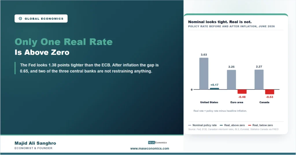
On the nominal numbers the Federal Reserve sits 1.38 points above the European Central Bank. After inflation the distance is 0.65 points, less than half of it. The reason is that the American inflation the Fed is holding against is itself the highest of the group, so the same nominal rate buys less restraint there than it would in Frankfurt. The gap between the United States and Canada narrows the same way, from 1.36 points to 0.70.
The second half of the figure is the part worth sitting with. The American real policy rate is barely positive at 0.17 percent, and the euro-area and Canadian real rates are negative. Two of the three central banks in the table are holding policy rates that do not keep pace with their own inflation, which is an accommodative setting by any standard definition, not a restrictive one. Whether that is appropriate depends on where each economy sits relative to its neutral rate of interest, which is unobservable and contested. What is not contested is that calling the euro area merely less tight than the United States understates a difference in kind: one central bank has a foot lightly on the brake, the other two do not.
The Growth Row Reverses Completely
The last row of Table 1 misleads most often, and it does so through a formatting convention rather than an error. The American figure of 1.5 percent is a seasonally adjusted annual rate: it answers the question of what a year would look like if the most recent quarter repeated four times. The euro-area figure of 0.44 percent is the plain quarterly change, the growth that actually happened between April and June. Setting them beside each other in a single row compares a year with a quarter.
Converted onto the same basis, the ranking inverts. American real output rose 0.37 percent between the first and second quarters of 2026. Euro-area output rose 0.44 percent over the identical quarter. Annualise both and the United States is at 1.50 percent, matching the official print exactly, while the euro area reaches 1.77.
| Economy | Plain quarterly growth | Annualised equivalent | As officially headlined |
|---|---|---|---|
| United States | +0.37% | +1.50% | +1.5%, annualised |
| Euro area | +0.44% | +1.77% | +0.44%, quarterly |
|
|
|||
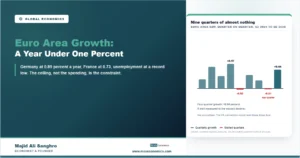
This is a single quarter and it should not be over-read. Over four quarters the American economy grew 2.10 percent against the euro area’s 0.94, so the year still belongs comfortably to the United States, and our study of euro-area growth under one percent sets out why that weakness looks structural rather than cyclical. But the quarter in the table, the one that gets quoted, has the euro area ahead, and nobody reading the headline convention would know it. The same conversion problem recurs whenever statistical offices publish on different bases, a family of traps catalogued in our piece on conflicting economic statistics.
What Survives Both Corrections
Two findings come through intact, and they are what the table is genuinely good for. The United States does have the highest headline inflation of the four, by 0.66 points over Canada, the nearest, for reasons examined in our account of why American inflation now leads the rich world. And it does have the lowest unemployment, at 4.1 percent against 6.5 in Canada, a 2.4-point gap between neighbours taken apart separately in our piece on Canadian unemployment.
Those two facts belong to the same economy, and that is the honest version of the story: the country running hottest on employment is the one running hottest on prices. It is not proof of a stable Phillips curve, because a single cross-section of four economies cannot establish one, and the euro area contains members where the relationship currently runs the wrong way. It is a reminder that a central bank choosing to hold its rate above its own inflation is buying something with that choice and paying for it somewhere else.
Two cautions keep the comparison honest. The first is timing: monetary policy works with long and variable lags, so June’s inflation reflects decisions taken a year or more ago, not the rate sitting on the line above it. The second is that the shocks were not identical. The euro area absorbed an energy price shock dated to a single week, close enough to a natural experiment that we treated it as one in our study of euro-area inflation, while the American acceleration since March has a different composition. Four economies observed once is a snapshot, not an experiment, and the table earns its keep as a place to start questions rather than an answer to them.
MASEconomics Explains
3 economic concepts behind the comparison
These concepts are explored in depth across our educational articles library.
Explore the MASEconomics BlogConclusion
The real policy rate is what turns a table of four economies from a ranking into an argument. On nominal rates the Federal Reserve stands 1.38 points above the European Central Bank; after inflation the distance is 0.65, and the American real rate of 0.17 percent is the only positive one of the three that can be computed here. On growth the reversal is complete: the widely quoted 1.5 percent against 0.44 percent sets an annualised American figure beside a plain quarterly European one, and on the same basis the euro area grew faster in that quarter.
What survives is worth more than what falls away. The United States has both the fastest price growth and the lowest unemployment of the four, and those two facts sit in the same column for reasons that are not accidental. The lesson for anyone reading a cross-country table is narrow and useful: check the basis of every row before comparing across the columns, because the corrections here did not shave a decimal off a ranking, they turned one of the rankings around.
Frequently Asked Questions
What is a real policy rate and why does it change a comparison?
It is the central bank’s nominal rate minus inflation over the same period. Because inflation differs across economies, two central banks holding the same nominal rate are not applying the same pressure. In June 2026 the Federal Reserve looked 1.38 points tighter than the European Central Bank on nominal rates but only 0.65 points tighter after inflation.
Why can American and European growth figures not be compared directly?
American national accounts publish quarterly growth at a seasonally adjusted annual rate, which reports what a year would look like if the quarter repeated. Eurostat publishes the plain quarterly change. Putting 1.5 percent beside 0.44 percent compares a year with a quarter. On the same basis the two figures for April to June 2026 were 0.37 percent and 0.44 percent.
Does a negative real policy rate mean policy is loose?
By the standard definition, yes: a rate below inflation means a borrower repays in money worth less than what was borrowed. Whether that setting is appropriate depends on the neutral rate for that economy, which cannot be observed directly and is estimated with wide uncertainty. The safe description is that such a rate is not restraining demand.
Why is the British policy rate missing from the table?
Our data layer holds recomputed Office for National Statistics series for British inflation, unemployment and gilt yields, but not Bank Rate. Every figure in these articles is recalculated from the underlying series rather than quoted from memory or a summary, so a cell without a recomputed source is left blank rather than filled in.
Does the table prove a trade-off between inflation and unemployment?
No. Four economies observed in one month cannot establish a relationship, and within the euro area the ranking of inflation against unemployment currently runs the opposite way across members. What the table shows is that the economy with the lowest unemployment also has the highest inflation, which is consistent with a trade-off without demonstrating one.
Thanks for reading! Most of the work in reading a cross-country table happens before the comparison, in checking that each row measures what the row beside it measures. Happy learning with MASEconomics